| |||||||||||||||||||||
| Public Boards/Beginner | |||||||||||||||||||||
|
Kira
(Feb 28, 2006)
Lately, this site has been making me feel that none of my works are good enough... no matter how hard I try, I get shot down... It has lowered my drawing mood a bit... |

| ||||||||||||||||||||
|
Pudding_chan
(Feb 26, 2006)
It's... me.
blahaha (Feb 27, 2006)
I would suggest the use of layers; they make things a lot easier to color...and spend a little more than 7 minutes to color in those white spaces. They're very...distracting and make it seem very unfinished. |

| ||||||||||||||||||||
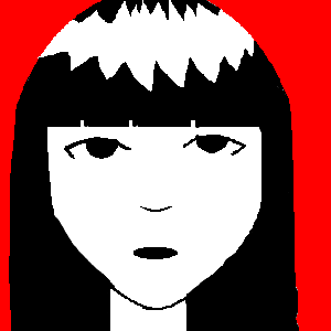
|
sesime
(Feb 26, 2006)
me
saucy (Feb 26, 2006)
Oh, this is you? This looks awfully familiar of something I have seen before! I believe it was "Emily" something. Nice try, like we wouldn't know it was copied. And bad at that.
blahaha (Feb 26, 2006)
*sigh* Kids these days. Come back once you've gained some originality and a good spanking from your mother for claiming something else as your own work (design in this case).
pUnKcHiLd (Feb 26, 2006)
Its a brand or something called Emily the Strange and its on wallets, keyrings and shirts, i suggest that you don't try and copy something that is widely known. ITS CALLED PLAGIARISM! |
| ||||||||||||||||||||
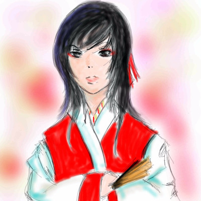
|
Rukia
(Feb 26, 2006)
A quick (and rather sloppy) piece I did before I lose myself to the insanity of Maths and History. There's a triple test coming my way tomorrow, which includes *horror of horrors!* Maths, History and Bahasa Melayu (my national language) Just when you though memorizing all those formulas wasn't enough, some smart aleck of a teacher decided to torture us on the same day with agonizingly long names of people who lived centuries ago. >.> Anyway, the guy *yes, that's a GUY.* in the pic is Gong-Ki, a character from my new found obsession, King's Man aka The king and the clown. It's a South Korean movie which was a blockbuster hit last year and you can find out more about it here: http://www.twitchfilm.net/archives/004483.html
NOVEMBER93 (Feb 26, 2006)
This is a very nice picture....It's a little scribbly though...At the same time, it looks ok scribbly....I don't know
blahaha (Feb 26, 2006)
I'm rather fond of scribbly, sloppy art myself. Good job, although the hand is rather globular-looking. |
| ||||||||||||||||||||
|
AngelDragon
(Feb 3, 2006)
A small soot spirit, carrying coal...(Took me a while to get him there, but he's finally done! X3 )
Distroy (Feb 24, 2006)
i love those little sooty guys great job :D
blahaha (Feb 24, 2006)
Teehee. Those things are adorable.
AngelDragon (Feb 25, 2006)
Thank you for the comments! I always thought they were the cutest too. Some of my favorite characters in that movie.
Zeal (Feb 26, 2006)
:) I love this.. :) |

| ||||||||||||||||||||
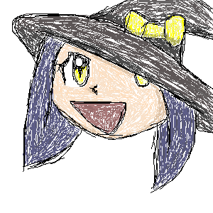
|
BloodyAcoustic
(Feb 16, 2006)
um... it looks pretty nifty! its my first try!
xiau (Feb 16, 2006)
Oh, come on now. Everyone knows "spiffy" is so much better than "nifty" :BAnd yes, very good for a first try! Welcome to 2Draw!
DrsFan (Feb 16, 2006)
Welcome,but what are the wight marks around him?
blahaha (Feb 16, 2006)
yeah, you'll want to get rid of the white marks. Overall, though, not a bad start. It looks like you have a good grasp on shading (unlike me, when I first started drawing). Keep practicing.Oh, and welcome, hi, hello, etc., etc. |

| ||||||||||||||||||||
|
Violette
(Feb 15, 2006)
Testing out techniques.
blahaha (Feb 16, 2006)
Bwaha. I'm such a sucker for long, flowing hair. Nice "whoosh" factor. XD Although, there is something...off with the shape of her body. I can't point it out though. Sorry. >_<
suzie (Feb 17, 2006)
Her hair looks so flowing just like in water, and the colours go so well together. :D
NOVEMBER93 (May 19, 2006)
that's really cool looking
Sweetcell (May 19, 2006)
Hair ribbon candy, very good. |

| ||||||||||||||||||||
|
technocrata
(Feb 15, 2006)
ooooooooooooo
InnocentSake (Feb 15, 2006)
Lol I love it, I agree with blahaha you have a very nice style going on in this picture. That poor guy, he'll never get her she is just teasing him! Tsk tsk tsk... *giggles* |

| ||||||||||||||||||||
|
KaykuyoAkabane
(Feb 4, 2006)
XD Tada. dementeD chibi scribble
blahaha (Feb 5, 2006)
You should use a bigger brush size to color...the white spaces are distracting. Otherwise, it's...okay. Practice a little more. |
| ||||||||||||||||||||
|
_Fullmetal_
(Feb 4, 2006)
I need some more time to think. What do you think so far? Is there any huge errors?!
blahaha (Feb 5, 2006)
The shape of the face is slightly off, and something bothers me with the eye on the left, but it's not too bad. A bit more practice I guess. At least you don't draw like a five year old.
xiau (Feb 5, 2006)
Sutafani: Ed's American voice sucked :|Anyways, I think it's cute, but it could use some shading ^_^; And, as you know, I love Edo~ Just tried changing a few things..I know it isnt better sorry.
The_Chosen (Feb 5, 2006)
meh? looks good but it needs a back ground |

| ||||||||||||||||||||
| |||||||||||||||||||||
| 2draw.net © 2002-2024 2draw.net team/Cellosoft - copyright details - 0.30sec (sql: 39q/0.12sec) |
drawn in 23 min
Aside from physical craptasticness... I feel much better mentaly, emotionally and uh artisticly? xD <3
I'm sorry I had a Galaxy Quest feedback for a second there.
Add some shadows to the arms, figure out where the light source is and apply accordingly, maybe some shadows under the chin to define the head, and work on the eyes and lips more to make them pop out. It's coming along, you finish this.
drawn in 32 min
drawn in 26 min
For all of you who gave words of encouragement I thank you.