| ||||||||||||||
| Public Boards/Intermediate | ||||||||||||||
|
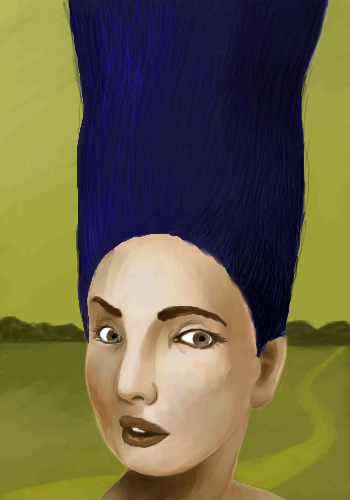
she's got a scissor
huirimeir
(Apr 26, 2005)
and cut everything
safescene (May 14, 2005)
Perfection! I love this.
featherstone (May 14, 2005)
I could so cut that hair for her
huirimeir (May 14, 2005)
scissors sister
ironoxide_red (Jun 16, 2005)
...everything but her hair! Or is this the "Before"-picture? |
| |||||||||||||
|
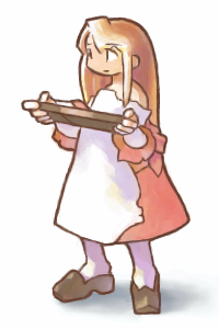
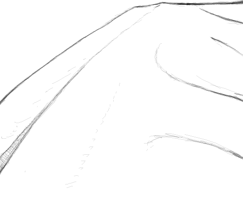
Zack
(May 2, 2005)
I was just laying down basic shapes in pencil stuff using my tablet for the second time ever (first was that apartment photo) and suddenly a little shading here and there and it started looking really cool on its own.edit: Thanks for the crits! I tried to address your concerns and changed a couple other things that were bugging me, what do you think? Was I successful? How well does the composition work now on the whole?
Caddris (May 2, 2005)
I love it! Very fantasy-esque. ^__^ I really like the shading on the breast plate.
davincipoppalag (May 2, 2005)
This will be fun to watch ! It's a good looking scene already.
TaCO (May 3, 2005)
O.O Great pic so far!!!!
DeadlyBlondeArcher (May 3, 2005)
I just now remembered to come back and see what you did with this... what you did in the background with the fading road and the hills and the little castle.. eggZACKtly what I was thinking. :) I love the way it so closely emulates a pencil sketch. |

| |||||||||||||
|
DireOnion
(Apr 26, 2005)
okay this is fine
HunterKiller_ (Apr 26, 2005)
I like them =)
davincipoppalag (Apr 27, 2005)
I think they work with the scene. It's odd, so are they. I like it.
WhoopsieDaisy (Apr 27, 2005)
hehehe...i think this would be an awesome illustration for a children's book....i dunno, but i really love this one... :D
Punky (May 1, 2005)
this really would work in a childrens book. Very imaginative! i love it. |

| |||||||||||||
|
25 comments
– latest 4:
starmarked (May 2, 2005)
Very cool Zach! I really like the brick work, and how there is harsh bright light areas and also dark shaded areas :]
PS (May 2, 2005)
nice styled building, you did great.
Fin_beast (May 2, 2005)
I don't think i'd even attempt something like this. :sGood job. :D
geekyshoes (May 2, 2005)
brill!!!! how do u do it? looks like a photo pratically! |

| |||||||||||||
| Public Boards/Advanced | ||||||||||||||
|
WhoopsieDaisy
(Apr 24, 2005)
thanks for the suggestions |

| |||||||||||||
| Public Boards/Beginner | ||||||||||||||
|
18 comments
– latest 4:
WhoopsieDaisy (Apr 29, 2005)
love the colors you decided to use...awesome work :D
Xodiak (Apr 29, 2005)
Very great soft colours. >:)|XOD|
staci (Apr 29, 2005)
LAZEH! BURNEM AT STAKE!
NemesisT (Apr 29, 2005)
very cute, soft and cartoony :) |
| |||||||||||||
| Public Boards/Intermediate | ||||||||||||||
|
TheCrimsonKing
(Apr 29, 2005)
HandGo through the versions.. or else this is all you see.
Caddris (Apr 29, 2005)
That's an awesome concept. It was fun to walk through all the versions.
p3ndragon (Apr 29, 2005)
Badass, Joe.You rock, man. Keep it up!
davincipoppalag (Apr 29, 2005)
Great idea...fun to look at...
Urei-sama (edited Apr 30, 2005)
this is wild. very orignal although version four confuses me |
| |||||||||||||
| Public Boards/Beginner | ||||||||||||||
|
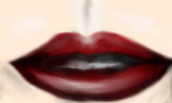
nekodesu
(Apr 28, 2005)
Bleh...first time doing lips....reference: http://www.lichtensteiger.de/Images/lips.jpgAny suggestion on how to improve this?
nekodesu (Apr 28, 2005)
Okay...thanks for the suggestions. And I'm not used to using references when I'm drawing so I tend to kind of make up things. ^^;; Anyways, I'll fix this later.
littlebunnyfu (edited Apr 28, 2005)
the teeth are pretty good, i thought.it sucks that they're using the old make-up trick of trying to make lips look even bigger by drawing the initial line outside the natural lip... I figure if you ain't angelina jolie, live wif it ^_^ Errm...I tried my best to fix it....but I think I might make some more changes later.
PS (Apr 28, 2005)
looks nice, but maybe try to sharpen it up a little bit |
| |||||||||||||
| Public Boards/Intermediate | ||||||||||||||
|
Anna
(Apr 27, 2005)
I'm not really a fan of eggs.
laurael (May 23, 2005)
Eggstrordinarily realistic... <---sorrah...couldn't help it. I love how the scratches on that steel under the egg came out...nice touch.
kitty25 (Dec 27, 2005)
wow this is very GREAT no its excellent it looks like a real brokken egg!
Nekoampy (Sep 1, 2009)
Still looks amazing.
backmagicwoman (Sep 1, 2009)
I like how it looks like a scratchy grill..it's like the one where i work... |

| |||||||||||||
| Public Boards/Advanced | ||||||||||||||
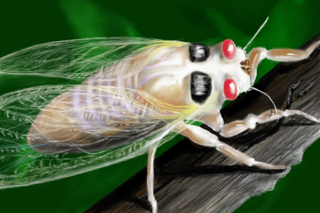
|
davincipoppalag
(Apr 23, 2005)
These come out every 17 years.. noisy as hell and....uuuggglllyyyy
DeadlyBlondeArcher (Apr 28, 2005)
More commonly known as the locust... I like the way they sound. Sorry, Pops, no can do with the .44... would be way overkill for that one... unless it's from one of those science fiction movies where it's like 5 times the size of a large building, then I can shoot it for you. My favorite part of this one is the bark and the shadows.
davincipoppalag (Apr 29, 2005)
I was happy with the branch and the shadows , too. guess I got lucky. Thanks..
marcello (Apr 29, 2005)
a texas girl saying something is overkill O_O(checks temperature outside) (nope, still not frozen)
DeadlyBlondeArcher (May 1, 2005)
lol @ cello |
| |||||||||||||
| ||||||||||||||
| 2draw.net © 2002-2025 2draw.net team/Cellosoft - copyright details - 0.73sec (sql: 37q/0.25sec) |