| |||||||||||||||||||||
| Public Boards/Beginner | |||||||||||||||||||||
|
ironoxide_red
(Aug 2, 2004)
computer screen + surroundings |

| ||||||||||||||||||||
|
Eiroku
(Aug 2, 2004)
This is one of the drawings i did on paper, i hate using long strokes, i use many scattered short strokes to complete the like, normally i dont use color but i felt it was to bland even for a contrasting image it needed a little color
LovelyLori (Aug 2, 2004)
lol, this is funny, good idea :)
ShadowKitten (Aug 2, 2004)
ya i like it, may b you should make the toaster more metallic.. this reminds me *goes and puts waffles in toaster* |

| ||||||||||||||||||||
| Public Boards/Intermediate | |||||||||||||||||||||
|
ShadowKitten
(Aug 2, 2004)
The timer is off by like 2 hours.. ya i really like the way the fire turned out... helpful comments would be nice
TriggerHappy (Aug 2, 2004)
I really like it! makes me want to close my eyes because it's so bright...but the handle part of the sword (don't know the technical name) could use some shading and maybe more definition on the higher points and lower points. give it some feeling and texture. but the fire looks awesome! what a cool idea
ShadowKitten (Aug 2, 2004)
ok il edit it soon thanx for the comment but im reely bad at shadiong so i dont knoiw how it wil turn out
LovelyLori (edited Aug 2, 2004)
maybe take a deeper shade of orange and the airbrush to shade the bottom area of that handle? I know nothing, but just an idea(and add some light to where the sowrd meets the handle) |

| ||||||||||||||||||||
| Public Boards/Beginner | |||||||||||||||||||||
|
ShadowKitten
(Jul 31, 2004)
yup thats me... dont i look horible? (sadly that prolly looks a lot better than me)
Kasha (Aug 1, 2004)
aww, ur blushing, cute. :D
ShadowKitten (Aug 1, 2004)
......I AM NOT CUTE..lolya anyway could someone comment on the art...like as in how could i make it better? i think i fixed myself
meh it still look horrible
|

| ||||||||||||||||||||
| Public Boards/Advanced | |||||||||||||||||||||
|
18 comments
– latest 4:
two-na (Jun 1, 2004)
clock dem hoes! hehehe no don't clock dem hoes!~~~this reminds me of oekaki-shi because it's all fuzzy and cool
ShadowKitten (Jun 2, 2004)
i think its cool how the clock is emphasized because the background is blurry
Kasha (edited Jun 2, 2004)
cool, where exactly is this at? I've seen one in Houston at Bank Of America in downtown. I used to see it all the time when I would wait for my mom to get out of the elevators. Except the one in the bank has this lil door in the base of it and I would always imagine a lil goblin makes the clock go tick tock. Nice work. :D
DeadlyBlondeArcher (Jun 2, 2004)
This one is in Houston in The Plaza. There is a door in the back of it and there is an oil refinery grease monkey monster that operates the clock. lol |

| ||||||||||||||||||||
|
Look
(Mar 6, 2004)
Just something pop into my head. havent drawn anything here for so long
ShadowKitten (Jun 2, 2004)
i really like the shinyness on his hair, very nice pic
bumpinthenight (Jun 8, 2004)
neat stuff... The skin appears quite smooth.. Great stuff!
Mipunai (Aug 15, 2004)
Wow, I love the hair X3
monkeyboy (Dec 11, 2004)
i love those eyes |

| ||||||||||||||||||||
| Public Boards/Intermediate | |||||||||||||||||||||
|
mx
(Jun 1, 2004)
Hi allI done this with the pen tool all the way through as i remember her go well mx
ShadowKitten (Jun 2, 2004)
I really like how it looks "drawn". Anyway she is really pretty and i like her eyes.I couldn`t stop thinking about her...
shes colorful and i decided to attempt to add color go well:) I wanted to try to keep it warm as she is a warm person:)
Woul appreciate som emore comments(thanks for the others) go well mx |

| ||||||||||||||||||||
|
ObeseityKills
(Jun 2, 2004)
forced to draw this piece of crap for someone, sorry so crappy >__<
emmamommalag (Jun 2, 2004)
Why are you calling it crap? Looks pretty danged good to me. I like all those patterns.
ShadowKitten (Jun 2, 2004)
I like the half tones and how your outlined her in white and how all the lines are so sharp. Nice work ^^
two-na (Jun 3, 2004)
what the heck, two comments? This is wicked! I wonder what would happen if you smoothed the lines out
Urei-sama (Jun 28, 2004)
dude, i think its fun... those are my boots anyway. they would kick my ass if i said otherwise XD |

| ||||||||||||||||||||
|
zep
(Jun 2, 2004)
dkwtd...
Knockoff (Jun 5, 2004)
This one is really neat. I like the dude in the background, he looks like hes a stalker.I like the coloring and shading on this one very much.
Zack (Jun 5, 2004)
That shading on the guy on the left's face is fantastic. Did you use the burn tool?
davincipoppalag (Jun 5, 2004)
OMG that's Medusa's brother ..if you look at him..you turn into polyvinyl chloride!! Look away!~ Look away~ nice one zep..yea that shading is tremendous and I like the compostion.
emmamommalag (Jun 5, 2004)
Lol, poppasweetie.. pvc, eh? lol I like that Medusa guy's hair and his face as well. Great job on the whole pic, zep. |

| ||||||||||||||||||||
| Public Boards/Beginner | |||||||||||||||||||||
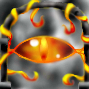
|
bumpinthenight
(Mar 28, 2004)
Yep... Will be the eye of Sauron when I'm done... Looks like crap now, (first stage), but it wont be later... I promise!
ChibiMidori13 (Mar 29, 2004)
Eye ball... of DOOOM... Lol, it's spiffy! ^_^
bumpinthenight (Mar 30, 2004)
Yeah... Just to see what the real eye of Sauron looked like, I watched the trailer for the return of the king again.... Well, needless to say, Please do consider this Saurons little brother :P
ShadowKitten (May 30, 2004)
dosent look like the eye of sauron but it still looks kool.
emmamommalag (May 30, 2004)
No idea who Sauron might be but this is a very cool looking picture. |
| ||||||||||||||||||||
| |||||||||||||||||||||
| 2draw.net © 2002-2025 2draw.net team/Cellosoft - copyright details - 0.72sec (sql: 39q/0.22sec) |
And like I said about the tones.. just simply... superb. 'Warm Computer' is certainly an apt title, since all the warms you used in this picture...