| |||||||||||||||||||||||
| Public Boards/Intermediate | |||||||||||||||||||||||
|
solve
(Sep 13, 2005)
timer way off yo. |

| ||||||||||||||||||||||
| Public Boards/Advanced | |||||||||||||||||||||||
|
davincipoppalag
(Oct 10, 2005)
From a picture I took on my last trip there.
davincipoppalag (Oct 16, 2005)
thanks Gigge!
darkshadow (Oct 18, 2005)
now i want to live here reallt likin that fince
HunterKiller_ (Oct 21, 2005)
It feels really fresh and clean. =]
Miss_DJ (Dec 10, 2005)
wow...so nice poppa. I adore lighthouses (we got married at one, ya know...Yaquina Head in Oregon) the fence is super! excellent job! I really like it. |

| ||||||||||||||||||||||
| Public Boards/Intermediate | |||||||||||||||||||||||
|
somebody
(Oct 14, 2005)
just practicing different textures and effects.
NemesisT (Oct 18, 2005)
Love the colours aswell ! And the motif is just beautiful :)
fleeting_memory (Oct 21, 2005)
This is awesome as many people must be telling you. Great job at getting the eyelashes to look wet from crying
Ruggi (Oct 21, 2005)
Great... awesome... lovin' it!
Gigge (Oct 21, 2005)
Really pretty somebody. I love how the fuchsia contrasts with the tears. |

| ||||||||||||||||||||||
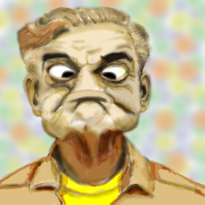
|
koo
(Oct 12, 2005)
I'd really like some comments that will keep me in the right direction of getting this image as close as possible to the reference. I feel I am about half way atm.REF: http://users.igl.net/toonie/gurner.jpg Hope it was worth the extra space :)
darkshadow (Oct 13, 2005)
haha great job that looks well wow and it was worth it or atlest i think so
Rosemary (Oct 14, 2005)
lol looks good now its done :)
LisaAnne (Oct 14, 2005)
Oh this made me smile, and for that I thank you. As far as constructive criticism...the head looks a little squashed (forehead area).I realize space is tight, but I think that perhaps the image going off the canvas might be better. Very nice in general though. |
| ||||||||||||||||||||||
|
mooseflower
(Oct 10, 2005)
Reach rhymes with peach which rhymes with leech which is distantly related to the butterfly!
Gigge (Oct 10, 2005)
That's neat. The butterfly looks as if it's heading toward the hand, but the hand looks as if it's just released the butterfly. It kind of makes me wonder who's catching who.
LisaAnne (Oct 11, 2005)
I dig it.
jord (Oct 11, 2005)
i love the sharp white lines of the background and the white shadow-outlines on the hand (even more). this is cool
DarkCloak (Oct 11, 2005)
Cool! I do like the way this was drawn and colored! |

| ||||||||||||||||||||||
|
Axil62
(Oct 10, 2005)
it has curly things that he thinks.
Anna (Oct 10, 2005)
Love the face, colors, and swirly curlies. :-)
Boichi (Oct 10, 2005)
I love it! Great job.
LisaAnne (Oct 11, 2005)
Extremely tantilizing to my eyes.
jayceepearl (Oct 12, 2005)
This is my brain every night before I try to go to sleep. |

| ||||||||||||||||||||||
| Public Boards/Beginner | |||||||||||||||||||||||
|
Pence
(Oct 9, 2005)
Yeah, It's a little early but I love october and I LOVE halloween!
LisaAnne (Oct 9, 2005)
I really like this style...very unique...My only suggestion is that the black lines around the moon are a little distracting. Either way its a very chic and cute draw.
JK-Arts (Oct 10, 2005)
Did you use mouse to do this or a palette? then i can say some people don't deserve a palette. I use a mouse.
Pence (Oct 12, 2005)
I was to lazy to go get my tablet. So I used a mouse I think at the end I went back in with a tablet to fix up some of the lines. |

| ||||||||||||||||||||||
|
Mal
(Oct 9, 2005)
Poppies
Yuugi-chan (Oct 9, 2005)
I like this. It looks like it was done with oil paints! =)
Fobix (Oct 9, 2005)
WOW thats really pretty! :)
davincipoppalag (Oct 9, 2005)
Very pretty picture Mr. Mal. The look of the metal pitcher is good
LisaAnne (Oct 9, 2005)
poppies are my favorite! Beautiful. |

| ||||||||||||||||||||||
| Public Boards/Intermediate | |||||||||||||||||||||||
|
NemesisT
(Oct 8, 2005)
What can I say. It's a dog and a girl.
LisaAnne (Oct 8, 2005)
I like it...very unique picture, and nice color scheme.background. can't help but giggle at my own line art XD
davincipoppalag (Oct 9, 2005)
I like the look of this one. The figures are interesting, and the grays you used really make it jump out.
lycene (Oct 9, 2005)
What can I say, I'm a sucker for black-and-white. I really like the simplicity of this. |

| ||||||||||||||||||||||
| Public Boards/Advanced | |||||||||||||||||||||||
|
zep
(Oct 5, 2005)
559
Bobstained (Mar 19, 2012)
You need to speak more succinctly.
Ailaik (Jun 13, 2013)
Oh wow, this is so Dave Mckean-ish.. which is a VERY good thing.
Suntan (Jun 13, 2013)
ahhhh..zep art. please come back.
davincipoppalag (Jun 14, 2018)
front page... |

| ||||||||||||||||||||||
| |||||||||||||||||||||||
| 2draw.net © 2002-2026 2draw.net team/Cellosoft - copyright details - 0.91sec (sql: 39q/0.27sec) |
I LOVE IT RIGHT NOW though <3 the shading and your use of clors is greatt