| |||||||||||||||||||||||
| Public Boards/Intermediate | |||||||||||||||||||||||
|
Adult Hidden Pictures
thug
(Jul 31, 2005)
Can you find these hidden objects? cigarette, wine glass, penis, vibrater, pubic hair, tampon, nipple, asshole, buttocks, condom, and G spot (can be very difficult to find).
IkariIreuL (Sep 13, 2005)
WTF a where´s Waldo alike
GOODBYE (Sep 16, 2005)
you're such a geniussss.
HunterKiller_ (Sep 16, 2005)
I can only find cigerette, penis, buttocks and pubic hair. >=(
Anna (Sep 16, 2005)
lol I never saw this before! |
This is hidden because it is rated 18+. Edit your privacy settings to make it visible.
| ||||||||||||||||||||||
| Main Forums/2draw.net | |||||||||||||||||||||||
 |
Deformed (edited Jul 31, 2005)
And stop pretending you know Japanese!! I'm sure alot of you also are getting extremely annoyed by the numerous posts that have waaaaaaay too many " Kawai"'s or "OMGLOLROFFLEPOPSWTF!"'s included in them. This site isn't a Pokemon fan site any longer (evn though it was a joke), so stop acting like a fool.
43 comments
|
||||||||||||||||||||||
| Public Boards/Advanced | |||||||||||||||||||||||
|
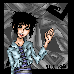
Knockoff
(Jul 23, 2005)
Well, first, I'm proud of this one. It combines several of my styles into one.Secondly, enough with the shitty comments. If you comment, comment on the picture, please.
Kenshin (edited Aug 1, 2005)
Great picture. I love the lips and her expression.The background is different from the rest of the picture and that makes it cool XD
DinoFlorist (Aug 1, 2005)
I would say nice things about this, because there are a lot of nice things that you've done. However, when you only focus on other people's negative work (with the exception of the few people you think are too cool to critique), it makes it harder to do that. This picture could be a lot better if you made the transition from the waxy girl a little more consistant. I think you quit on it, which is easy to do. Good job on the nostril and the lips, but the bridge of the nose is weird and the eyes look like the skin is peeling off of it. Of course, it was supposed to be that way @_@! With more practice, maybe you yourself can be in that small group of people that you won't harass. There are degrees of crappiness and your standards are too high. And, there are degrees of tactfulness, and your standards are too low.
starmarked (Aug 1, 2005)
Okay....I just read all of that ^ and I am halfway confused because I think some comments have been deleted/removed. So KO I just want to tell you that I only visit 2draw to look at everyone's contributions and I comment on those that amaze me or those that I feel I can help out with my comment. I ignore and skip over all of the other mess/gossip/in the end just words that have nothing to do with art. This way I "protect" myself from becoming so upset about the latest topics taking place here. That enables me to continue visiting this site.Now on to the more important thing, KO this is an amazing drawing! When I first saw it and that you drew it, I was soooo proud at how your skills have grown. Her nose, lips, chin, and cheeks are excellent! I like the extra bit of pink/purplish color you have added there. And the teeth add nice detail to her expression (which I also love). The outline of the eyes is not just right, and her eyebrows don�t quite fit the rest of the face. I also think that more emphasis would have been put on her expression and face if you made all of her hair black (or leave only a very few highlights) and remove the partial ear. Make the viewer wonder what is this girl looking at that is causing her to have this facial expression. I am glad you incorporated your different style in the background. This will be one of those drawings that I think about and have to go back to look at it again. Thanks Knockoff :D
Gigge (Aug 5, 2005)
Welcome back, knockoff. I like the mix of styles. |

| ||||||||||||||||||||||
| Main Forums/The Post Board | |||||||||||||||||||||||
|
EliteDrawer-TM (Jul 28, 2005)
The www.freewebs.com/elitedrawers site is going to be destroyed soon. Because the freewebs site is not letting me add all the things that i need to add. ///// The new elitedrawer site will be please check it out it will be done in the next 2weeks and will have twice as much stuff. Just like 2draw you will have to log in to draw. Thanks
17 comments
|
|||||||||||||||||||||||
| Public Boards/Intermediate | |||||||||||||||||||||||
|
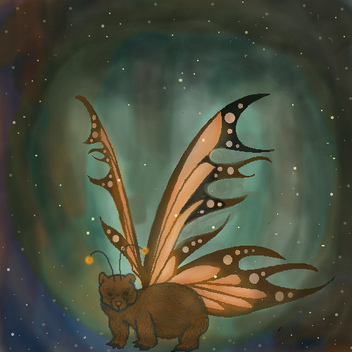
Seklyan
(Jul 23, 2005)
I love Monarchs, and for this drawing i added my own flair to it.
Kilala (Jul 29, 2005)
wow that blows my mind O_O
Seklyan (Aug 1, 2005)
Thanks for your comment Hunter. I actually got to a point where i just didn't know what to do next, so that's why the bear doesn't fit. And Thank you Kilala. I have no idea what made me draw that. i'm glad you liked it :D
Knockoff (Aug 9, 2005)
Oh, awesome concept. Nice jb on the bear, and the wings are a nice an creative touch. I love the background too, this picture is one random thing in a random place!
KH44N (Aug 9, 2005)
This looks beautiful. I like the colours in the background. |
| ||||||||||||||||||||||
|
fleeting_memory
(Jul 13, 2005)
Alright I am afraid to add anymore to it. All I really wanted to fix way the skin to tail transition. Thank you to Maiko for the space! YAY you are awesome. If you guys feel that this should be moved then I can't stop youl, but I am proud of it.
Asriel (Jul 22, 2005)
for all the simplicity of the rain and lightning, it still works. and yeah, lets see hideyourface do better, or copy it for that matter.
hideyourface (Jul 22, 2005)
hey, It's just my point of view.Im giving my thoughts on the picture.
Gigandas (Jul 22, 2005)
I think there's a difference between helping and just saying that you dislike the picture. If you don't like something, you could point it out? Then say what you think needs to be done to fix it. That way, it'll be beneficial.I like the rain, but now the tail seems to blend into the background a bit. You could try lightening up one or the other to separate the two. I might also add some glow around the lightning too. I like seeing how hard you're trying here for sure :). Keep on going.
Knockoff (Jul 22, 2005)
Pretty cool idea, unfortuantly this isn't advnced quality. The clouds are a bit blurry and could have more detail in them, Maybe a bit more variation in them too, it look like one big line of clouds. The lightning is a bit harsh on the eyes, no offence. It looks like you used the linetool. The rain is too thick and you can see it too much. Blocks the picture a bit. Good wings, but they look a little thick at the edges. I'm not sure about the hand behind the back, and after that the proportions go whacky. (though I think that was on purpose) The colors in the black sky are neat, but maybe you could add more detail and add variaiton. The circle of light really needs work on. Make it brighter and less blurry. (it'll bring your eyes to the character) Good attempt. More practice would be better if you plan on taking your art into this board. |

| ||||||||||||||||||||||
| Public Boards/Beginner | |||||||||||||||||||||||
|
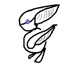
Narasa-mk3
(Jul 21, 2005)
I need to color it
Narasa-mk3 (Jul 21, 2005)
it isn'tIt is just to show how crappeh I am...
Zinc (Jul 21, 2005)
read the rules. if you don't like what you've done, then don't post it.
SimplyX (Jul 21, 2005)
Toucan Sam, no?
Narasa-mk3 (edited Jul 21, 2005)
I like it, but I forgot teh color it... I am a newbie here... |
| ||||||||||||||||||||||
|
FLYING_SQUIRREL
(Jul 20, 2005)
my best picture ever!!!! :)
Truearashi (Jul 22, 2005)
this is like the best pic ever XD! only a true artist can create something this... perfect lol
Knockoff (edited Jul 22, 2005)
How lame. Had you ever thought that some people have a different skin?
squee (Jul 23, 2005)
Duuude. Red X. XD
renire (Aug 29, 2005)
Aaaawwww man! Thats brilliant! I actually thought it wasnt there! XD XD XD XD |

| ||||||||||||||||||||||
| Public Boards/Intermediate | |||||||||||||||||||||||
|
You can colour it Miss Marini, it is better if you use the layers beneath, but please leave the hair uncoloured because I have an idea.
20 comments
– latest 4:|XD|
maiino (Jul 19, 2005)
wow n__n= at first i was just scrolling by n i noticed ur kittie x3 when i got a good look at it xD it waslike *smack* x3 aw.. xD its so nice ^^= teh way u did the hair is absolutely great xD nice stuff &^^=
Kenshin (Jul 19, 2005)
That coloring is so unique and interesting.I like it a lot.
Cordelia_Pink (Jul 22, 2005)
Purdy! I just love how you do your coloring, xod. it's like nothing i've seen before. lol it's really neat how you made the hair as if it was part of the background considering how it's like the sky and the trees as if I was looking at something invisible. But the real background is the one that looks like out in space. It's a neat illusion. This is a neat idea and great job, both of you!!
Cianteed (Jul 23, 2005)
Awesome illusion! I like how her body looks like a candy cane, too! XD |

| ||||||||||||||||||||||
|
Aikara
(Jul 15, 2005)
I am new here. It took me about 5 minutes just to send it. <_<;;; Next drawing I am not using Lascaux sketchh x_o;;Anyway. This is a safety save in case my computer goes evil. I hope this is ok for Intermediate board so far. Doing a neutral thingy in the background. >_> So..hi. +waves+
Knockoff (Jul 15, 2005)
Welcome! I'm sure you'll find 2draw rather chaotic sometimes, but keep up the drawing and future ones. This one looks promising. Finish it.! :D
cold_graffiti (Jul 15, 2005)
this is nice i like your style!And it is done!. Thanks you guys for your comments. :D
Punky (Jul 15, 2005)
Hi Aikara! Do you remember me? Anyways, nice style as usual, I dig the swirls. |
| ||||||||||||||||||||||
| |||||||||||||||||||||||
| 2draw.net © 2002-2026 2draw.net team/Cellosoft - copyright details - 2.80sec (sql: 36q/2.13sec) |