| |||||||||||||||||||||||
| Public Boards/Beginner | |||||||||||||||||||||||
|
The light
Knockoff
(Jul 5, 2004)
The light will some day be gone...........................
LovelyLori (Jul 8, 2004)
the deep and lighter shades of purple rule, I really like that pathway too.... nice job KO
laurael (Jul 8, 2004)
These pics of yours are very interesting KO. I just love how you get these glowy effects.
RIKG (Jul 8, 2004)
I agree, very cool purple clouds. The gold is great too ^^.
Knockoff (Jul 20, 2004)
Thanks for the lovely comments, everyone :D |

| ||||||||||||||||||||||
| Public Boards/Intermediate | |||||||||||||||||||||||
|
laurael
(Jul 8, 2004)
Hey, y'all...
Atsever (Jul 8, 2004)
wauuw cool
Pantera (Jul 8, 2004)
Very pretty, love the dress :)
Gigandas (Jul 20, 2004)
Dang, she's very pretty laurael^^;.She "does" have that mysterious look though.Reminds you of one of those women in the old detective movies XD...
laurael (Jul 20, 2004)
Thanks, G...I think she sort of has that Jani Lane look...*shrugs*... |
| ||||||||||||||||||||||
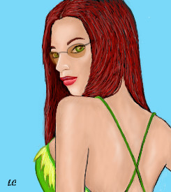
|
laurael
(Jul 8, 2004)
Inspired by KO's last one and everyone else who's done one.Just thought I would try one from LOTR that I saw up on the net.
Zack (Jul 15, 2004)
I thought I commented on this...? Shame on me. :O This is, of course, excellent work Laurael.
15grifficorntears (Jul 17, 2004)
Legolas: Are we there yet?Gandalf: No. Legolas: Are we there yet? Gandalf No. Legolas: Are we there yet? Gandalf: For the last time, NO! Don't make me come back there!
laurael (Jul 17, 2004)
Lmao, 15...that is so funny...and goes with this perfectly... :)
Gigandas (Jul 20, 2004)
This is really interesting to look at.Each person is pretty unique with different types of clothing and weaponry that it makes you want to look for more as you stare at it :). |

| ||||||||||||||||||||||
| Public Boards/Beginner | |||||||||||||||||||||||
|
Priszcilla
(Jul 13, 2004)
RAWR! Angry anime guyhmm....practicing hair...not all that great though...
Zack (Jul 14, 2004)
I think that his chin only seems long because it goes off the canvas; if the canvas were just a tad larger, you'd see the end of his chin instead of being able to imagine it being larger. Or maybe not.You must have high standards for hair, as it seems to me that you did an excellent job here.
Priszcilla (Jul 14, 2004)
^_^ thanks...the hair could be better, but I do like it more than the "Darkness" one
Deformed (Jul 20, 2004)
It kinda looks somthing like kaiba, mabey?
Knockoff (Jul 20, 2004)
Oh, wow. You have really nice lineart! The coloring is very nice, and simple at the same time. Grrr :D |

| ||||||||||||||||||||||
| Public Boards/Intermediate | |||||||||||||||||||||||
|
9 comments
– latest 4:
davincipoppalag (Jul 17, 2004)
THis is a good one! It sorta looks like a younger Danny Bonaduce. Great pic
Gigandas (Jul 20, 2004)
You did an awesome job with the texture of his hair on this one.The sunglasses seem to be pretty symmetrical too :P.Did it just happen to be, or did you get that consistent pink scheme going thru this one when you planned it out?I think that's the best part about the pic here.Well done once again :).
Knockoff (Jul 20, 2004)
Oh! This is really cool. Your awesome at realism, Laurael! The hair is great, lot of detail :D
laurael (edited Jul 20, 2004)
The 'pink' scheme was planned...yessirree. I thought it would be an interesting shade for this...lol..Edit: Thanks KO...you're sweet... :) |

| ||||||||||||||||||||||
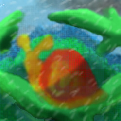
| Public Boards/Beginner | |||||||||||||||||||||||
|
Yair
(Jul 20, 2004)
Snail standing on a leaf in the rain.
emmamommalag (Jul 20, 2004)
This needs sharpened up quite a bit but it has nice colors, drawing and shading. I like it. :)
Knockoff (Jul 20, 2004)
I agree with emma. Still nice though. |
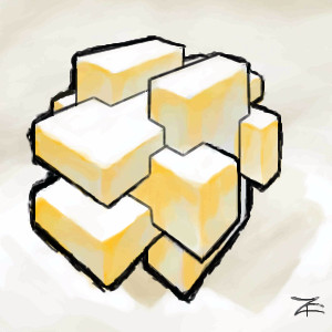
| ||||||||||||||||||||||
|
Zack
(Jul 18, 2004)
It appears to be some sort of thing.
emmamommalag (Jul 18, 2004)
Yep, very nice. It IS cheese, isn't it. Yummy!
ChibiNay (Jul 18, 2004)
This is cool, it kinda reminds me of a gaem called jenga...curse that game!
Knockoff (Jul 20, 2004)
Woo, I love the depth, Zack. Its just really nice, for how you didn't use that many lines except for the out lines.
safescene (Jul 20, 2004)
With the colors you used, it looks like a bunch of blocks of american cheese :P......maybe I'm just hungry. |
| ||||||||||||||||||||||
|
Cordelia_Pink
(Jul 19, 2004)
A is for apple... right?lol the animation is extremely puny. lol Sorry, if you have to squint your eyes to watch it.
Cordelia_Pink (Jul 19, 2004)
lol some people rate their pictures 18+ or something just to fool those people thinking it was something just bad. lol
Knockoff (Jul 20, 2004)
Wooo, purdy colorful apple. Hehehe. this is very nice! |
| ||||||||||||||||||||||
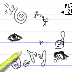
|
mkkmypet
(Jul 19, 2004)
Finished for now... might edit and add a few more doodles.
Ty854 (Jul 19, 2004)
I like the 3-d effect of the pencil. And other than adding on to the doodles you should also try to color the pencil in a bit more, cuz i can see through it. nice jorb so far tho'.
Knockoff (Jul 20, 2004)
Hahah, Hey! I haven't seen you in a while! Well, this is really nice. Great depth. I really see an improvment :D |
| ||||||||||||||||||||||
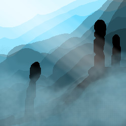
|
Yair
(Jul 18, 2004)
Don't tell me it's not intermediate. =(Lately I'm pathetically try to submit something good but it doesn't.
Sutafani (Jul 19, 2004)
um...... it looks pretty good, you need to spend more time on it
emmamommalag (Jul 19, 2004)
I like this, Yair. It has an ethereal and mystical feeling. It's very interesting and I like the progressively lighter hillsides as you look further into the distance.
Knockoff (Jul 20, 2004)
Ohhh, this is like a silhouette. Very nice depth and fog :D |
| ||||||||||||||||||||||
| |||||||||||||||||||||||
| 2draw.net © 2002-2026 2draw.net team/Cellosoft - copyright details - 2.47sec (sql: 33q/2.00sec) |