| |||||||||||||||||||||||
| Public Boards/Intermediate | |||||||||||||||||||||||
|
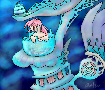
Chiritsu
(Nov 24, 2004)
This is a smaller version of a a4 drawing i have in my a4 sketch book.. its no where near the exact porportions of the page i have but it will do.. i hope you enjoy it when im finished ^^;;Japanese exam time very soon so i better stop ^^;.. for now lol |
| ||||||||||||||||||||||
| Public Boards/Beginner | |||||||||||||||||||||||
|
bakuraiscool
(Nov 25, 2004)
Very ugly, and I can't believe I took 9 whole minutes.
davincipoppalag (Nov 25, 2004)
Then why did you feel the need to post it..
Knockoff (Nov 25, 2004)
How about you press the delete button if you don't like it? |
| ||||||||||||||||||||||
| Public Boards/Intermediate | |||||||||||||||||||||||
|
seaanemone
(Nov 24, 2004)
... |
| ||||||||||||||||||||||
|
Kerokid2000
(Nov 25, 2004)
Yeah, only reference was Google Images search for Fire..... guess who this is.... well.... ... one hint.. " it's name is FLUFFY!?" and yes if your wondering i LOVE C+C and i am a first time oekakier.... someone here stole my nickname tho..... i use it for everything.... KEROKID IF YOUR OUT THERE MAKE A NEW ACCOUNT! yeah.. ummm... bye |

| ||||||||||||||||||||||
| Public Boards/Beginner | |||||||||||||||||||||||
|
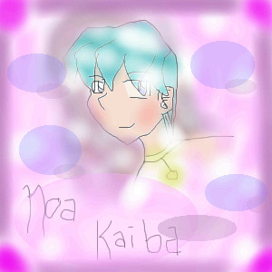
Hakkai
(Nov 24, 2004)
Aaah. Paint BBS. How I adore you now that Shi-painter decided to be crappy to me. Inspired by a music video.
SanzoGirl (Nov 24, 2004)
thats cool! i saw that music vidio it was ok not the best though
davincipoppalag (Nov 24, 2004)
He's been tarred and feathered! poor fella..
Knockoff (Nov 24, 2004)
Yes, paintbbs is a loyal friend to many. ;)Awesome job. I always love your style, the way you draw, the way you color.
Kerokid2000 (Nov 25, 2004)
This belongs in Intermediate... or even advanced.... |

| ||||||||||||||||||||||
|
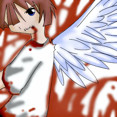
bakuraiscool
(Nov 25, 2004)
Holy crap, I suck!
seaanemone (Nov 25, 2004)
yeah listen to Knockoff!
plasma_ooganator (Nov 25, 2004)
the shading is way to dark compared to that white. but it is an okay drawing. besides the fact that malon dosent have huge eyes! lol. hate japanimation
terra (Nov 25, 2004)
It isn't too bad. I would recommend that you start out with a frame for the body it will help with the problems with the anatomy. As for the eyes you may want to space them out a bit more. Remember no matter how big the eyes are there is all ways a forehead. As for the shading try a light blue or a softer gray for the white. Shading the hair and the collar and giving a shadow on the background will help give the picture depth. Adding a detailed background can add to a picture as well. Knockoff is right you might want to take his advice and spend more time on stuff. Also putting your art down wont get you any place, think positive. I hope that helps.
p3ndragon (Nov 25, 2004)
Yes you suck because you aren't reading Knockoff's comments. |
| ||||||||||||||||||||||
| Main Forums/2draw.net | |||||||||||||||||||||||
 |
mazi (Nov 23, 2004)
just out of curiousity does this happen to anyone else? when you move windows (regardless of being in the applet) over shi-painter it leaves trails of outlines. drives me insane. same happens when you scroll. boo. and yeah i realize you can make it go away by zooming or hitting undo but thats still a pain.
29 comments
|
||||||||||||||||||||||
| Public Boards/Beginner | |||||||||||||||||||||||
|
Panda
(Nov 25, 2004)
Another Digi Charat pic. Comments please! ^_^This is just a little chibi i wanted to try. Mostly, this was just an experement. Still, i really need some help with coloring so thats what ill be working on. Anything else thats wrong with this picture please tell me! ^_^
demon666child (Nov 25, 2004)
awww its sooo cute i love it! just maybe add a little more shade in the face and do the hole things in the bells haha too cute!
Knockoff (Nov 25, 2004)
Not bad, but fixing the lineart and adding shading would make this looks so much better!
Kenshin (Nov 25, 2004)
Yes. Also.. do you know how to use layers? |

| ||||||||||||||||||||||
|
Serchul
(Nov 13, 2004)
Blurbersk is happy.
davincipoppalag (Nov 13, 2004)
Whew..I'm so relieved.. I was worried about Blurbersk..
Fin_beast (Nov 14, 2004)
I really like the texture of that background.I can see he is dribbling. Always good to know that Blurbersk is dribbling. lol
bethica2001 (Nov 14, 2004)
aha it looks lik,e a chunk of cheese!!!! ahh this is sso great!
Knockoff (Nov 25, 2004)
Looks like a golden cookie sponge.! :D |

| ||||||||||||||||||||||
| Public Boards/Intermediate | |||||||||||||||||||||||
|
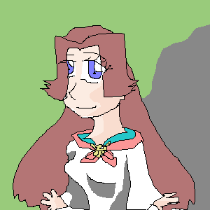
sagenev
(Nov 24, 2004)
tired
davincipoppalag (Nov 24, 2004)
This is one of XOD's cousins. I like the contrasts you created with the colors you used, and the flesh colored lips were a good choice with the greens.. This is striking sag
sincity (Nov 24, 2004)
' Tis very basic and well executed, Kudos baby.
IdentityOne (Nov 25, 2004)
Wow, Nice....I likes, I likes. The scrappyness makes the picture.
Knockoff (Nov 25, 2004)
Hey! Nice to see your art! I love the colors you used! |

| ||||||||||||||||||||||
| |||||||||||||||||||||||
| 2draw.net © 2002-2025 2draw.net team/Cellosoft - copyright details - 1.89sec (sql: 37q/1.27sec) |
this picture will definitly take ages.. i wonder if the board will beable to save the amount of edits.. i hope so.. ill screen shot it incase (if you dont know how to screen shot theres a button on your keyboard, its says PrtSc and SysRq under it.. PrtSc obviously now means print screen.. then you can paste it onto pain or another art programme like photoshop, paint shop pro so on so forth)
edit - polythenepam, you can see the picture in real life hehe, tho its no-where near finished ^^;;
drawn in 1 hour 42 min