| ||||||||||||||||||
| Public Boards/Beginner | ||||||||||||||||||
|
Kakashi_Hitake
(Apr 3, 2006)
i nvr intended to draw ed ^^ o well ^^ |

| |||||||||||||||||
|
hottie-girl
(Apr 8, 2006)
i tried it doesnt look right it didnt turn out the way i wanted to!
Shanghai (edited Apr 8, 2006)
You could use layers!PaintBBS's layers are easier to figure out.
Ana-hime (Apr 8, 2006)
You should use a different applet than PaintBBS. I would suggest Lascaux Sketch, but some people find Shi Painter better, since it's from the makers of PaintBBS. You should use layers to put the lineart in one layer, coloring in another, and in the third layer the background. That pretty much eliminates the need for the fill tool, and ultimately those pesky white spots. :3
Shoebox (Apr 8, 2006)
PaintBBS is pretty simple to use, and can produce some pretty nifty graphics (See; Everdream), but better starting applets would be Shi-painter, or Shi-painter Pro. Lascaux is another excellent applet, but may be more confusing at first.Other than layering problems, you may want to work on proportions and symmetry a little more. The arms are different lengths, and one ear is much larger than the other. The head seems very big, but it could just be the style. The neck also dominates the shoulders a little too much, in fact, the neck is almost as thick as the torso. That could be considered a problem. Don't worry though, you'll soon get the hang of things, try observing realistic proportions (IE, not Anime) to get a better feel of human anatomy. In a.. non-dirty sense.
Ana-hime (Apr 9, 2006)
What I did to get the hang of proportion was to see how others drew it, or look at myself in the mirror and draw what I saw. |
| |||||||||||||||||
|
DoOp
(Mar 11, 2006)
:0 This is a bad tutorial, i'm betting it isnt' going to help anyone >_> but that's okayyyyy
Jodylicious (Mar 11, 2006)
Well.. the little swatches of color off to the side are a refrence to what colors you used, so yu can easily go back and choose them again, instead of using the dropper on the picture or trying to search for that exact same color again >> unless you like writing down numbers =P. Nice tutorial XD
DoOp (edited Mar 11, 2006)
Really? xD... How come i never knew that, well that makes so much more sense O_O;;; hehe, maybe i'll do that now XD actually use it for the dropper... :)
laurael (Mar 11, 2006)
Now 'that' was great! I think this is for more than just Natsuna...like 'me'...THANKS!
Kakashi_Hitake (Apr 8, 2006)
wow thanks this is gonna help me loads thanks for giving me the link to this ^^^ |

| |||||||||||||||||
|
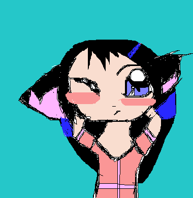
Hinata945
(Apr 4, 2006)
I'll finish after my shower. And Since I think I wasn't good enough, I practiced.
Kakashi_Hitake (Apr 4, 2006)
good job so far ^^
Shoebox (Apr 4, 2006)
Yeah, she looks pretty cute :)I think the chin is a little offcenter though o.O Could just be the angle. The lineart could use some cleaning up, but lineart can be pretty hard sometimes.
NOVEMBER93 (Apr 8, 2006)
the neck is very small....i think that's all...the hair is nice |

| |||||||||||||||||
|
Sasuke-fan-Sapphire
(Apr 2, 2006)
pokemon so far: Pikachu (bottom right), Zigzagoon (bottom left), Umbreon (top left), Ekans (top right), and Azurill (middle) I'll probably add more pokemon. but for now I have colored in ekans. =D
Kakashi_Hitake (Apr 3, 2006)
very good !! ^^^^^^
Kakashi_Hitake (Apr 4, 2006)
great job ! ^^^^^
101_Torchic_101 (Apr 5, 2006)
(^,^) Yay!..Omg, that Zigzagoon is SO CUTE! |

| |||||||||||||||||
| Public Boards/Advanced | ||||||||||||||||||
|
xiau
(Apr 1, 2006)
Artwork long overdue for Woah_Pockster darling \(*D*)/Because... you're so sweet and talented and wonderful and--- (rambles on) Love you! <3<3<3 EDIT: I remember when I used to think this was good rofl. Screwy proportions much?
Punky (Apr 7, 2006)
Dang it xiau, I hate you. :b You're awesome.
Zeal (Apr 8, 2006)
I love the purple highlights in the air
xiau (Apr 9, 2006)
The purple highlights are there because I thought the hair was too boring without them XP
alichanotaku (Apr 16, 2006)
GORGEOUS I adore the clothes...the way they fade to yellow...I'm SO JEALOUS <3 |

| |||||||||||||||||
| Public Boards/Intermediate | ||||||||||||||||||
|
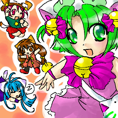
xiau
(Mar 20, 2006)
Panyo Panyo Di Gi Charat doodle.Guess what I was listening to while I drew this? :B
Kakashi_Hitake (Mar 20, 2006)
great job ! ^__^
Natsuna (Mar 20, 2006)
Ahaha this is soo coooll :D I'd be too lazy to do this~ :D
xiau (Mar 20, 2006)
Well, lazy or not, your art beats the crap outta mine :P
Natsuna (Mar 24, 2006)
Xiau-Pshhhh Yeah right.....I draw like a blind guy compared to you..........With no hands.......o__o |
| |||||||||||||||||
| Public Boards/Beginner | ||||||||||||||||||
|
Sasuke-fan-Sapphire
(Feb 20, 2006)
just some dragon I decided to drawstill goin' at it @.@
done :)
Kakashi_Hitake (Feb 24, 2006)
looks good ^^ good job
Zeal (Mar 1, 2006)
Hrrm.. A suggestion if I may? Both wings look like they are on the same side.. you should draw the left wing joint beside and attached to the left forward shoulder to make it look like the wings are on separate sides of the body.. Again, Just a suggestion.. |

| |||||||||||||||||
|
Kakashi_Hitake
(Dec 18, 2005)
these are some eyes i have been experimentsing with tell me what u guys think if any think needs to be changed. foucus mainly on the eyes plz thanks
kitty25 (Dec 18, 2005)
wow .i like how you did the eyes!
cutiepie (Dec 18, 2005)
blue da cute
vigilante (Dec 20, 2005)
funny. ;)
Kakashi_Hitake (Dec 21, 2005)
thx ^^ |

| |||||||||||||||||
|
Kakashi_Hitake
(Dec 8, 2005)
I need your opioions on what should be changed to make this look betteri need some adive on what to change next time just focus mainly on the eye plz
kristine (edited Dec 8, 2005)
1. the beginning of the eyebrow should line up with the eye, and arch where the middle of the eye is, and end diagonal from the right corner of the eye, if that makes any sense.2. you smushed the nose into the picture, which looks wierd. try studying some of the (good) anime noses on this site and try to get a feel for what they should look like. 3. the head isnt that much bigger that it should stretch that far away from the eye. try to cut the edhe of the head right next to the eye, then out a bit for the cheek. but since you just want help on the eye... try not to make the eye too tall, you should try using more different shades of color that way it looks more dynamic and the more color you use the more the viewer gets drawn into the picture...i hope this helps :)
Kakashi_Hitake (Dec 8, 2005)
yea i think this will help thx alot for ur words or wisdom =D ^^
kristine (Dec 8, 2005)
you are very welcome =) |

| |||||||||||||||||
| ||||||||||||||||||
| 2draw.net © 2002-2025 2draw.net team/Cellosoft - copyright details - 0.82sec (sql: 36q/0.23sec) |
This came out well :D Great job~