| |||||||||||||||||||||||
| Public Boards/Intermediate | |||||||||||||||||||||||
|
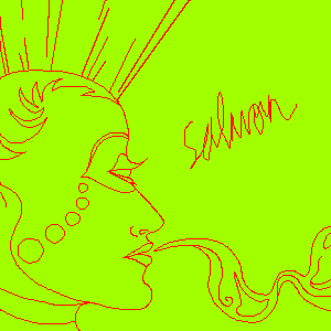
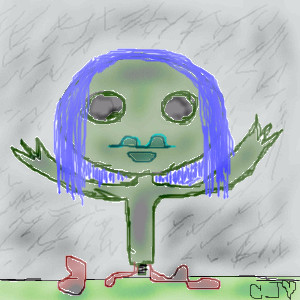
Estecca
(Nov 9, 2005)
Just a doodle right now. :) Maybe I'll colour later.No, I'm not implying that salmon is a Bohemian snackfood. XD I just like random names sometimes. CRITIQUE. I CAN'T DRAW REALISM. The forehead looks like it needs help. D; |
| ||||||||||||||||||||||
|
sal
(Oct 28, 2005)
...move down to inter pls..
Creature201 (Nov 11, 2005)
Is it just me or does that look like Jack Skellington?
JESSI (Nov 11, 2005)
this is cool its different and thats why i like it ....i like how you can tell what the picture is talking about ...its not just one of those crappy things that you dont understand !...yeah it does look like jack the SKELETON ...lol yeah great work you did awesome keep it up
IamaCunt (Nov 11, 2005)
CUTE
IkariIreuL (Dec 3, 2005)
the everyday stuff that usually goes blind . |

| ||||||||||||||||||||||
| Public Boards/Beginner | |||||||||||||||||||||||
| 2 comments – latest 4: |
| ||||||||||||||||||||||
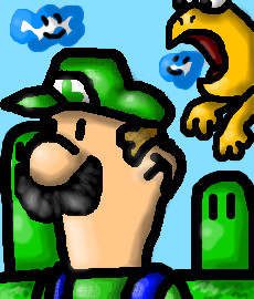
|
Creature201
(Nov 9, 2005)
Watch out, Luigi, if you touch a Koopa, you'll Lose your power! |
| ||||||||||||||||||||||
|
IamaCunt
(Nov 10, 2005)
I love the colors, I'm trying to use some tools I have ignored. |
| ||||||||||||||||||||||
|
IamaCunt
(Nov 10, 2005)
I was looking at my moms collection of frog stuff, and I drew this. I think it's one of the better shading jobs I've done mon |
| ||||||||||||||||||||||
|
7 comments
– latest 4:
IamaCunt (Nov 7, 2005)
That penis looks like a large gummy worm, but it's still a penis so yay! way to go mon
Nyuusen (Nov 7, 2005)
I am bad at drawing penises because it makes me sick to use life references. I'll try and work on that though.hide your face = hide matsumoto album name. Thus, yes, broken-lock
hideyourface (Nov 10, 2005)
it makes you sick to look at a real penis, but you dont have a problem with drawing a guy licking one? :p
Nyuusen (Nov 15, 2005)
Yup. |
This is hidden because it is rated 18+. Edit your privacy settings to make it visible.
| ||||||||||||||||||||||
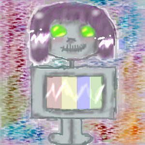
|
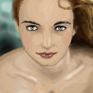
GundamWing
(Nov 9, 2005)
Trying realizm again.
hyschara (edited Nov 10, 2005)
I love her hair the most. I like how it blurs at the back^^and the colour for it^^
davincipoppalag (Nov 10, 2005)
Very nice work! I think you need a touch more work on the hair and eyebrows with some finer lines, but generally this is very good.
IamaCunt (Nov 10, 2005)
Yes, good job it I really like the face esp the eyes mon |
| ||||||||||||||||||||||
| Public Boards/Intermediate | |||||||||||||||||||||||
|
hideyourface
(Nov 7, 2005)
anything wrong with this?..
Deino (Nov 7, 2005)
Oh, I love it! x)the abs suck cause references are boring.
too many abs -____-. SEE?!
davincipoppalag (Nov 9, 2005)
This is a good one conor..the figure is well done and it works very well with the bg..it gives motion. |

| ||||||||||||||||||||||
| Public Boards/Beginner | |||||||||||||||||||||||
|
merwee
(Oct 28, 2005)
my first picture
meobi (Nov 8, 2005)
I think it's too blurry, it's good to be blurry but try having some sharp lines mixed in with the blur so that there's a variety
SneakyWalter (Nov 8, 2005)
The neck's a little too long.
Maiko (Nov 8, 2005)
or maybe she's wearing a very low cut shirt? >_o; who knowwws~
water3 (Nov 11, 2005)
yorum yazm???m ama art?k ayn? fikirde de?ilim,bence bir gül gibi al ve narin bir su gibi saydam ve sakin olmu?... |

| ||||||||||||||||||||||
| |||||||||||||||||||||||
| 2draw.net © 2002-2024 2draw.net team/Cellosoft - copyright details - 0.79sec (sql: 38q/0.52sec) |
By this I mean, go for something you've never thought of drawing before, something that will blow everyones mind and think ' WOAAAAA THIS KICKS BUTT!!! '
Sorry if I seemed that I was getting at you but I couldn't resist >___<
*offended
*it's (its is possessive)
*supposedly
*intermediate (it's freaking written on this page)
You asked for critique, however, so I am not surprised people gave such comments. You can't draw realism, but that's does not seem to apply here since you did not even attempt to do so. I would say, yes, this is beginner level. While the lines are fairly clean, they still lack thought and seem rather arbitrary. Random text does not a make a picture better or more abstract, and in this case, I would say it detracts from the overall piece. I imagine you added it because you felt the picture was missing something, it still is.
This is all very fine and well for a quick sketch, but it's hard to imagine it took you 30 minutes.
The eyes are generally a bit further back on the head, that's probably why the forehead looks 'funny' to you. ^^;;
Though I think this picture really looks cool in a designy sort of way, it does kind of look like she has just one eye in the middle of her forehead.
The shape of the head/chin bugs me just a little, too, but it's not too far off, there, and I'm sure not all people have perfectly round heads anyways.
I hope I helped!