| |||||||||||||||||||||||
| Public Boards/Intermediate | |||||||||||||||||||||||
|
rydicanubis
(Dec 7, 2003)
sketch of a ... well, non-human ... hand... |

| ||||||||||||||||||||||
| Main Forums/2draw.net | |||||||||||||||||||||||
 |
Edward (edited Dec 7, 2003)
My question of the day...TODAY is: Marcello, Why in the world do you have a place for tutorials if you have no tutorials to begin with. This seems odd to me and may seem odd to others like me who think empty pages are usless and take up the space that you where complaining was being taken up by spammers just a month ago. For those of you who did not know that there where tutorials they are here Edward
5 comments
|
||||||||||||||||||||||
| Public Boards/Beginner | |||||||||||||||||||||||
|
DieChan
(Dec 7, 2003)
My very first pic. I didn't know how to use the layers and half of the other stuff so if you consider it bad, tips are appreciated. This is no one in particular.
Harmanye (Dec 7, 2003)
very good for a first, but too much Sharpen around the edges.Lovely eyes, and a ear; ooo. The neck seems to skinny, but it could be the style or the hair covering it up *shrug* The expression is cool though ^_^
HJ (Dec 7, 2003)
Oh, yes! Very nice expression! And the eyes have a unique style to them! Could consider using cleaner lines, though. Welcome to 2draw! (but I myself have only been here for about a month -.-) |

| ||||||||||||||||||||||
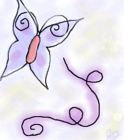
|
HJ
(Dec 7, 2003)
Just messing around, trying to test the technique Mazi said.
Harmanye (Dec 7, 2003)
Oh cool, this is neat! I love the swirly things, and that butterfly is spiffy, I can definetly say you are getting better ^_^ Since I am who I am I must say smoother (as in less jagged) lines would be nice, but I quite understand that it is difficult sometimes. Are you a mouser or a tablet-user (Tabby)? Either way qualities vary and it can be hard to get flowy lines.
HJ (edited Dec 7, 2003)
I use a mouse, but I am asking my parents for a Wacom Tablet for Christmas.. Possibly a Graphire or Intuos. Thanks for your comments! Yah, I hope I am getting better! I drew PowerPuff girls for the first months I started doing oekaki (I was at PowerPuffOnline). I started this oekaki-business in June. But I have 'branched out' to anime & a little bit of furries. My Next Goal: Scenery! Or maybe not..
mazi (Dec 8, 2003)
i reccomend the graphire. thats what i use.. i dont really see a need for the really expensive ones. i only have a graphire2 4x6. it was $99 at the time, and well worth it. the only diff with the "better" tablets is more pressure sensitivity, or a bigger space.. i dont even really use the pressure sensitivity.
marcello (Dec 8, 2003)
I recommend getting a 6x8, and not a 4x5, no matter which line you get. 4x5 just isn't worth it. Now, graphire3 has 4x5 for $100, and 6x8 for $200. Whereas intuos is $300 for a 6x8. The advantage with an intuos is you'll have a much more robust tablet, (plus you can get platinum, while the graphire 3 design sucks and the colors aren't great). So it's really a question of if you're willing to spend $100 more for a more powerful tablet. A side-by-side comparison. (I should mention I find the menu strip useless, the tilt can only be used in expensive programs like photoshop (7 and later), or painter (7 and later as well, I believe, 8 supports it). I'm working on a new applet that'll support tilt as well, though. I really like the intuos2 mouse, but I haven't used a graphire3 mouse to compare (The tablet mouse has completely replaced my optical). Since they have 6x8 in graphire as well now, that's not really a reason to go with intuos2 (one of the main reasons I went with it). Grip pen... that's probably also meaningless, it's nice, but dunno if it's worth it. |
| ||||||||||||||||||||||
| Specialty Boards/Collaborations | |||||||||||||||||||||||
|
3 comments
– latest 4: Grass. Yay.
I tried to color the other tree so it could kinda match yours. I also messed around with the bush.. O.o; I can't color bushes, haha.
Very nice job on the grass! I can almost hear the breeze gently rustling through the blades of grass!
Harmanye (Dec 6, 2003)
Oh, nice tree, nice blending going on, mine is sort of scratchy ^_^Glad you like the grass. I'm afraid I've taken some liberties with the unicorn and the bush, I wanted to give the unicorn a suggeston of a coat,I hope I haven't ruined it -_-
|

| ||||||||||||||||||||||
| Public Boards/Beginner | |||||||||||||||||||||||
|
Gothic_Otaku
(Dec 6, 2003)
do not be alarmed by what you see. I was experimenting with the burn and dodge tools in lascaux. I noticed when I was dodging one layer, the layers on the bottom got lightened... Why?
Aunvi (Dec 6, 2003)
Because those layers were on the top?
Knockoff (Dec 6, 2003)
I dunno is it l33t, but it sure is fl_l/\/l<y (Its a little hard to read,.)(Psst, funky.)Not bad though.
Gothic_Otaku (Dec 6, 2003)
let me rephrase that. Why when I dodged the empty space in an already used layer the stuff in the layers below that got lightened, yet if you erased the dodge the lightening goes away?
Harmanye (Dec 6, 2003)
Maybe I'm just mad, but maybe you should have preserved the transparency of the layer you were dodging? Or, I could be spouting nonesense, I do that sometimes. |

| ||||||||||||||||||||||
| Public Boards/Intermediate | |||||||||||||||||||||||
|
lucy_430
(Dec 3, 2003)
I'm trying to make an angry expression but its not working out very well.
Harmanye (Dec 6, 2003)
Wow, Awesome hair Lucy ^_^ I think though, that the tongue should have darker shading underneath it, because it looks 'rolled' in the picture, Unless that's what you were looking for. and a neck, necks are good ^_^. But the rest is amazing, and very realistic, Good job! Keep it up :)
marcello (Dec 6, 2003)
it's what'sherface from flcl :)
Tamuriil (Dec 6, 2003)
O_______________________________O Whoa..This looks almost identical to my friend...I thought I was blind or something when I first saw the picture(except her hair is a caramel color with blond highlights. XP)
laurael (Jun 7, 2004)
Wow...this is friggen awesome looking! The expression, the eyes, the teeth, the hair it's all totally cool! |

| ||||||||||||||||||||||
|
Harmanye
(Dec 3, 2003)
Clothing and faces and hair Oh my!I can fit some more outfits, so any requests? Not to say I haven't got plenty of ideas, but I'd love to hear some of yours. this is pretty loosely based on an outfit I have.
I hope I haven't commited what might be termed as Texture Abuse ^_^ Still open to any requests!
lucy_430 (Dec 4, 2003)
Ahh! Gimme that shirt! *snatches shirt* Erm...sorry about that. Anyways, I love the lace on the sleeves, it looks really good. Texture abuse? No way, the texture is excellent. :) Don't have any requests, not good at clothes.
Harmanye (Dec 4, 2003)
lol, thank you, That's actually my favorite shirt as well. It's around my first time using textures so I was a little worried ^_^ Thanks for your comment.
Childlike_Vampire (Dec 4, 2003)
This is very cool, my favorite shirt thus far. I don't really have any requests...if I did, it'd be something crazy punky and red cos...that's what kind of mood I'm in right now. lol. I like the background too, very fluid ^^ |

| ||||||||||||||||||||||
| Public Boards/Beginner | |||||||||||||||||||||||
|
haruko_ryuu
(Nov 29, 2003)
it isnt hat i started with but, hey, might as well change it cuz of all the flamez
haruko_ryuu (edited Dec 2, 2003)
i wasnt trying for smooth lines. i know i havent spent much time on it but i will when i have the time! and your caustic remarks may have a purpose but u dont have to say them as sarcastic as you are
Harmanye (Dec 3, 2003)
Here we go, no sarcasm. You're stagnating, spend more time on what you draw.This doesn't look like anything, the title doesn't have anything to do with the picture, the picture doesn't have anything to do with anything, I don't know WHAT you are going to do with this, but I don't think it will be too great. There we go, no sarcasm at all. If you don't like what you hear that's your business, these people have a point. I'd like to help you improve this picture, but my only advice would be to scrap it, and only draw -When You Have Time To Draw-. its the year of the monkey now and we need to celabrate!!! yeah!!!!!
Shuichi-chan (Jan 22, 2004)
yeah monkey! ...kawaii.. you are getting better...gee i hope no one yells at you...O_o well try drawing some anime sometime ne? i bet you will get it eventually if you try...^^ |

| ||||||||||||||||||||||
| Public Boards/Intermediate | |||||||||||||||||||||||
|
Childlike_Vampire
(Dec 2, 2003)
Ce'Nedra is a character from one of my favorite series of books. She appears in the Belgariad and the Mallorean, as well as a few supplements to the series. This is for a signature pic for a guild I'm joining on Go-Gaia.com in honor of the author, David Eddings.
Zinc (Dec 3, 2003)
Reminds me of princess what's her face from Shrek.P.S. Gotta love my shitty comments.
HJ (Dec 3, 2003)
Very lovely shading overall! It gives a soft, kind of pastel-y feel..(The girl from Shrek is named Fiona) (:
furyofroy (Dec 3, 2003)
Her body looks great! And the hair is resplendent. I'm not sure if that word is real or not, I just heard it on TV.
concannon (Dec 3, 2003)
Yep, real word.Great hair, and love the little simple background. Great job. |

| ||||||||||||||||||||||
| |||||||||||||||||||||||
| 2draw.net © 2002-2026 2draw.net team/Cellosoft - copyright details - 0.93sec (sql: 41q/0.44sec) |
hm... looking at it, i like the way the thumb turned out, but i don't like the fingers... they're too short, haven't quite got the perspective...
oh well, that's what practice is for right...?
->Well, you said it wasn't a human hand...it's quite obviously not human...it minds me kinna of this pic by V.V., the top hand there. It looks good man.
looks too much like a paw, not enough like a hand...