| |||||||||||||||||||||||
| Public Boards/Beginner | |||||||||||||||||||||||
|
Harmanye
(Dec 8, 2003)
To Whom It May Concern:I, Harmanye, hereby state that in the course of this drawing I had no clue whatsoever. Harmanye. (and I just want to mantion I had this open all night because, as usal, I can't submit between the hours of twelve and six.) |
| ||||||||||||||||||||||
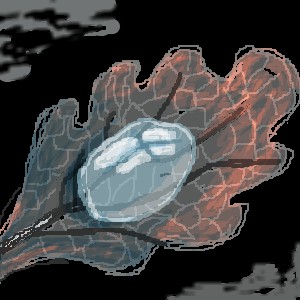
|
gisela
(Dec 8, 2003)
sometimes simple things in life are the greatest
Harmanye (Dec 8, 2003)
would make a great icon, looks capital 'A' Amazing when small, still very nice when large though ^_^
strangeoid (Dec 9, 2003)
It does look really cool small. The drop looks positively amazing when it is puny-fied.
izas (Dec 9, 2003)
it's great!, i really like itit's cool the effect you put in it, specially the drop |
| ||||||||||||||||||||||
|
Harmanye
(Dec 8, 2003)
Oh goodness, It's huge.
Harmanye (Dec 8, 2003)
Teehee. Tag, what? Well thank'ees Knockoff ^_^ I'm glad you like it. I'm glad they look real(-ish), I saw a flower like this before and it took me awhile to find the name. I like them at any rate, but I had to find a few picture of them before I could draw because, well, one can't draw something if one doesn't know what one is drawing.
Childlike_Vampire (edited Dec 8, 2003)
wow!! that's so bright, and pretty! the flower is gorgeous!! the grass, from the blur to the foreground, very spiffily done. Meks me eyes go o.o.lmao you know whit I mean! ^^
Harmanye (Dec 8, 2003)
^_^ Thanks Childlike, and I made a specific effort not to give it a rainy-day look. But I think you should have your eyes checked out....
bearbudl (edited Jul 31, 2004)
You know - I started looking at all of your work - since I just found it all- and I really, really, like this one - not really certain what draws me to it - but I like!!!! This statement comes to you with love from CA------I do know - went back and looked at it some more - blew it up - shrunk it down etc. etc. - it's the detail with the grass - don't know how you do it - You are special LK |

| ||||||||||||||||||||||
| Specialty Boards/Collaborations | |||||||||||||||||||||||
|
A collab where we (dangerous_punk and I) both put 2 people. Someone else can draw one in the middle too, or if it would be easier, D_P, you could draw one in the middle instead. So until I can figure out how to sucessfully reverse mask in shi painter, it's d_g's turn. I guess I got used to lascaux. It's a very nice applet. Oh, and dangerous, please don't tough the dots on the top. They're very important!
8 comments
– latest 4:
Harmanye (edited Dec 8, 2003)
OH, thank'ee sorry I didn't see sooner.One question, does it have to be punk? Lookit me! I'm in the background! ... heh. BTW, when the rest of the background gets put in tere will be a little blurry white like around my person and the floor., I'll fix that when it happens.
Gothic_Otaku (Dec 8, 2003)
You might want to not use the blur tool that much o_x. And no it doesn't have to be punk, just as long as it isn't prep.
Harmanye (edited Dec 8, 2003)
Nah, I'm in the background, I'm blurry, like movies.Anyway, those hardly look like clothes pertaining to Prepatory schools. |

| ||||||||||||||||||||||
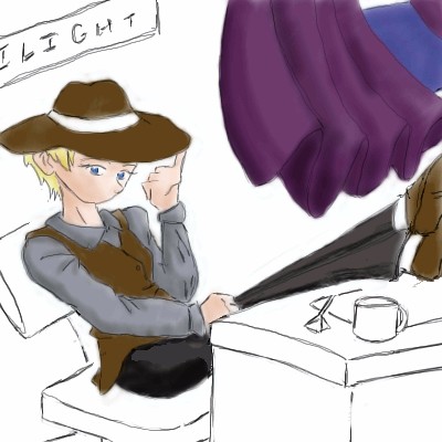
|
A collab. *shrugs* 'kay, JesusFreak89, your turn. I'm imagining a pretty shady office.
5 comments
– latest 4:If there are any major problems with the lineart, I could fix that up...stupid feet...*pokes them* I wasn't exactly sure of how to shadow the curtains so you might have to do that Jasan....I was think that we could make the wallpaper really ugly and peeling.What do you think?
For some reason there are splotches on the curtains..
Jasan (Dec 9, 2003)
Ah, shade with halftones, I meant, but I guess it's better just to avoid that for this pic. ^_^ Ah, and the "Ilight" was a filler poster at the time...I think it would look better as a picture frame, eh? The wallpaper thing is a good idea...I'll do that when I come in and shade the curtains and fix up the lines a little. ^_^
JesusFreak89 (Dec 10, 2003)
Sounds good to me. :)I cleaned up the strangely jagged lines, but I had to get rid of a lot of your coloring, JF. >_< I mimicked your colors as closely as I could; when you do the rest of the undercoloring, can you do it on a separate layer from the lines? ...thanks. ^_^
|
| ||||||||||||||||||||||
| Public Boards/Beginner | |||||||||||||||||||||||
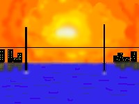
|
elnevo
(Dec 8, 2003)
cia small city
Harmanye (Dec 8, 2003)
That's a very nice effect you've got going with the sun and clouds, I do suggest in the course of it's completion; more hightlights on the water, a cloud colour of a less aggressive nature, and evening out those poles. All suggestions though! By no means do I pretend to tell you what to do with your picture, it's yours and yours alone. |
| ||||||||||||||||||||||
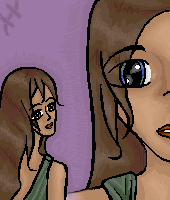
|
DieChan
(Dec 8, 2003)
It's all about the demonic wings and the killer claws, baby. Another made up character.
Harmanye (Dec 8, 2003)
I like this, something about it is very drawing, I think it is the lack of outlines, I'm pretty sure.Yes, I like this, lots of movement, shading could be improved but one must not go overboard, the wings are very nice and the lack of background doesn't disturb me too much. Good job ^_^
Childlike_Vampire (Dec 8, 2003)
this is pretty spiffeh, cept the color of the shirt looks too close to teh skin color, so she looks kinna topless and flabby. lmao but other than that i really like, veddy nice ^^ |

| ||||||||||||||||||||||
| Public Boards/Intermediate | |||||||||||||||||||||||
|
Harmanye
(Dec 7, 2003)
Mainly inspired from Live's song 'Forever may not be long enough'.
furyofroy (Dec 7, 2003)
Very lifelike rose. :D
Harmanye (Dec 8, 2003)
Oh, ta, thanks to you both, I'm glad you like it ^_^.Mayhaps though I am doing too many flowers? o_O
Knockoff (Dec 8, 2003)
Yes VERY nice.Its so nice I can almost smell the rose. =)
Harmanye (Dec 8, 2003)
*beams* Thank you Knockoff.Like the title suggests, I was just testing things out, so I'm happy (and a little surprised) that three whole people like it ^_^ |

| ||||||||||||||||||||||
| Public Boards/Beginner | |||||||||||||||||||||||
|
17 comments
– latest 4:
wyrickj (Dec 18, 2003)
OMG I can't belive it. I love this one so much Knockoff. Want to come work for me????Great job and keep up the work. From: jrwinternetservices (you should know who this is)
marcello (Dec 18, 2003)
lmao, aren't you his brother?
tappie_chan (Dec 18, 2003)
the light is really beautiful. i especially like the red windows (?). they look nice and shiny, yo.like it lots.
Knockoff (Dec 29, 2003)
Thank you all for the comments! |

| ||||||||||||||||||||||
| Public Boards/Intermediate | |||||||||||||||||||||||
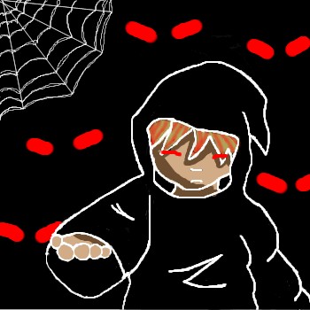
|
Gothic_Otaku
(Dec 7, 2003)
I worked really hard on this pic and perhaps the most careful and unrushed picture I've drawn. I'm prety pleased with it, overall.
Edward (Dec 7, 2003)
wow scarry demonic eyes...the hand looks kinda weird like a big foot coming out of his sleve...maybe its just me... I like the white outline makes everything look more evilish X3
Harmanye (Dec 8, 2003)
Eeee... giving me nightmares GO...Now all it needs to do is buy a black horse and shriek... But anyhow, very cool, white lineart is spiffy. |
| ||||||||||||||||||||||
| |||||||||||||||||||||||
| 2draw.net © 2002-2026 2draw.net team/Cellosoft - copyright details - 1.31sec (sql: 38q/0.37sec) |
And the eye of course. =)
It's might not be the most original idea ever but you know how it goes?
Nothing new under the sun,
Nothing to do it's all been done.
Something along those lines, but I'm glad you like part of it ^_^... Only having two layers is a scary experience.