| ||||||||||||||||||
| Public Boards/Beginner | ||||||||||||||||||
|
George_Goat
(Feb 17, 2006)
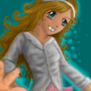
I left it on for a long, long time again. D; Now, I really need advice. On the hand. I wanted the perspective on the hand to look like it was waaay in front of her, but does it look...funny? And does anyone know what could I do to improve it/make it more realistic? I'd really, really appreciate any advice at all. >u< |
| |||||||||||||||||
| Public Boards/Intermediate | ||||||||||||||||||
|
Estecca
(Nov 9, 2005)
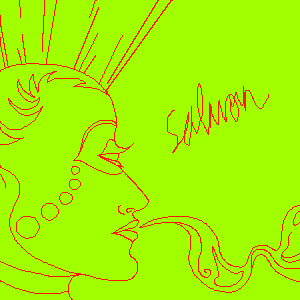
Just a doodle right now. :) Maybe I'll colour later.No, I'm not implying that salmon is a Bohemian snackfood. XD I just like random names sometimes. CRITIQUE. I CAN'T DRAW REALISM. The forehead looks like it needs help. D;
mybettastorm (Nov 11, 2005)
You shouldnt be critasizing so much, simplt tell the person what they need to work on. I dont think that is so hard, Im trying to do that more often myself! :) XP
Minty_hippo (edited Nov 12, 2005)
I disagree with you, this is not up to the standard of intermidiate level, and besides the more critacism (sp?) the more that person can improve on. Critasism (sp?) is nothing to get affended of and nor is it personal. Hideyourface may not have included why he thinks its beginner, but you should know by looking at this anyone can draw that, theres no colour just a plain background and no heart gone into this drawing. Just because its over 30mins and supposidly has effort doesn't mean its intermidiate, anyone can do that, if thats the case then everybody would be drawing on intermidiate. I suggest you work on your pictures more and stick to the beginners board for doodles like this, otherwise carry on what you do best ^___^ like to see more pictures from you and see your full potential!!By this I mean, go for something you've never thought of drawing before, something that will blow everyones mind and think ' WOAAAAA THIS KICKS BUTT!!! ' Sorry if I seemed that I was getting at you but I couldn't resist >___<
marcello (Nov 12, 2005)
*criticism (It's spelled like critic)*offended *it's (its is possessive) *supposedly *intermediate (it's freaking written on this page) You asked for critique, however, so I am not surprised people gave such comments. You can't draw realism, but that's does not seem to apply here since you did not even attempt to do so. I would say, yes, this is beginner level. While the lines are fairly clean, they still lack thought and seem rather arbitrary. Random text does not a make a picture better or more abstract, and in this case, I would say it detracts from the overall piece. I imagine you added it because you felt the picture was missing something, it still is. This is all very fine and well for a quick sketch, but it's hard to imagine it took you 30 minutes.
George_Goat (Feb 12, 2006)
*le-gasp* Here's an actual tip on realism. =O The eyes are generally a bit further back on the head, that's probably why the forehead looks 'funny' to you. ^^;; Though I think this picture really looks cool in a designy sort of way, it does kind of look like she has just one eye in the middle of her forehead. The shape of the head/chin bugs me just a little, too, but it's not too far off, there, and I'm sure not all people have perfectly round heads anyways. I hope I helped! |
| |||||||||||||||||
| Public Boards/Beginner | ||||||||||||||||||
|
4 comments
– latest 4:
Kenshin (Jan 28, 2006)
Thanks a bunch! I love it! It's so dementedly cute >v<
Pakasutemanshikuka (Jan 28, 2006)
Where the hell do you get your ideas from? Your drawings are so unique as just can be.I'm soo jealous! Your style is the biggesst love<3
Punky (Jan 28, 2006)
If I knew myself where I got my ideas from, I'd tell you. I honestly have no idea, and judging from the stuff I draw, I'm probably better off not knowing. Thanks a billion. C:
George_Goat (Feb 10, 2006)
That is so awesome! I love the colors, and the wonderfully twisted, cool character! =O And I really like how your linework is pink. |

| |||||||||||||||||
| Specialty Boards/Collaborations | ||||||||||||||||||
|
a colab with stillremains and snow fox too teach them some stuff
3 comments
– latest 3:
FallenOne (edited Jul 28, 2005)
I LOVE GOATS!!!!!!! good pic,guys
sesshomarulove (Sep 6, 2005)
can i do one plz
George_Goat (Feb 10, 2006)
GOAT! <3 |
| |||||||||||||||||
|
Draw some "sexy" eyes!!! ;D
27 comments
– latest 4:
deleted10215 (Feb 23, 2006)
aaawwwwwwwwwwwww i want to join but its finished
Protocom-iko (Feb 23, 2006)
wow! me like the red eyes their soo DARK
DieChan (Mar 9, 2006)
This is kinda creepin' me out... that signature looks just my real name. o_O The last name, too. The signtaure under the grey eye on the bottom. Freaky. What is that name?
whitefox0 (Nov 30, 2006)
I love this one!!! |

| |||||||||||||||||
| Public Boards/Intermediate | ||||||||||||||||||
|
101_Torchic_101
(Feb 6, 2006)
(>,<) Can't stop drawing him!..I tried a different lineart style =3 It looks pretty good..
Zeal (Feb 17, 2006)
Its good.. exept for the pendant on his head.. the beads look square... so I'm guessing you used the circle tool or the square tool for them..The clouds look almost real however.. This is one of your best..
Punky (Feb 19, 2006)
Although I can't really say I'm big on the subject matter, this has got to be my favorite drawing that you've done. I like the coloring and the bcakground suits this well.You've been improving alot lately. :D
rulerofpsychos (Mar 9, 2006)
ohh...That's amazing...I wish I drew like you..
101_Torchic_101 (Mar 22, 2006)
(^_^)" Omg, thanks, you guys! (sorry I haven't been on in a long time..long story..but..i'm kinda back..ish!) |

| |||||||||||||||||
|
terracotta
(Jan 19, 2006)
.
SYTHE (Jan 21, 2006)
Looks outstanding! It has an airburshed quality that is very hard to acheive.
mikron (Jan 23, 2006)
Thats ok... we all dream about tropical bitches sometimes..
Pseudonymous (Feb 5, 2006)
I went through the animation a bunch of times, and then I tried to replicate it myself. Haha - like that worked. >.>This is very smooth and well done. Shi Painter ate another one.
|
This is hidden because it is rated 18+. Edit your privacy settings to make it visible.
| |||||||||||||||||
| Public Boards/Beginner | ||||||||||||||||||
|
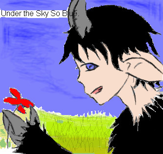
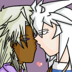
101_Torchic_101
(Jan 20, 2006)
(>.<) Yaaay! They're about to kiss!!...If you don't like it, don't comment!!
whitebunny1063 (Jan 21, 2006)
Very sexy indeed.:)
marcello (Jan 21, 2006)
their facial proportions make them look like they have down syndrome.
BlitzCloud (Jan 21, 2006)
@Marcello: hahahhahahhahahhha.Im starting to think that yami and bakura's brains are placed in their jaw >:)
Sasuke-fan-Sapphire (Jan 21, 2006)
yay! it turned out very good! X3 |
| |||||||||||||||||
|
George_Goat
(Jan 19, 2006)
It's a shooting star in space, with a rainbow at the end, of course. What else would it possibly be? Geez. >:]
phantasmagoria (Jan 20, 2006)
i like
marcello (Jan 20, 2006)
I think it's a vagina
George_Goat (Jan 20, 2006)
Ah...! But it's perfectly innocent! People these days. x]
DeadlyBlondeArcher (Jan 20, 2006)
To me, it honestly looks like a bent old horseshoe with a tuft of hay at the top... and... some cow placenta hanging out of it. HAH |
This is hidden because it is rated 18+. Edit your privacy settings to make it visible.
| |||||||||||||||||
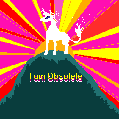
|
George_Goat
(Jan 2, 2006)
Maybe I'll be remembered on another day.
kejoco (Jan 3, 2006)
this is kind of cool in an old school, cheesy kind of wayI can see this on the front of a trendy t shirt
Skai (Jan 3, 2006)
Awesome, it looks like it's from some really old game. >w<
George_Goat (Jan 4, 2006)
Yay, that's exactly what I was going for. :]
Ty854 (Jan 4, 2006)
I like this. The colors coming from the sun look cool, and I like how the unicorn kinda looks like it's exploding. Makes me think of the 70's or the 80's. Very cool. |
| |||||||||||||||||
| ||||||||||||||||||
| 2draw.net © 2002-2026 2draw.net team/Cellosoft - copyright details - 1.60sec (sql: 34q/0.49sec) |
I definitely will take that into consideration, I did leave the hand kind of smudged/blurry, mostly because I was unsure what seemed to be the trouble. And indeed, the cuff's too high up. For now I'll just say it's....rolled up while the other one isn't. >U<
Now that I looked away and see it again I'm also thinking I might add a tiny bit more shadow to the very base of the fingers and maybe make the tips even lighter, for more contrast and dimensionality.
And yep, the teeth were drawn that way specifically for the customer. X3 I also think it would have been a less...disturbing picture without them, but, the customer is always...right. Dx
You both were a great help. <3