| |||||||||||||||||||||||
| Public Boards/Intermediate | |||||||||||||||||||||||
|
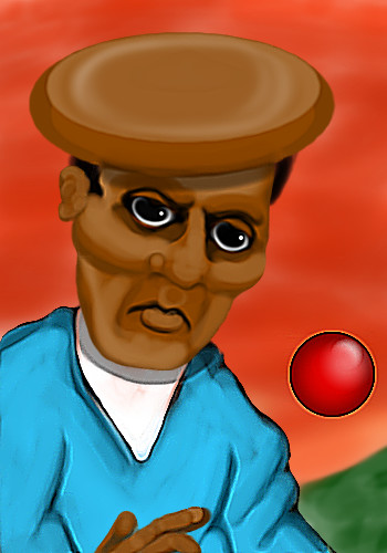
shorty_sal
(Jul 13, 2004)
Will Finish |

| ||||||||||||||||||||||
|
DMV
(Jul 13, 2004)
It just came out this way?
audie (Jul 13, 2004)
IT LOOKS LIKE BILL COSBY! maybe thats what you were going for?Its sweet!I love floating balls!
Gigge (edited Jul 15, 2004)
LOL! I thought it was his head too. I thought he had a bad accident with the wall while playing squash. The colors in this are fantastic, so vibrant.
davincipoppalag (Jul 14, 2004)
This is a picture of Ngimba of the Flathead tribe. Some African tribes put wooden plugs of increasing size into the lips or ears of their children as a beauty enhancement. The Flatheads have a thriving wine and restaurant empire, so they put in increasing sizes of wooden disks under the scalps of their children so that when they join the tribal business they can place wine glasses and hors d'ouevre trays on their heads. Great drawing D
DMV (Jul 14, 2004)
I was really pleased how I shaded it .Thanks all:) (LOL audie!) |
| ||||||||||||||||||||||
| Public Boards/Beginner | |||||||||||||||||||||||
|
shorty_sal
(Jul 13, 2004)
I dont think i did a very good job on the colouring and i still wanna do some stuff to it
DinoFlorist (Jul 13, 2004)
coloring is pretty good, but once again it is composition that makes this drawing look so nice. I think it's your best one so far.
davincipoppalag (Jul 14, 2004)
Yea shorty, this one has a kind of Tim Burton feel to it
Knockoff (Jul 14, 2004)
Lol, this is funny. Did he loose his eyes? ;)
Aubrey (Jul 14, 2004)
I agree, the first thing I thought of when I saw this was "Nightmare before Christmas" It looks very Tim Burton-ish |

| ||||||||||||||||||||||
|
Deformed
(Jul 13, 2004)
iced earth rocks! };)>
DinoFlorist (Jul 13, 2004)
are they the ones that did that spawn album? if so, they suck
Deformed (Jul 13, 2004)
No they werent. |

| ||||||||||||||||||||||
| Public Boards/Intermediate | |||||||||||||||||||||||
|
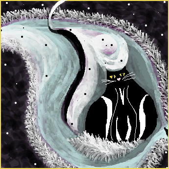
LovelyLori
(Jul 11, 2004)
cat
Bumble_Beez (Jul 12, 2004)
It's cool, but it reminds me of smoething I'd see on a christmas card or somthething x_x
Urei-sama (Jul 12, 2004)
wow, crazy! i like the abstractness of the whole thing. plus fat cats! cant go wrong there
DinoFlorist (Jul 12, 2004)
Thats a great picture! Nice job, LovelyLori! I really like the whole composition a LOT. THe tail is also really well done.
emmamommalag (Jul 13, 2004)
This picture is really odd... in a good way of course. I saw a thin cat until I read Urei's comment about fat cats and a tail.. now I can see the fat one. lol |
| ||||||||||||||||||||||
|
longway
(Jul 9, 2004)
to my best buddy whom died today, checkers...1994-2004
davincipoppalag (Jul 11, 2004)
So sorry..I still sniffle some when I think about when my last one went. It hurts worse than losing people sometimes...
Rosemary (Jul 12, 2004)
aww lovely picture..sorry to hear...
longway (edited Jul 12, 2004)
thanks everybody, it really means alot to me. there are those people whom don't understand the grief that we know. to them a dog, is a dog, big deal. but for those of us who took the time to care and teach a pup, we know the difference. i still remain shocked as he reached out his paw to me at the last moment, raised his chin into the air, and bade me farewell. he had some of the worst habits a dog can have, but i would give anything for him to be here, and do them again. my god, it hit me like a brick, it was and is so profoundly done, i am in awe of his magnificence and grace, to the last moment, in as much as we intended, he never made it to the vet... again thankyou all so much.....inoun or longway..
cmb (Jul 13, 2004)
Damn! Im so sorry I only just found out- my telephone line has been broken for the last 5 days- all I can do is send my condolences- I know how you feel having lost various cats, I really do think they touch our hearts in such a profound and trusting way! |

| ||||||||||||||||||||||
| Public Boards/Beginner | |||||||||||||||||||||||
|
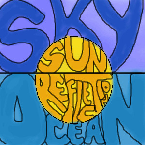
shorty_sal
(Jul 11, 2004)
Its a sunset over the ocean =D
Birute (Jul 12, 2004)
Id say its pretty original. Well atleast I havent seen such... stuff. :] Still yous should have put some more effort into the letters. But if you spent 2 hours its your best I guess.
DinoFlorist (Jul 12, 2004)
It's a good idea. I think it's very intellectual. I fixed up the letters abit, and i put "reflection" instead of "sun"
|
| ||||||||||||||||||||||
|
01
(Jun 28, 2004)
This is my first piece; it's a portrait of a famous actor (I hope people recognize him) using a reference. I will appreciate any feedback; I am especially interested in skin and hair coloring.
davincipoppalag (Jun 29, 2004)
Yes, not a bad likeness, but I agree with mazi.. the proportions are off a bit.. also the face seems a bit too long overall? Good skin tones but you might blend a bit more?Thank you for your comments everybody =) I tried to fix the jaw lines and blur the skin tones, but like you all said, my original pencil sketch was a bit skewed and made the face a little too long. I am afraid of tinkering with it anymore, as I am getting close to the size limit.
Aubrey (Jun 29, 2004)
You did a great job, the length was the problem but I think that comes from makin the nose too long.. so naturally you wanna make the rest of the face propotionate, but the nose bein long throws it all off. I've had that problem too. Always makin the nose too big to start it seems.
Anna (Jul 12, 2004)
hehe... I can't believe I didn't see this one before. Looks just like him, 01 :D (hmm and I'm wonderin' why you didn't link me to your user board that one night in iSketch! I nevvvver knew!) |

| ||||||||||||||||||||||
| Public Boards/Intermediate | |||||||||||||||||||||||
|
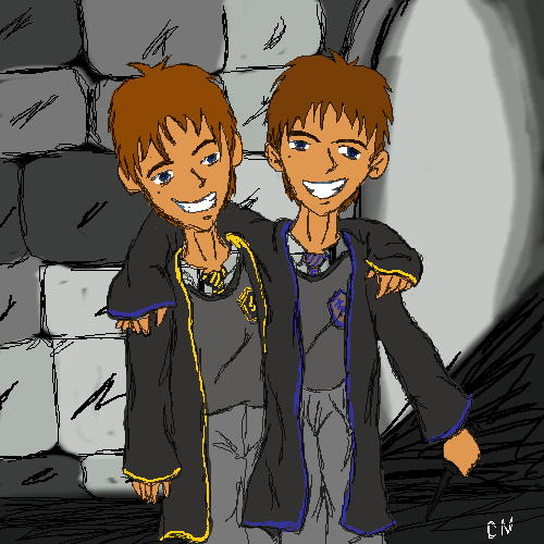
ChibiNay
(Jul 10, 2004)
Just a picture of my characters Sei on the left and Saber on the right. Yeah i know its sketchy looking, but I wanted it to look that way. Trying a new style.
DinoFlorist (Jul 11, 2004)
these guys remind me of harry potter!
ChibiNay (Jul 11, 2004)
yea they are HP based Chars |
| ||||||||||||||||||||||
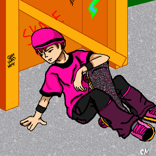
|
ChibiNay
(Jul 2, 2004)
Picture for a friend!This may not be intermediate work but I neede the space sorry.
DinoFlorist (Jul 9, 2004)
it is intermediate quality in my opinion. I think you did a great job with this one. The only really odd thing is the way the plant hand looks, but overall, I think it's a nice job.
debem (Jul 10, 2004)
I agree with DinoFlorist. This is great work. I love the patterned fill-in on the pants and think you did a fantastic job on the tennis shoes and skateboard.
davincipoppalag (Jul 11, 2004)
This is a nice one Chibi.. I would have liked more shadows to put the figure connected with the bg.. but this is good |
| ||||||||||||||||||||||
| |||||||||||||||||||||||
| 2draw.net © 2002-2026 2draw.net team/Cellosoft - copyright details - 1.21sec (sql: 38q/0.49sec) |
drawn in 36 min
drawn in 12 min