| |||||||||||||||||||||
| Public Boards/Beginner | |||||||||||||||||||||
|
This sucks
kya
(Jul 13, 2004)
this sucks
Cordelia_Pink (Jul 13, 2004)
Wow... how weird. Like watching a sitcom with a twisted ending.... lol I dunno.
emmamommalag (Jul 13, 2004)
Looks like a balloon-headed Rod Serling.
davincipoppalag (Jul 14, 2004)
It sort of reminds me of the old NBC (this show is in color) turkey logo |

| ||||||||||||||||||||
| Public Boards/Intermediate | |||||||||||||||||||||
|
Anna
(Jul 13, 2004)
Wanted to draw something quick... so I decided to do this soda can on my desk. :D
emmamommalag (Jul 13, 2004)
Very nice, Anna! Woo-woo-woo-woo-welches.
laurael (edited Jul 13, 2004)
For some strange reason, I'm really thirsty...hmm...I wasn't thirsty before I saw this here picture...(lol).Nice job...now please don't draw any food...jk...I 'know' what's on the boards here 'elsewhere'...(stomach is now growling too...)
audie (Jul 13, 2004)
This is funny...And it makes me laugh.ha hah ha
davincipoppalag (Jul 14, 2004)
Lol good one Anna now draw a Sunkist for Mizz Aubsie |

| ||||||||||||||||||||
| Public Boards/Advanced | |||||||||||||||||||||
|
Snoozy27
(Aug 24, 2003)
Not sure where I'm going with this one. Once it's finished, though, I'm going to have to draw something with a headache-inducing palette. I must!Still... not quite finished. Need to work on the grass and roots some more, etc.
That's it. Overall I'm rather pleased with how this turned out, but it still could be better. :/
rydicanubis (Aug 25, 2003)
gorgeous, you are one of my fav. artists...know that you inspire me... :)
Cordelia_Pink (Jul 13, 2004)
your style is really neat. lol I like the shading on the tree. |

| ||||||||||||||||||||
| Public Boards/Intermediate | |||||||||||||||||||||
|
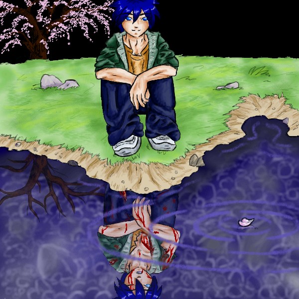
ToraNeko
(Feb 12, 2004)
I was trying to fit both guys in.
lp_phaery (Feb 13, 2004)
GREAT background and foreground,basically tha whole pic is awsome.!!!
oversoul_trump (Feb 29, 2004)
Very cool, nice ripple effect
SaheraNights (Mar 2, 2004)
OMG hes soooooo cute..and omg..that must hurt...Reminds me of Ying and Yang alot
Cordelia_Pink (Jul 13, 2004)
lol whoa this is interesting. the subject matter is pretty 14A-ish I'd say lol since the blood and scars on his face in his reflection on the water is pretty intense. But overall it's a pretty cool pic. good job. |
| ||||||||||||||||||||
| Public Boards/Advanced | |||||||||||||||||||||
|
EverDream
(Jun 29, 2004)
I'll try to get a better background on this sometime later...for now, I'm leaving this as finished. Hope it's not too bad. X(Char. Tandel and Falen (right to left) belonging to Adele Sessler.
Zack (Jul 2, 2004)
This is much better than animation cell quality. The shading in animation ('cell shading') is usually limited to two or three distinct shades per color. I think the kind of shading here is called 'gradient,' and to produce an animation where every frame was shaded to this kind of gradient quality would be an utterly insane undertaking. The shading in Disney movies is better than most, but still not this quality.As for Disney itself, I have no doubt ED could get a job there. But unless you're 'the best of the best', you'll end up doing little more than drawing repetitive frames of someone else's characters to smooth out the work of the lead animators, and might not even get your name in the credits. Additionally, while working for Disney, any artwork you produce, even at home with your own utensils, belongs to Disney. I would hate for ED to work where her art would go unappreciated.
EverDream (Jul 2, 2004)
Thank you for your support Zack. I've considered working for the Disney companies long ago, but the idea of sitting constantly and repeating drawings of something someone else came up with just didn't appeal to me. You don't even get to colour them you know? Any wayz I'm shooting for one of three things, either becoming a digital illustrator, a game character designer, or tatoo artist. :D
Aubrey (Jul 2, 2004)
I like the lighting and you did the shadows of it really well! The colors are great too :-D Another great picture by Everdream.
Cordelia_Pink (Jul 13, 2004)
oooh they both look cute. lol I prefer the blonde one. XD hehe wow, awesome. |

| ||||||||||||||||||||
| Misc. Boards/Sprites | |||||||||||||||||||||
|
kingdom_hearts
(May 23, 2004)
i like it....
emmamommalag (May 23, 2004)
I like it, too... it's different and very pretty.
Gigandas (May 23, 2004)
looks like a screen shot from a video game XD
acidplanet (May 28, 2004)
cool. lots of ppiiixxlleess! please check out my stuff on the beginner board.
Cordelia_Pink (edited Jul 13, 2004)
it looks OK... maybe you should take out the bright areas that are right on her face so that we can actually see her face better. lol but nice hair and eyes. |

| ||||||||||||||||||||
| Public Boards/Beginner | |||||||||||||||||||||
|
YukiEiriSan
(Jan 28, 2004)
Okay, so this is a bit better than my last, I've got to say, But I still stink. Still.. I'm satisfied. What do you think?
RabidMalikFanGirl (Jan 28, 2004)
Suggestions??? Don't use PaintBS for starters ^^ The left is kinda outta alignment and the left curve of the face needs to be more smooth. A bit more curved inward.As for the pic as a whole, I love Yuki!!!!
YukiEiriSan (Jan 29, 2004)
I only used PainBS because it's the one I know how to use.. Used to do Pchat and Oekaki years ago before I got a tablet.. These other programs confuse me! ><
rikurules (Feb 28, 2004)
overall its an OK pic. in fact... its pretty goodwatching the animation, i see u put some good effort into it. i like it! ^_^ i can see pink hair guy kissing him now.... i kinda forgot his name... i read the first manga though!
Cordelia_Pink (edited Jul 13, 2004)
Whoa, he's hot *faints*... lol great job... I don't really know this anime but it looks pretty cool. Maybe I should check it out. lol Yuki... hmm. |

| ||||||||||||||||||||
|
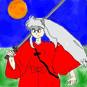
Vash
(Dec 23, 2003)
Srry i couldnt finish it i have ta fix the lines...when its colored and the lines are fixed it will probably be pretty kool^_^
rikurules (Jan 9, 2004)
^_^ awesomey!!!!! ^_^^_^ ^_^_^__^__^_______^ i likes it! but... I'm ugly! TT_TT
Gothic_Otaku (Jan 9, 2004)
wow, this is nice...the head is way too small, and you forgot to draw his ears, but I really like his face and hair though!all i can say is that i tried my best,Btw his right ear is behind his hair...i dont care if you dont like it because i worked really hard on this and spend alot of time on it
Cordelia_Pink (Jul 13, 2004)
lol this is one comical Inuyasha... lol Looks pretty good though. |
| ||||||||||||||||||||
| Public Boards/Intermediate | |||||||||||||||||||||
|
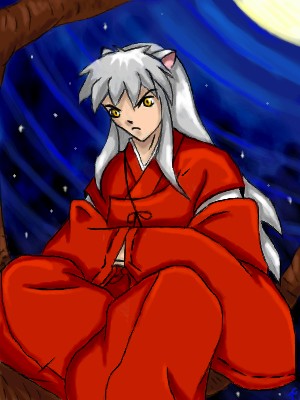
The_Chosen
(Feb 21, 2004)
.... i think this is the first time i`ve drawn Inu on an oekaki board & the second time i`ve ever drawn him *shrugs*
The_Chosen (Feb 21, 2004)
sezy sesshi ^^ yea i may draw one of him some day ^^. ne!
dixielandcutie (Feb 22, 2004)
oh wow. nice detail, and i love the bg!
Gigandas (Feb 22, 2004)
Hey, that's really smooth lookin'.Um....is this the same chara that DieChan drew???I wouldn't know since I don't watch any type of cartoons^^;.Well, nice job anyways.
Cordelia_Pink (Jul 13, 2004)
he looks nice but he looks mad though... oh well... good picture. I love the background. =) |
| ||||||||||||||||||||
|
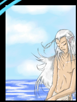
The_Chosen
(Jul 3, 2004)
yea i got kina lazy on this one XP ... he has a loooong waist but he`s supost to look that way
Ameraq (Jul 4, 2004)
Oh yesh, he's sexy anyways *glomps him* ... .... >_> <_< *grabs him and runs away laughing*
Cordelia_Pink (Jul 13, 2004)
lol wow this is nice... you seem to draw a lot of half-naked guys lol (I saw your gallery) but that's fine with me ;) |
| ||||||||||||||||||||
| |||||||||||||||||||||
| 2draw.net © 2002-2026 2draw.net team/Cellosoft - copyright details - 1.25sec (sql: 40q/0.60sec) |