| |||||||||||||||||||||
| Public Boards/Beginner | |||||||||||||||||||||
|
boogilibaby
(Jun 3, 2009)
I just got this pic from my mind... |

| ||||||||||||||||||||
|
Miss_DJ
(Jun 6, 2009)
firecracker (Jun 7, 2009)
Very cool "bull"......I like it!! :)
davincipoppalag (Jun 7, 2009)
That's a cool piece of work
Suntan (Jun 7, 2009)
This is very awesome.
Miss_DJ (Jun 7, 2009)
Thank you so much! I decided to try a different canvas size and was playin around and voila, out came some bull...lol...wink wink... |

| ||||||||||||||||||||
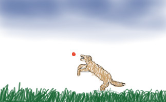
|
koilybugart
(Jun 7, 2009)
i dont know?
Black_Bird (Jun 7, 2009)
Well, there is a brown dog jumping through the air in a field. However the dog is unaware there is a red laser pointer targetted at him as he jumps past. |
| ||||||||||||||||||||
| Public Boards/Intermediate | |||||||||||||||||||||
|
artistforrent
(Jun 4, 2009)
hey, guys, don't mean to clutter things up here, just uploading for safety-- plus, I'm getting tired! ;)
Bubblicious (Jun 5, 2009)
I like it :)
Black_Bird (Jun 5, 2009)
I like the way how she is holding that apple.
firecracker (Jun 5, 2009)
This is really nice.....I like it. Her upper arms look a little thin......but maybe she is supposed to look like that.....she's very pretty, and I like the colors you used, and I really like the background. Very nice draw.....:)
enjoydotcom (Jun 6, 2009)
Unlike other websites, you don't need to write Finished in the title. Here the site knows it without you telling it. |

| ||||||||||||||||||||
| Public Boards/Advanced | |||||||||||||||||||||
|
Artiste
(Mar 29, 2006)
.
JACster (Jul 9, 2006)
This a really good picture. I espically like the leather jacket. :D
concannon (Jul 9, 2006)
Beautiful. I love that most of the color shades are brown and tan, and then there's just that little bit of blue in the necklace and earrings. Really, wonderful drawing.
Black_Bird (Jun 5, 2009)
Ah this is lovely.
Suntan (Jun 6, 2009)
Yes, this really is wonderful |

| ||||||||||||||||||||
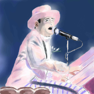
| Public Boards/Beginner | |||||||||||||||||||||
|
Black_Bird
(Jun 5, 2009)
Don't wish it awayDon't look at it like it's forever Between you and me I could honestly say That things can only get better And while I'm away Dust out the demons inside And it won't be long before you and me run To the place in our hearts where we hide And I guess that's why they call it the blues Time on my hands could be time spent with you Laughing like children, living like lovers Rolling like thunder under the covers And I guess that's why they call it the blues Just stare into space Picture my face in your hands Live for each second without hesitation And never forget I'm your man Wait on me girl Cry in the night if it helps But more than ever I simply love you More than I love life itself
firecracker (Jun 5, 2009)
Very nice draw, and very nice song also......:)
kupocoffee (Jun 5, 2009)
this picture has great emotion!
Miss_DJ (Jun 5, 2009)
Great song and I love the pic, but he's so 'known' for his big glasses, I was surprised not to see them.
Black_Bird (Jun 5, 2009)
Thanks everyone. :) I really appreciate it. Glad you like it.Miss DJ: Yeah me too, the ref photo I used didn't actually have him wearing them. Oh well! |
| ||||||||||||||||||||
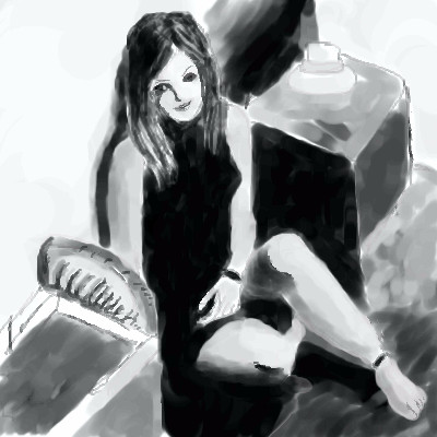
|
Black_Bird
(Jun 4, 2009)
QTgillie (Jun 4, 2009)
great angle and compositions, I like how undefined much of it is.
firecracker (Jun 4, 2009)
Very nice......I like it. :)
noonelikeyou (Jun 4, 2009)
Wonderful drawing, very impressive. I like it~
Black_Bird (Jun 5, 2009)
Thank you everyone. :) |
| ||||||||||||||||||||
|
kupocoffee
(Jun 3, 2009)
I really want to improve.
Black_Bird (edited Jun 3, 2009)
Keep drawing. :) Look up Oekaki tutorials etc too if you feel the need....Eventually your drawings will evolve from one another and you'll come up with all sorts of different ideas and techniques. For instance, I started doing Oekaki back around 2005 on TACo and it was mostly anime. Now it has changed to other disciplines also. |
| ||||||||||||||||||||
| Public Boards/Intermediate | |||||||||||||||||||||
|
elly
(May 29, 2009)
Whatever text I've added to this in the last 10 minutes is NOT showing up for me! I'm not a very happy camper at this moment .\ /.
bette_davis_eyes (May 31, 2009)
it's a great looking logo elly! your pastor will really love it :)
elly (May 31, 2009)
Thank's, y'all. You ROCK! y'all are so consistent. I love it! I'm happy to say that the pastor loved this draw, but I talked him into trying it with a more 'rugged' looking cross instead of a clean lined one. So, whenEVER I get the chance to play with that, I will....after the wine wears off...LOL. Oh, dave, there are many premises as to why these elements are in this logo but I'm afraid it would take too long to lay it all out!!!! Ooo, that might not be a good thing... *off to the think tank*
shults (Jun 3, 2009)
Forgive my ignorance, but is there a meaning to the unnatural way in which the water flows?Well, if this text doesn't show for me, this one is HISTORY!!!! I've typed my explanation out several times now and it hasn't shown up with the drawing yet! I think I've got my s**t together now and will try to explain my dilemma with this draw ONE MORE TIME......
After drawing version #5 and tried to use the logo, it has a white bkgd along with them image that I wanted to get rid of. SO, I opened the draw and using the eraser tool, erased everything on all the layers under the cross/water, then uploaded it. The version that appeared instead was version #6 looking nothing like the one I uploaded. After thinking on it a bit, I decided to go back in and completely delete all the layers under the cross/water layers and resaved it again. This time I got version #7, again nothing like what I saved. Also interesting and frustrating as well are the last two entry thumbs that have a blue bkgd till you open the file, then you see what's above now. Does anyone have any idea how/why this would happen? Can anyone tell me what I can do to get rid of the white bkgd box so I only have the cross and water show up when using this image on something????? Huge thanks to anyone who can offer some info!! |

| ||||||||||||||||||||
|
artistforrent
(May 29, 2009)
sketch and flats, another painting experiment. I really want to get away from my dependence on line art.EDIT: Cleaned up the flats, colors. Crits and comments always welcome. :) EDIT 2: did most of the shading, almost finished. I'm at a loss for a BG. >> Suggestions are welcome! :D EDIT 3: I'm done with this pic. Was a lot of fun, learned a lot! Crits and comments honored. <3
Miss_DJ (Jun 2, 2009)
there's a ton of stuff I like about this drawing...the placement of the people, the highlights/shadows... they remind me of the type of cartoons I watched a long time ago. The one thing that bothers me is his nose.
firecracker (Jun 3, 2009)
I think the finished picture looks awesome! I like the way you did this, and I love the colors, and the way you blended and highlighted everything. You didn't use any textures....and the pic looks awesome. Great draw. :)
artistforrent (Jun 3, 2009)
Miss_DJ: I totally agree! I hate his nose.....firecracker: awww, thank you honey! *hug*
backmagicwoman (edited Jun 3, 2009)
Beautirful in every aspect...I particularly love the way you do lips...something about your work seems very familiar to me...:) |

| ||||||||||||||||||||
| |||||||||||||||||||||
| 2draw.net © 2002-2025 2draw.net team/Cellosoft - copyright details - 1.37sec (sql: 37q/0.51sec) |
So in closing..I would like to say...
Put your crap where it belongs ..or better yet put some damned effort ito your work before you post it...and if there are any ramifications to this rant of mine..then so be it....
And I just want to say to all the people here that I really am sorry I have not been commenting on all the great art I've been seeing lately..but I really don't feel well at all lately...so I am sorry...but everyone is doing good work right now..with the exception of this picture...So this will be a catch all comment for all you woderful artists..love you guys and keep up the wonderful work...