| |||||||||||||||||||||||
| Main Forums/Drawing Discussion | |||||||||||||||||||||||
 |
15grifficorntears (edited Jul 29, 2004)
i tried to revise one of my unfinished pics and it came out on the applet as the 1st version instead of the 2nd version. my comp was having problems when i uploaded my 2nd version,and it shows the 2nd version on my user board. i'm confused.
2 comments
|
||||||||||||||||||||||
| Main Forums/2draw.net | |||||||||||||||||||||||
 |
emmamommalag (Jul 28, 2004)
Evil Clown Week was such a great idea. What fun! I'm really enjoying seeing what all you talented people are coming up with.
16 comments
|
||||||||||||||||||||||
| Public Boards/Intermediate | |||||||||||||||||||||||
|
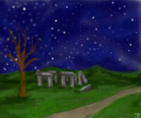
Standing Stones
thesolarwinds
(Jul 29, 2004)
any suggestions?
15grifficorntears (Jul 29, 2004)
alittle more colour in the grass, tree, and stones. not so smudgy, use the pen tool to thicken up the edges. it'll look good when it's finished, i've got a feeling about it.
davincipoppalag (Jul 29, 2004)
To me, this looks like Stonehenge. As I recall that's a fairly large structure. The foreground tree makes the stones look tiny by comparison. I think if you lose the big tree, and put some small boulders and a few small shrubs, the scale will look more like what it should.
emmamommalag (Jul 29, 2004)
Also.. sharpen up the edges of things. It looks blurry.
friend (Sep 25, 2005)
Is it stonhenge? if it is i dont like the tree but if it's not i love this. |
| ||||||||||||||||||||||
|
Zack
(Jul 25, 2004)
He's not a bad bot. He's just misunderstood.
15grifficorntears (Jul 29, 2004)
he looks pissed. nice work.
Zack (Jul 29, 2004)
Ty: Hehe, the star could go either way. If he was red with a gold star, he'd be a communist bot. ;)Dino: I'm obsessive about my lines. The timers for this and my other robot pics are accurate. The clown was a spontaneous thing that turned out better than I expected.
Ty854 (edited Aug 2, 2004)
evil commy bot?
Knockoff (Aug 4, 2004)
Woaw, The shading is very simple, but I think it looks great. |

| ||||||||||||||||||||||
|
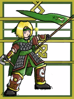
Noremac
(Jul 28, 2004)
this is Eohyrde. rider of rohan. mixed with kiwy's for my drawing fun
rosalyn (Jul 29, 2004)
Cam You are so awesome ^^
squee (Jul 30, 2004)
wow. it turned out pretty good! ^-^
DaggerQuill (Aug 6, 2004)
lord of the rings! Yay! cam i think is my fav. of yours i love the background
Gnome-Commando (Oct 22, 2004)
hey c am, your so cool, i wish i was as cool as you.. and i suck |
| ||||||||||||||||||||||
| Misc. Boards/Sprites | |||||||||||||||||||||||
|
15grifficorntears
(Jul 28, 2004)
alot of points for such a little picture
davincipoppalag (Jul 28, 2004)
And, these little ones are harder than they look, aren't they..Nice..You should zoom down Ridley and make him your icon!
concannon (Jul 28, 2004)
Ooh, very nice. I dig it. I'm glad you changed it too...v2 is much better, in my opinion.
15grifficorntears (Jul 28, 2004)
if i make Ridley my icon, it will be so small that you wouldn't be able to make out what it is. also because the background is like the same colour as he is. |

| ||||||||||||||||||||||
| Public Boards/Intermediate | |||||||||||||||||||||||
|
emmamommalag
(Jul 22, 2004)
from a photo I found
Miss_DJ (Apr 6, 2005)
should be in a frame in my house! or SOMEONE'S for cryin out loud...lol
emmamommalag (Apr 7, 2005)
Thanks for your kind comments on my pics, Miss DJ. And thank you too, Gigge. I'm glad you like it. :)
sincity (Apr 7, 2005)
I thought I commented on this , SHESH! How did I miss this. I Love it! Considering I'm Scotch Irish. :}
davincipoppalag (Apr 7, 2005)
Och!~ ah nooo ah liked ye mikeylad.. |

| ||||||||||||||||||||||
| Main Forums/Drawing Discussion | |||||||||||||||||||||||
 |
JackSprat (edited Jul 26, 2004)
I've had a fantastic time browsing just a few of the various artists on here, and there is so much more to see. It's nice to get creative ideas from seeing others at work. I thought I would just tell everyone (and I'm sure a lot of you already know about it) about a great publication that comes out every year just filled with amazing stuff. Its called Spectrum, I get it every year at Borders, and have found back issues at amazon, and it has a compilation of what the editors feel is the years bes...
3 comments
|
||||||||||||||||||||||
| Public Boards/Beginner | |||||||||||||||||||||||
|
Brimstone
(Jul 28, 2004)
first pic ever here. I don't like it to much. XP
15grifficorntears (Jul 28, 2004)
it's better than alot of first pic. you're off to a good start, welcome to 2draw Brim.
Sutafani (Jul 28, 2004)
WELCOME to 2DRAW!!!!!! I love THIS PIC!
The_Chosen (Jul 28, 2004)
CUTE i love the contrast of colors XD |

| ||||||||||||||||||||||
| Public Boards/Advanced | |||||||||||||||||||||||
|
DeadlyBlondeArcher
(Jul 27, 2004)
I forgot to buy light bulbs at the grocery store yesterday and today I was thinking I'm completely out of ideas for creative or interesting subject matter to draw here, and so this is what I came up with.
rosalyn (Jul 29, 2004)
I have an IDEA! :|
LovelyLori (Jul 29, 2004)
nice blend on the bg... lovin' it dba
Supergurl103 (Jul 30, 2004)
nice light bulb!!! what a brilliant idea :P
Cordelia_Pink (Aug 3, 2004)
oooh this is a bright and clear idea, DeadlyBlonde! I also like the little golden bottom part (what-cha-ma-call-it). lol |

| ||||||||||||||||||||||
| |||||||||||||||||||||||
| 2draw.net © 2002-2026 2draw.net team/Cellosoft - copyright details - 2.08sec (sql: 36q/1.12sec) |