| |||||||||||||||||||||||
|
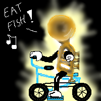
Eat Fish
fleeting_memory
(Mar 2, 2004)
a glowing instrument riding a bicycle saying "eat fish"You gotta love the idea box lol how do you like it?
Gigandas (Mar 2, 2004)
XDDD.That's cool XD. I like how you tilted the bell this way so that it looks like it has a circular head.That's a creative touch you added there^^.Nice XD.
davincipoppalag (Mar 2, 2004)
you can tune an instrument..but..can you tuna fish?
fleeting_memory (Mar 3, 2004)
HA-HA *slaps knee*
dixielandcutie (Mar 3, 2004)
lol. thats really cute fm, awesome shading with the light too.. |
| ||||||||||||||||||||||
|
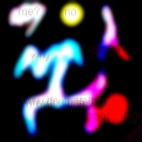
Minitsaru
(Mar 2, 2004)
just a test....
drworm (Mar 2, 2004)
It's so... hypnotically glow-y and cool... *stares*
DeadlyBlondeArcher (Mar 3, 2004)
This is very fluid. I like it. |
| ||||||||||||||||||||||
|
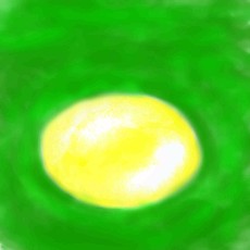
DejasView
(Mar 2, 2004)
My very first. Just trying to figure out all the tools. Looks like this will be fun but, I'll need to take some time to figure out how all this works.
DeadlyBlondeArcher (Mar 3, 2004)
But if the ovals weren't there it wouldn't have reminded me of the spiraley mosquitoe thingy at the drive in, and... I figured it had to be someone else in the Mod Squad that deleted it. On the time thing, though, I really think drawings should be judged first on artistic merit, and then if it totally sucks, look at the time spent, see if more time could have made it better, and then decide whether or not to delete it. I'm sure you already do that most of the time, but I have seen some real junk in here that is just annoying to even scroll past, and this one is interesting. Tea, anyone? :)
marcello (Mar 3, 2004)
On the time thing, though, I really think drawings should be judged first on artistic merit, and then if it totally sucks, look at the time spent, see if more time could have made it better, and then decide whether or not to delete it.That's how it is now, look at the rules.
method3 (Mar 3, 2004)
8 minutes, and then 4 minutes. Someone was just messing around with the different tools and stuff. The only real tangible thing is the mushroom, the rest looks like randomly places ovals (are they there for a reason? if so, what's the reason?). What about the colors? Are they chosen for a reason? I think it's deletable material, but I don't know if I would bother actually deleting it (I didn't). The thing that really bothers me is the neon green squigly lines along the bottom which doesn't help the piece at all.The rules: This doesn't mean you can't post 5 or 10 minute sketches, but they have to be good 5 or 10 minute sketches, and they should be mixed with pictures you put more time into. Although there is something to be learned from quick sketches in traditional art, we strongly discourage submitting these sketches.I don't think it's that great for a quick sketch even for beginner stuff. As for whether drawings should be judged on artistic merit, I think there's still an acceptable "bottom line" as to what is just spam.
jayceepearl (Aug 20, 2004)
I thought the green squiggly lines at the bottom were grass. The ovals (in my eye) were a clay pot & lid to gather the mushrooms. But then, Dejas my sister so I know how she thinks. :) Or maybe not. |

| ||||||||||||||||||||||
|
GodXofXIce
(Mar 2, 2004)
My first computer drawing...ever....it took alot longer,i just didnt know refresh reset the timer ^^;
Deformed (Mar 2, 2004)
An egg? Boooooooorringggggg!!
GodXofXIce (Mar 2, 2004)
First drawing...me was just figuring out how the programs work and stuff ;-;
Knockoff (Mar 2, 2004)
Hmm, that wasn't that nice to say.I think you did a good job for someone new. I like how you did shding and all. Nice job, and welcome.
Deformed (Mar 6, 2004)
I know but I don't like pics that are boring...... |
| ||||||||||||||||||||||
|
PurpleLlamasRcoming
(Mar 1, 2004)
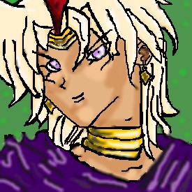
its marik ishtar the BEST yugioh character of them all! he will conquer kaiba one day.....JUST U WAIT AND SEE!! mwahahahahaha! ok....wooo. hope you like!
cursive (edited Mar 2, 2004)
thats looks good, woo marik is my hero <3
PurpleLlamasRcoming (Mar 3, 2004)
yayers!cursive, ditto! i luv u marik!
Typo_Maan (Jun 30, 2004)
marik is eevil!! why dont u unndestand that!!!oh and i still cant draw the board is just graay and the computer says it "done" do u thinnk i could delette this account and make a neww one!!? maybe thall wor send me a memo on 2draaw NOT TO MY EMAIL!!!!!! remeber that acttually forget tthat idea i ll try and get u over sometiime and discuuss then we will
PurpleLlamasRcoming (Jul 3, 2004)
well, Typo_Maan, if u want an explanation, i shall give ya one. the fact that marik is evil is not his fault. in the anime, the first child of marik's parents was odion, but they adopted him, and in their family they guard a phaorohs tomb forever and they can't go up into the real world. so odion wanted to do it, but then they had marik. but marik didn't want to do it, and he had to. so when the did the tombkeepers initiation, an "evil" awoke in marik's subconsciousness and that evil spirit took over mariks body for a minute and banished his father to the shadow realm. he had no control over it. so then he went into the real world to search for the phaoroh for revenge, which just happens to be Yami Yugi. So thats how that got started. so u see, its not mariks fault. :D |
| ||||||||||||||||||||||
|
Deformed
(Mar 2, 2004)
.m,.l.gv
Deformed (Mar 2, 2004)
Thanks pinku. .
Maiko (Mar 25, 2004)
uhm...it's actually Jaganshi... >__> the eye's name i mean..but nice pic i guess ^^; it's a bit DBZ styled...oh and.. KURAMA FOREVER!!
Deformed (Mar 30, 2004)
Yeah.... I know. I like kurama too but... *Throws hot water in wasil's face and runs away* HEEHEHEHEHEEE!!!!! |

| ||||||||||||||||||||||
|
SaheraNights
(Mar 2, 2004)
This is just practice..for fun
SaheraNights (Mar 2, 2004)
glad ya like it! ^.^ You know Rikku I was just practicing and i was sleepy then..so yeah it was sloppy % -confuzzled- But thanks for the advice
cursive (Mar 3, 2004)
i like it ,really nice shape of the face & hair , but i think it would have looked good with the blue bg :D but thats just me
Deformed (Mar 3, 2004)
Sorry. I was just triing to help you.
SaheraNights (Mar 3, 2004)
I know Rikku and I appreciate it alot! ^.^ thanxies! glad you like it Dragonclaw and Cursive! |
| ||||||||||||||||||||||
|
morbidboblover
(Feb 29, 2004)
Don't you hate it when your kicked off when your almost done? IDEA BOX! an honest pyromaniac.
Gigandas (Feb 29, 2004)
Nice colors used here^^.It has a Native American feel to it.I like the smoothness too.
ToraNeko (Feb 29, 2004)
Agreed! the outfit is so cool, I love how it kinda has a sctechy blend to it Very nice
morbidboblover (Mar 2, 2004)
Yeah ran out of space again! :(
Childlike_Vampire (Mar 20, 2004)
This is really pretty, I like it alot. Especially the colors and the smudgey lineart, for some reason. ^^ |

| ||||||||||||||||||||||
|
DMV
(Mar 2, 2004)
excuse the drawing ,just trying to get back into color:)
davincipoppalag (Mar 2, 2004)
lol like it.. great face..nice colors and a cool bg..
drworm (Mar 2, 2004)
I dig the whole design... from the horns to the teeth to the sharp, little nails. I like the way half the face is in shadow too... |

| ||||||||||||||||||||||
|
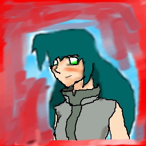
lilypad
(Mar 2, 2004)
just another pic of...
Childlike_Vampire (edited Mar 2, 2004)
She doesn't have purple hair, but other than that it pretty much looks like ya BZ. Especially the book, lol. Oh and I think you have more fingers than that lmao.
lilypad (Mar 3, 2004)
eh. ur right/. i'm a normal human with 5 fingers. and if you look at the eye a bit more, you can see the blue.um....could a mod, ANY mod, please change this to unfinished hidden? (for now???)
wow! i really like how this turned out and i'm really glad that i spent the time to re-do it. well, it's pretty cool, you have to admit. oh, and i tried to make the orange on the book look gold by using dodge. i don't know if it worked that well, but it still looks nice!
|

| ||||||||||||||||||||||
| |||||||||||||||||||||||
| 2draw.net © 2002-2025 2draw.net team/Cellosoft - copyright details - 6.81sec (sql: 37q/6.75sec) |