| |||||||||||||||||||||||
|
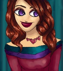
Another faerie
Mafuyu
(Nov 2, 2003)
Another faerie. Comments would be much appriciated.
taori (Nov 3, 2003)
Hmm...well, youv'e got a couple basic issues going on here, but nothing a little practice won't fix. The hair looks good, but for starters, check out that face shape. See that lump? Bye-bye, lump. Also, the lips and the nose seem a little misplaced- they don't slant with the rest of the face. Pretty good perspective on that one arm, the other seems a little... bone-less, though. That'll improve over time. Her body's a tad bit funkeh, too-- the hips are too big or the chest is too narrow, one or the other, but they're disproportionate to each other. Good efforts with shading on her legs, neck, and chest. All in all, with some more shading and practice on anatomy, you'll get good soon! Nice job. |

| ||||||||||||||||||||||
|
juliamandapanda
(Oct 30, 2003)
ta-dah
strangeoid (Oct 30, 2003)
Yesh, boodiefull hair!jagged lines
!! yep/
Harmanye (edited Nov 2, 2003)
I love your style. I know you pretty much draw the same thing, but it doesn't annoy me so much as it might. I love the colours in this one too, very rich and warm. And she must be a fortune to Pantene ProV ^_^. And hey! Lineart. Veerry cool. Keep it up. How 'bout some 300X300 pictures; I bet you could come up with some amazing dresses. |
| ||||||||||||||||||||||
|
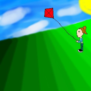
khotz
(Nov 2, 2003)
I still need to color her, add a kite, and a lot...
Harmanye (edited Nov 2, 2003)
A suggestion. It is better to finish your unfinished piece (and in the future, perhaps; pieces) before starting new ones. Other than that, the shading on the hill is too dark from shade to shade, let the colours sort of leak into eachother; I don't mean blur it more, I'm not fond of the blur too, I mean to pick at least one colour to go in between the colours you have (try selecting a colour where the shades merge). Her head is too big as well, perhaps you wanted to have it big for more detail, but it would be more aesthetic if she were proportionate (And remember to darken up the lineart, it will be easier to colour that way). The clouds are very nice though, I often have trouble doing clouds, one bit of advice about them though; I don't think that they should slope with the hill, but that's the only thing odd I can find about them. Just trying to be helpful, so you can't complain that no one tells you how to be better ~_^. (P.S. Giving the girl a bit of a shadow would be cool too.) *Shrugs* Anyway, I'm not trying to be harsh, I know your unfinished, but I always think that if one starts out with a strange picture, they'll end up with a bad one. Just trying to prevent that, but do your own thing. OH and be sure to finish your picture with your next edit, because you're close to the KB limit.
ebilkitti (Nov 2, 2003)
I agree with Harmanye on many things except I think you need some source of light, or rays of light to give it a better touch, but it's your piece so... go with itWell... finished, I guess.. I like the sky, but the grass and girl look a bit... bleh...
|
| ||||||||||||||||||||||
|
jord
(Oct 30, 2003)
you have to hear 'haa...haaaa...haaaaashmoghglkshhh' with it |

| ||||||||||||||||||||||
|
Mafuyu
(Nov 2, 2003)
Heh. |
| ||||||||||||||||||||||
|
ky
(Nov 2, 2003)
temp:_null \finish
Marienkind (edited Nov 2, 2003)
whee, it's done! great detailing on the clothes... you're so elusive, ky.edit: a fan. i used to go by another name. i'm very sorry for being so clingy. Read your memos.
|

| ||||||||||||||||||||||
|
Ameraq
(Oct 30, 2003)
finish later, gots to go see ixy-boy. (horse)
Lark (Oct 30, 2003)
yep. it's very blue. that makes him even more sad looking... but it's very pretty!and thus, the finished product.
Shuichi-chan (Nov 2, 2003)
WOW!!! O_O *falls off her chair* So......BLUE!!!! I like it!
Nyuusen (Nov 2, 2003)
It's very pretty, I like it, ^_^ |

| ||||||||||||||||||||||
|
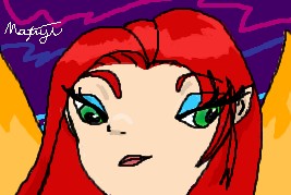
rydicanubis
(Nov 2, 2003)
i dunno, i've had this whole thing with angry eyes lately... |

| ||||||||||||||||||||||
|
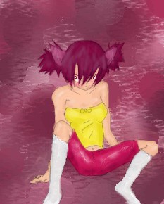
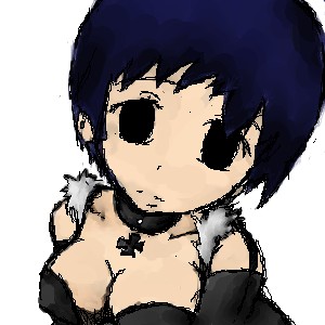
Ace
(Oct 27, 2003)
Sorry for the bg, I had none in my head when I started drawing... just a practice.
Nanibunny (edited Nov 2, 2003)
This is nifty. heh the bg looks like carpet or something. hmmm O.o something about her lower body is out of proportion though. . like she has no butt or something. . . |
| ||||||||||||||||||||||
|
Aoi
(Oct 27, 2003)
i did this for a friend
Nanibunny (edited Nov 2, 2003)
thats awesome! It could use some more shading and a bg though ^.^ . Love the expression. |
| ||||||||||||||||||||||
| |||||||||||||||||||||||
| 2draw.net © 2002-2025 2draw.net team/Cellosoft - copyright details - 4.35sec (sql: 39q/4.32sec) |