| |||||||||||||||||||||||
|
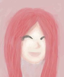
Ariel
ittykitty
(Jul 10, 2007)
Doodle of my favorite Disney Character!
Kyie_Isabug (Jul 11, 2007)
nice work. |
| ||||||||||||||||||||||
|
frinny
(Jul 10, 2007)
:(
Morggey (Jul 11, 2007)
Whoa... That's trippy. How'd you do it? Especially the Celtic-knot-like shape in the hair, that's really cool... |
| ||||||||||||||||||||||
|
ChronoKairos
(Jul 9, 2007)
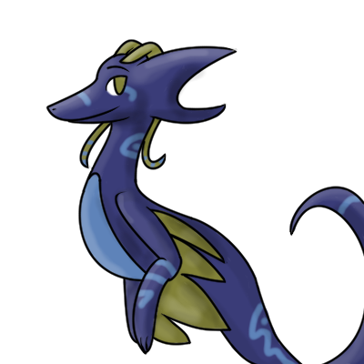
My Character, Astelion
Kchan (Jul 9, 2007)
Nice lines and shading. Nice character design too. :3
enjoydotcom (Jul 11, 2007)
Adorable, nice and clean lines and coloring, I just wish you had anything other than a white background. It might just be me, but even off-white - ish would make it look even more cool. |
| ||||||||||||||||||||||
|
ittykitty
(Jul 11, 2007)
...! |
| ||||||||||||||||||||||
|
leeds
(Jul 11, 2007)
no reference used. |
| ||||||||||||||||||||||
|
Kloxboy
(Jul 10, 2007)
n/a
DeadlyBlondeArcher (edited Jul 11, 2007)
I still have this undeniable desire to see you do a very in-depth landscape. Could you? Would you do it for me?
Dr.Moony (Jul 10, 2007)
Has a lot of tension. good stuff :)I always imagine these paintings as a part of something much larger. Like a texture. I enjoy that focus. |

| ||||||||||||||||||||||
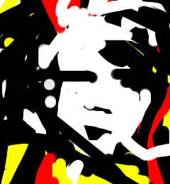
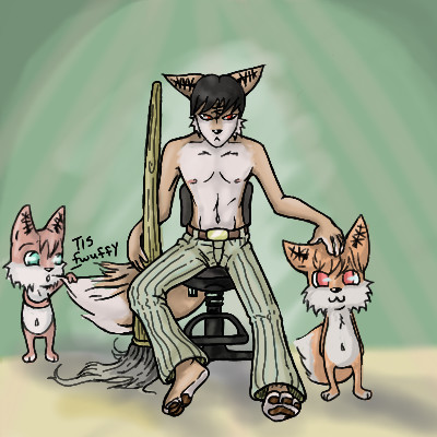
|
psychofox0
(Jul 8, 2007)
I drew..... I tried and tried to make a back ground. -falls over- computer screen.... window.... a dungeon... nothing worked out. >.<.. so, in my frustration.. I made a generic green bg thing. >.<
deathking (Jul 8, 2007)
Aw theyre adorable, I really wish I had pants like those.
Punky (Jul 9, 2007)
Wow those little fox things are cute. :O
Sweetcell (Jul 10, 2007)
First thing in my head when I saw the broom was Disny's Fantasia and the scene with Mickey and the Wizard. But I don't think Fox would let him off so easy. :) (what's this character's name Aaron?)"Tis fwuffy." Adorable. Don't worry, bg's are hard for everyone. Just do simple ones and slowly work your way to more complex pieces. Best way (well one of them) just sketch you rooms, set some things up and do a still life. You'll learn a lot.
psychofox0 (Jul 10, 2007)
XD. hmm, a name? Aaron's generic furry #261.... lol, nah, he's just another vision of the psyfox. I haven't really got him down yet. XD. And as for those mini-psy's they all have names, the one with out a tail is named Charlie, and the one to the right is named Tsuey. ^ ^ there's a million of em'. XD. And yush I know they're adorable. Thankies for the comments. X3. I'll be drawing more of em'. XDDDD okies. I'm gonna draw my room. D:.. oh noes, is so messy. ^ ^ |
| ||||||||||||||||||||||
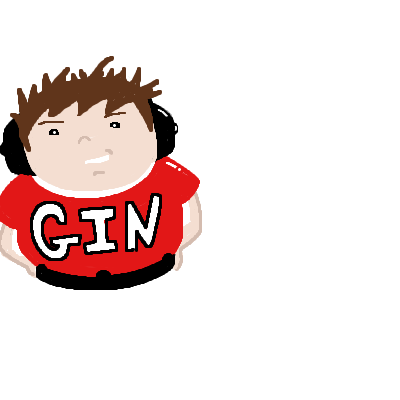
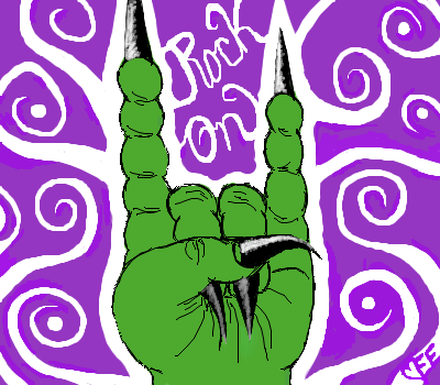
|
Old_Gin
(Jul 10, 2007)
Im tired |
| ||||||||||||||||||||||
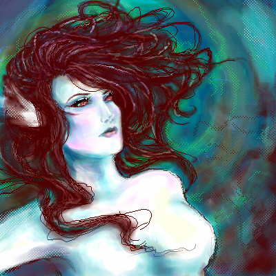
|
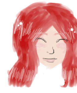
PockyGod
(Jun 17, 2007)
Getting a feel for the tablet again. This is supposed to be a mermaid of sorts, or Siren. I seem to have a thing for those :DDangerous beauty is more fun to draw, though she looks pretty harmless at the moment.
Anna (Jul 10, 2007)
i like it
Sweetcell (Jul 10, 2007)
I like the colors you put in the skin. I'm not a fan of the jagged lineart on the body, looks so much better without it as can be seen on the head, but the hair is nice and flowy.
davincipoppalag (Jul 10, 2007)
I think it's beautiful, the colors in the bg really set her off and I like the flowing hair
Miss_DJ (Jul 10, 2007)
this is coming along really nicely. love the colors used for shading, and the hair does look great. |
| ||||||||||||||||||||||
|
TripleE313
(Jul 10, 2007)
...I'm bored outta my mind today.
davincipoppalag (Jul 10, 2007)
I wish I could be bored.. I've been too busy. |
| ||||||||||||||||||||||
| |||||||||||||||||||||||
| 2draw.net © 2002-2025 2draw.net team/Cellosoft - copyright details - 4.36sec (sql: 33q/4.32sec) |