| |||||||||||||||||||||||
|
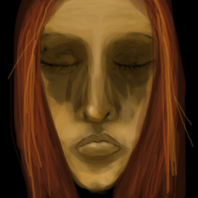
a thousand pills later
Kloxboy
(Jul 31, 2007)
junkie superstar
Wraith (Jul 31, 2007)
Wow what a trip. The Icon for this drawing looks really really detailed. Can't stare at this for too long because it's giving me sick feelings. Great drawing otherwise.
patienceisoverrated (Jul 31, 2007)
I like this lots, feels mellow and fuzzy-headed, looks goopy like an oil painting.
davincipoppalag (Jul 31, 2007)
The price of fame, sometimes. Excellent hopless expression
lori (Aug 1, 2007)
love these colors together <3 great pic |

| ||||||||||||||||||||||
|
2 comments
– latest 2:
davincipoppalag (Jul 31, 2007)
Hiya Neko!
dridridreamz (Jul 31, 2007)
the perspective is hott. not to mention the outfit! cute =] |
| ||||||||||||||||||||||
|
davincipoppalag
(Jul 31, 2007)
Felt like drawing a country scene with cows and silos and tractors and all that
davincipoppalag (Aug 1, 2007)
See ..you guys like farm pics too!! Thanks!
Sweetcell (Aug 1, 2007)
I get it now, it's an abatoir.
davincipoppalag (Aug 2, 2007)
Is that the french word for farm?
Sweetcell (Aug 2, 2007)
FARM OF DEATH! Bwahahahahaha................. |
| ||||||||||||||||||||||
|
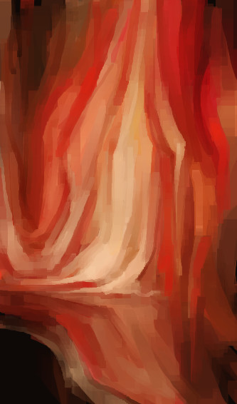
Kloxboy
(Jul 31, 2007)
soaked in warm bliss, sun rays through pine forests, unknowing, unseen, becoming the dance
davincipoppalag (Jul 31, 2007)
This actually looks like a close-up of an area from the last one..
Sweetcell (Aug 2, 2007)
Fire, burning inferno. Hot. |
| ||||||||||||||||||||||
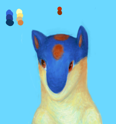
|
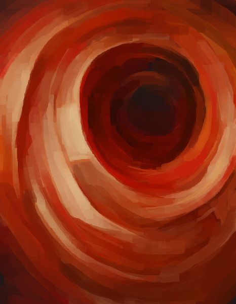
Kloxboy
(Jul 31, 2007)
big red suck
brenndurdrykkur (Jul 31, 2007)
sigmoidoscopy
Kloxboy (Jul 31, 2007)
Lol brenndurdrykkur, ya think? That would be an interesting journey....one that I'd probably pass on...so to speak. HA!
brenndurdrykkur (Aug 9, 2007)
:)
deathking (Aug 9, 2007)
I see a rose... |
| ||||||||||||||||||||||
|
Blank
(Jul 30, 2007)
Well.. lots of "firsts" with this one. First time drawing here (hello everyone :3 ), first time not using line art as a base, and also first time using Lascaux, which I put horribly, horribly to shame. :[I would like to finish this, but I have no idea where to take it that wouldn't seem ridiculously bland.
SanzoGirl (Jul 31, 2007)
Aww, hi! ^_^I love this~ Quilava is one of my favorite pokemon :] I like your style, and I look foward to seeing more of your art. ^3^
Unknown_User (Jul 31, 2007)
This is really good so far!I like the blended colors.
cmb (Jul 31, 2007)
awsome texture!
concannon (Aug 2, 2007)
I think this has lovely tone to it, actually. The white/cream is wonderfully warm, and it's a great contrast to the blue. I think that it would turn out very nicely, if you finished. |
| ||||||||||||||||||||||
|
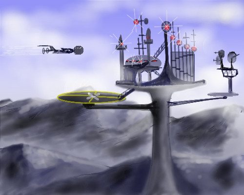
Hokori
(Jul 30, 2007)
Sorry guys. I didn't even put any of the people in their slots. :'(This is a big ol' picture of a few of my comics/stories. It has slots for each story, ya' see? But my father's kicking me off, and I can't work on it right now. I'll probably have to request more than 5 versions. @_@ |
| ||||||||||||||||||||||
|
lori
(Jul 30, 2007)
maybe I'll add more
lori (Jul 30, 2007)
nah was just doodling, been good thanks
Sweetcell (Jul 30, 2007)
So glad to hear it. Hate when my friends get sick, I worry. :)
lori (Jul 30, 2007)
thanks :) I hope you're well too.
Sweetcell (Jul 31, 2007)
Got myself an ear infection and can't see the doctor till Thursday. Add the overwhelming heat and humidity....I'm looking forward to winter. X} |
| ||||||||||||||||||||||
|
Kraisa
(Jul 30, 2007)
ok see he stopped a while ago, right before a rain storm, to admire the pretty little flower. He was never the brightest guy and sat for quite a while admiring the flower as it grew and finally wilted...by then many rains had come and gone and he had slowly rusted. Now he is stuck admiring the grandchildren and great grandchildren and great great grandchildren of the original flower as they grow from tiny seeds, live their lives then wilt away. It just so happened that this season one of the beautiful blossoms grew in the exact same place as the original giving him a particularlly good view of a little late bloomer.
enjoydotcom (May 25, 2011)
There he is!!! :)
backmagicwoman (May 25, 2011)
Aw...I am glad you found this..it's really adorable...and so soft and well done.
shults (May 25, 2011)
Yes, very nice :)
Alter.Native (May 25, 2011)
Beautiful.. |

| ||||||||||||||||||||||
|
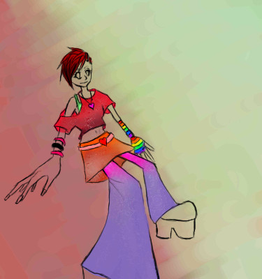
Lishan
(Jul 29, 2007)
My OC's Mon and Key. But with a bit different clothes.. ah well. Timer's majorly off, I was watching my little brothers at the same time. xDD I want to do something more with the background, but I don't know what. Any ideas? Just the bg left
Forgot Mon's star tattoo xD;;
senshi (edited Aug 1, 2007)
I like it.
Punky (Jul 30, 2007)
I like it better like this, it looked kind of bland in black and white. I love the colours you use, and the way you used the rainbow dots without it looking distracting or cluttered.I really like your art. C: |

| ||||||||||||||||||||||
| |||||||||||||||||||||||
| 2draw.net © 2002-2025 2draw.net team/Cellosoft - copyright details - 2.80sec (sql: 34q/2.76sec) |