| |||||||||||||||||||||||
|
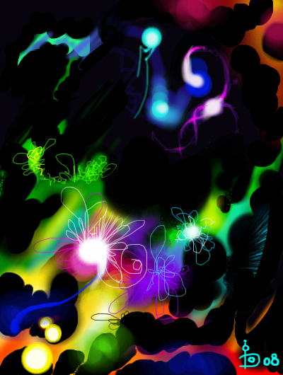
Thought Energy
DorsY69
(Feb 20, 2008)
Everyone sends energy while thinking!
davincipoppalag (Feb 20, 2008)
My thought energy only looks like this on Friday nights.. its all black and gray on weekdays
Roxana1890 (Feb 20, 2008)
beautiful,dorsy.
Miss_DJ (Feb 23, 2008)
lovely! man, can I relate to thought energy!!
klm21 (Jul 6, 2008)
wonderfully done beutifull colours!!! |
| ||||||||||||||||||||||
|
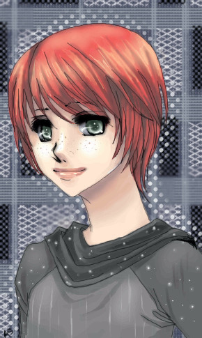
ittykitty
(Feb 19, 2008)
My most recent attemp at "Realism". Reminder: This is my 8th grade advanced art project, I am currentally in 7th grade, so I am not very good...Please let me know on what can be improved. (set unfinished so I can change what you think should be changed.)
patienceisoverrated (edited Feb 19, 2008)
My advice is to try more contrast and colours. Take a close look at skin, there are all sorts of colours in it, depending on where the light is coming from, oranges, pinks, purpley and reddy colours. Try really exaggerating these to start, and then gradually toning them down until they look natural. Also, make your shadows and highlights really stand out! This will help to give your drawing the feel of being a real object, with form and mass. Try working from a mirror or photo reference, but instead of drawing wht you expect the shapes to look like, really LOOK at it, try to understand WHY the shadows are here, highlights there. Touching an actual face can help, feel up your own face, poke around to find where the bones are, where the slopes are, what moves where when you smile or frown. If you can find a willing volunteer, feel their face as they make different expressions and watch how the shadows move. This sounds kind of awkward, but I find it's one of the most helpful things when I'm stuck with a painting. Also, it seems you've chosen really grey colours for your shadows and highlights. This makes your lady look a bit dead, I would try some more saturated colours to give her a little more life. done, I had to soften some features...
NOVEMBER93 (Feb 20, 2008)
This is pretty good :)I would have liked to see a bit more contrast in the skin tones, but I think you did a good job. |

| ||||||||||||||||||||||
|
Alethea-sama
(Jan 5, 2007)
I started the original picture here, the lightning one, years ago it seems, and I ran out of new picture space, so I decided to draw over it~ This is one of my current favorite sims, From The Sims2 game, Matt.
Alethea-sama (Feb 20, 2008)
He is a sim of mine from the PC version ~ One of thousands =v=;;;;
SanzoGirl (Feb 20, 2008)
I love your line art~And your coloring, it works very well together ^v^ I see nothing wrong with him, I don't think he looks feminine. I can't draw manly-looking guys ~x~;; I've only played the sims once, but I have to say it's an interesting game. None the less, great job ^3^~
STARZSHINE (Feb 21, 2008)
beautiful delicate work, nice use of the brush tools/texture :D
fleeting_memory (Feb 21, 2008)
Very interesting looking face-definately got a style going. Great piece. |
| ||||||||||||||||||||||
|
diinee
(Feb 19, 2008)
hmmm i was bored and wanted to try this website since its been a long time since ive drawn here...this sis only my second and i hope to get my tablet soon D: it looks messy DX its also very ill proportioned D:
clover_pocky (Feb 20, 2008)
Hi there. ^^ Welcome to the board, Diinee. This is really cute, and the coloring is off to a good start. Your lineart could really use some attention - I understand you're working with a mouse, but half an hour's work on cleaning up the sketchyness will add definition and solidity to the drawing. I love love love the eyes! They're extremely bright and uh, er, eyecatching? You're right on the proportions, even for this style - she's very strangely put together. Try adding more space and roundness to the area around her ribcage in her torso. Her hand is good, but the way her left arm is bent is pretty much impossible. Try looking at a friend do the pose you had in mind for this girl, and then see how the arm falls in relation to the rest of the body. The colouring on the hair is great in terms of value and contrast - but it could use to be a little smoother, especially with the harshness of the dark lines in the hair. Also, watch where her collarbones lie in relation to the rest of the body - you'll find if you look at yourself in a mirror (if you're a girl) - that your collarbones are going to be more straight across, rather than angled. You have them drawn as if you would draw a man's. Another further addition - shadows on white are blue, not grey, unless you're aiming to make that white part silver, and even then - still add in a little blue. You're off to a good start! Keep drawing and experimenting and welcome to 2draw! <3 |

| ||||||||||||||||||||||
|
jpjp1052
(Feb 19, 2008)
.
davincipoppalag (Feb 19, 2008)
Great painted looking still life .nice!
gel_o (Feb 21, 2008)
Very nice. Let's have some lemonade!
QTgillie (Mar 1, 2008)
Looks like fel_o is pouring....I will have some also. This is lovely.
elly (Mar 1, 2008)
Yep! Looks like an oil painting! nice perspective too! =) |

| ||||||||||||||||||||||
|
jpjp1052
(Feb 18, 2008)
.
davincipoppalag (Feb 18, 2008)
Pretty effect, like you're seeing it through one of those wavy glass windows
lori (Feb 19, 2008)
very pretty jp
gel_o (Feb 21, 2008)
Beautiful colors and beautiful work! |

| ||||||||||||||||||||||
|
zep
(Feb 18, 2008)
gimme five
Deino (Feb 19, 2008)
jejeje, genial Zep. Tienes una imaginacion muy avtica... ver un hombre en la cara que hizo Kloz :D Genial, repito.
zep (Feb 19, 2008)
thanks people, Juno is a great reference if you wanna learn how to draw hehehe.sorry Juno :)
Kloxboy (Feb 19, 2008)
I'd like to try this sometime, take someone's painting and make it into a double image. This would be a cool contest idea as well.
lori (Feb 19, 2008)
pretty awesome zep |

| ||||||||||||||||||||||
|
clover_pocky
(Jul 8, 2007)
DO NOT WANT.DO NOT WANT! ... C&C welcome, not done yet. Timer does not lie. ---- I need to delete this but it won't let me... and I can't finish it because I don't have enough space. >_< Someone please kill this. Could I get more space for this, please? :) Wow. Almost a year in the making here. Final version. Thank you for the extra space, mod! :)
Sweetcell (Feb 20, 2008)
BUMP FOR MOOOOAAAAAAAARRRRRRRRR!
STARZSHINE (Feb 24, 2008)
very cool draw interesting imagination there, it's got that mike tyson smile goin on. |

| ||||||||||||||||||||||
|
1 comment
– latest 1:
Sweetcell (Feb 17, 2008)
Um....... intermediate? Oh, you just started. |
| ||||||||||||||||||||||
|
Hokori
(Feb 17, 2008)
This is Octavia, from an untitled story in which a group of people fight to preserve the existence of dolls--beings who aren't technically alive. She is a doll, so she is a cloth form stuffed with thread, something very uncommon among the others.Alongside the scissor-wielding Auguste, the magician Chadwick, the armless Ebenezer, and two pairs of siamese twins (who are rather skilled in the art of kicking your ass), Octavia must figure out why she is constantly attacked, and why she is so unique... even if the truth is disturbing.
davincipoppalag (Feb 17, 2008)
This is a pretty and free-flowing drawing. Nice work
Sweetcell (Feb 17, 2008)
I love your stylish works. I remember when you first came your pieces were sketchy, but you've come a long way baby. :)
Hokori (Feb 17, 2008)
You are both just sweeties (and one happens to have the word in their name? HA!). I should redraw my very first drawing like many people do. It would blow my mind, that's for sure. Gaaaaawd, my first drawing looked like steaming poo.
Sweetcell (Feb 17, 2008)
Hahahahahahahahaha................... steaming poos punny. |
| ||||||||||||||||||||||
| |||||||||||||||||||||||
| 2draw.net © 2002-2025 2draw.net team/Cellosoft - copyright details - 2.75sec (sql: 35q/2.69sec) |