| |||||||||||||||||||||||
|
Look
(Jan 24, 2004)
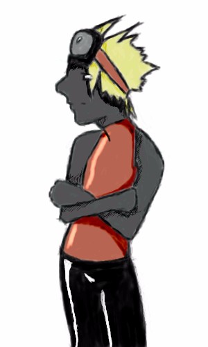
"You are MINE! Nobody can escape the blood seal!" - vampire wizardYAY! MY FIRST DRAWING HERE! I love the drawing board, it's great! I'm very happy with the color it turns out. This is probably the bloodiest drawing I've ever done. I don't know what's gotten into me. I was just going to draw an elvan assassin at first... and some how it mutated... Look closer, you may see the blood stain on his face... |

| ||||||||||||||||||||||
|
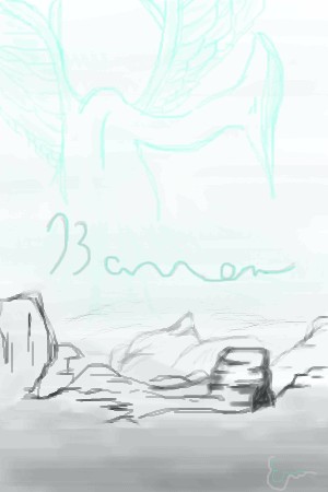
Soshell
(Jan 24, 2004)
The bird type entity creature thing's name is Barren. my last three pictures werent successful for some reason...i worked on a fan art pic for the whole day then i tried to save it and it dissapeared im so sad, it was looking good too. oh well here's this hope its enjoyable :)
DeadlyBlondeArcher (Jan 27, 2004)
I'm not sure I understand what happened to your pic, I have lost things as well (although not here). Try not to be discouraged.. keep drawing! :) |
| ||||||||||||||||||||||
|
Tamuriil
(Jan 24, 2004)
r..Yeah. XD I'm gonna touch this up a bit in Photoshop.
Look (Jan 24, 2004)
Nice! I like that tattoo like thing on his hind leg.
Tamuriil (Jan 24, 2004)
Oh,that's the Elvish translation for "Rainbow". ^_^; I dunno why I put it there.I just felt like it. :P
Soshell (Jan 24, 2004)
ohhhhh its a green punk dog! hehe peircings and tattoos :-p
Northern_shadow (Jan 27, 2004)
Maybe its an transformer (animage) :D. But still, really ns job |

| ||||||||||||||||||||||
|
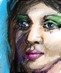
cmb
(Jan 24, 2004)
learning to adapt brush sizesI came back and looked at the original of this tonight and hated it so much I have mostly re worked it. Its meant to be a study to try and get asolid human looking face, Im almost inclined to delete it... ah well cant get it right al the time
jasmin (Mar 12, 2004)
Nice one too.
davincipoppalag (Mar 12, 2004)
the eye on the left is a bit funky but I like the "done with colored pencils" look..you should work this until you like it.. I think this is pretty good.. |
| ||||||||||||||||||||||
|
Ari
(Jan 24, 2004)
Eh, random eye-doodle that turned into something completely different...I still need to touch up the shading and highlights, but my hand's sore so I'll come back to it later. I *think* the grammar of the title is correct... It's been entirely too long since I took French. >.< "Chocolat" is masculine... I think... *can't remember* |
| ||||||||||||||||||||||
|
LightBen
(Jan 19, 2004)
Music can inspire your subject (Violin is one of the best musical instruments ! ^^).It's a girl playing violin in front of her young brother.
DeadlyBlondeArcher (edited Jan 24, 2004)
I strongly agree with Marcello's suggestions. Also, if that is a mirror on the left wall, it would be reflecting something, and doesnt even contain reflections of the wall color opposite. If it were a window, it would partially continue the other window scene.Other than that, this is wonderful composition and the subjects and colors are very well executed. It also has alot of feeling - You should consider illustrating children's books!
oversoul_trump (Feb 29, 2004)
Looks really good, I like the way you did the hands.
marcello (Feb 29, 2004)
Well, I am assuming what you think is a window on the left with the clouds is probably a painting on the wall. Kind of disappointing that he did not fix the violin, but one can only do so much, I suppose.
LightBen (Mar 3, 2004)
The "window" on the left is actually a painting ^^.And for the violin ... I think I'm not gonna touch this picture as I won't be able to draw a better violin ... I should practice drawing musical instruments on paper instead ... For my next big picture :) |

| ||||||||||||||||||||||
|
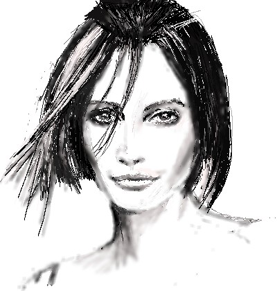
Cobra
(Jan 24, 2004)
From a photo
Ari (edited Jan 24, 2004)
Wow... This is amazingly realistic... *worships*A little more blurring to smooth some of the hard lines might be helpful, but it looks great like this, too.
cmb (Jan 24, 2004)
strong use of line here, obviously a portrait.. I like the limited palette, it adds coherence to the overall image
DeadlyBlondeArcher (Jan 25, 2004)
This is very good work - it has a lot of dimension for a black and white sketch.
davincipoppalag (Feb 24, 2004)
wonderful likeness of a very beautiful woman.. i like the "wash" effect |
| ||||||||||||||||||||||
|
yumi_natsuki
(Jan 24, 2004)
The flower tends to be in bloom to the plum tree here.
marcello (Jan 24, 2004)
Must be nice. not enough japanese on this site.. nice website.
Ari (edited Jan 24, 2004)
Wow... This looks like watercolour... *worships* And the eyes are amazing... So expressive... *worships them too*Just took a look at your website... Can't read it >.< *needs to learn to read Japanese* but your art is fantastic! ^_^ And you use a Mac! Yay! ^_^ *claps* Not nearly enough Mac users here...
marcello (Jan 24, 2004)
maybe cause we're not rich bastards. ;) |

| ||||||||||||||||||||||
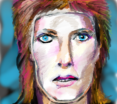
|
cmb
(Jan 24, 2004)
drawn from a black and white image- so the colours might be odd
DeadlyBlondeArcher (Jan 24, 2004)
I kinda remember the 70's.... some of it's kinda fuzzy, tho. lol Great likeness.
concannon (Jan 24, 2004)
Excuse my idiocy, I'm only 14, but I'm gonna guess David Bowie.That sexy man. And no, I don't remember the 70's. If somehow I did, I'd be rather worried for my mental state.
jord (edited Jan 24, 2004)
ow, nice.... but i really don't like this hairstyle of his..uk..(although its well-drawn) i tried to draw him too once, but i guess he wasn't recognisablegood job! and such a short time...
cmb (Jan 25, 2004)
thanks all! I think the haircut was based on or called the mullet? |
| ||||||||||||||||||||||
|
morbidboblover
(Jan 17, 2004)
:D i like it but this is just a safety save >.< |
| ||||||||||||||||||||||
| |||||||||||||||||||||||
| 2draw.net © 2002-2025 2draw.net team/Cellosoft - copyright details - 4.08sec (sql: 35q/4.04sec) |
drawn in 12 min
o