| |||||||||||||||||||||||
|
Stampede
_Neko_Sama_
(Feb 6, 2004)
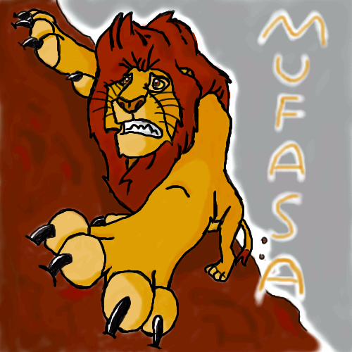
it blurred up! what happened...? well nevermind......ta...da..? Mufasa. I am very tired so it's not my best work...i do much better drawing on peper. My mouse messes up, also its my first time on this shi-painter (not including those paintchats). To tell you i think i have gotton MUCH better.
Pkingsora (Feb 6, 2004)
I remember this scene..heheh looks like it..very nice ^_^
Tuukke (Feb 6, 2004)
Nice.. great job..
DinoFlorist (Feb 6, 2004)
scar is horrible, just horrible, which is unlike this picture. This is picture is great! I would take out the letters thuogh. They aren't stylized and its a good enough likeness that we can all tell its mufasa!
jasonsgrl14 (Feb 9, 2004)
It seems so real! Love the picture, but DinoFlorist is right you should take out the letters. |
| ||||||||||||||||||||||
|
Tuukke
(Feb 5, 2004)
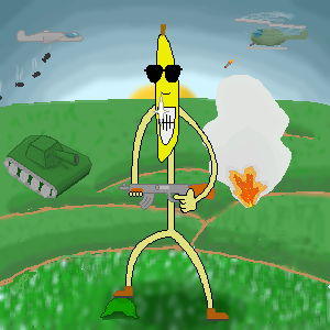
Heh.. this is my first image, just heard from this place from my friend :) this is a sort of apractice-piece, wich i drew today during my english-lessons to my englishbook (can't blame me, i was bored :P) and i decided to try to draw it here and make it very cool.. :) hopefully, some day it will be a nice picture.. :) thx for this place.it's advancing.. that helmet looks quite stupid but i'll be like that.. oooh.. now i'll rest a bit :)
one small piece at a time it advances.. :)
Oh damn.. i cant finish it!! it's too big size for the beginner board :( gotta try t omove it somewhere else or sumthin' ok, now it's really finished..
Wez (Apr 14, 2004)
this is kool nice explosion lol ^_^ |
| ||||||||||||||||||||||
|
thug
(Feb 5, 2004)
party upstairs
sal (Feb 6, 2004)
really nice pic... cool idea
Tuukke (Feb 6, 2004)
Wow... dice picture!!! really looks real! ohhhh.. wish i woul'd be that good..
tryagainpixie (Feb 6, 2004)
hm...makes me think of when i was little and i would go to other peoples houses and be joyful and happy....<3 i like this picture a lot..
davincipoppalag (Feb 24, 2004)
I like how you did this as a reflection it adds to the effect quite nicely |

| ||||||||||||||||||||||
|
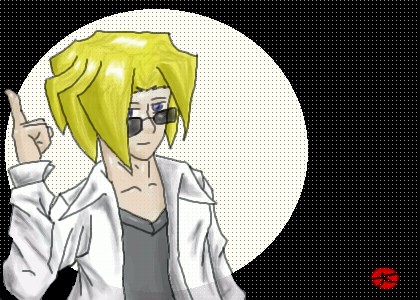
Pkingsora
(Feb 3, 2004)
Er...i cant do the ears..but! the line work turend out pretty cool..i have to get off the comp..so sadly i have to go watch cowboy bebop..tell meh whacha think so far!!
Ari (Feb 7, 2004)
Yayyy!!! Sora rules, as does the pic! 'Tis kawaii!!! *applauds*
Look (Feb 7, 2004)
very nice shading! i like his expression
SaheraNights (Mar 9, 2004)
HOLY SHIT! -passes out-
Pkingsora (Mar 10, 2004)
^__^;; i am glad you like it..*pokes you* o . o do you live~? |

| ||||||||||||||||||||||
|
Soshell
(Jan 31, 2004)
i tend to draw things bigger than i should...i had trouble getting her head small heh -_-! i think its cuz im trying to smoosh her into the small space i have...even though she is pretty small and so that shouldnt be a problem...i just cant draw small figures oh well i'll keep practicing :)ugh i dont have much time for anything anymore...
still not done...
Alicia (Feb 6, 2004)
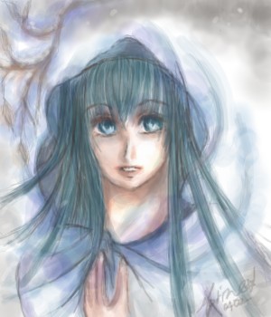
I was eyeing the outline drawing and waiting to see the outcome. Magnificent shading on tinkers dress and eyes.
RabidMalikFanGirl (Feb 9, 2004)
I love the shading on her dress ^^ Her bum is a bit odd looking but I like how the pic turned out :) |

| ||||||||||||||||||||||
|
marineblue
(Feb 5, 2004)
Veiled Lady...
Soshell (Feb 6, 2004)
looks like pastels :) its very pretty |
| ||||||||||||||||||||||
|
Alicia
(Feb 5, 2004)
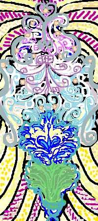
Mosaic, filigree, and Ironwork Inspirations.
Tuukke (Feb 6, 2004)
quite nice.that migt be cool if you would soften it a bit.. maybe. gj anyway |
| ||||||||||||||||||||||
|
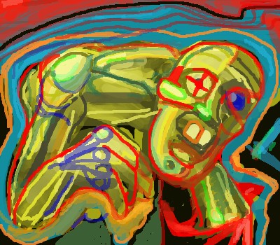
Kloxboy
(Feb 5, 2004)
playing with color and design....yep.
thug (Feb 6, 2004)
looks like your robot has a gold toof, great colors but what good is an arthritic robot(jk) 8) |
| ||||||||||||||||||||||
|
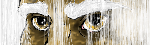
kaT
(Feb 5, 2004)
Tonight, I have no description for this, maybe just a reminder to myself that I should PAY ATTENTION in Biology class. |
| ||||||||||||||||||||||
|
Alinnia
(Feb 5, 2004)
Alinnia (Feb 6, 2004)
Thanks, D... but unfortunately every time I look at it I cringe >-.o< Probably shouldn't've made his eyebrows so bushy... or colored his eyes so weird..or s...umthin.. >-.o< But if you like it that's all fine and well and good :3 |
| ||||||||||||||||||||||
| |||||||||||||||||||||||
| 2draw.net © 2002-2026 2draw.net team/Cellosoft - copyright details - 4.77sec (sql: 40q/4.71sec) |