| |||||||||||||||||||||||
|
Zappo
(Feb 26, 2004)
somethings missing!, but what! |

| ||||||||||||||||||||||
|
Axil62
(Feb 26, 2004)
Serving tea
laurael (Feb 26, 2004)
That's awesome when you're born with that talent. You're one of the best up here.
DeadlyBlondeArcher (Feb 26, 2004)
You are so extremely versatile... I'm always amazed at the next thing you are able to do.
davincipoppalag (Feb 26, 2004)
you are amazing..every piece is great..every piece is different.. I come here several times a day just to see if there is a new Axil picture...(and I am usually not disappointed!) you even got the liquid distortion of the spoon in the glass... I stand in awe...
shell (Mar 1, 2011)
very nice |

| ||||||||||||||||||||||
|
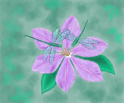
laurael
(Feb 25, 2004)
just a simple pic...
laurael (Feb 26, 2004)
Uh...I can't...limit is up. I didn't want to run out before I got the dragonflies in. But thanks anyway for lookin'.
DeadlyBlondeArcher (Feb 26, 2004)
I love this color combination. I have these colors in my bedroom. :) May I hang this above my dresser? lol It's beautiful.
starmarked (Feb 27, 2004)
oOO i know exactly what flower this is, there are some in my back yard. it looks exactly like the real thing!
Alicia (Mar 14, 2004)
I love the colors and the details put into both the dragon fly's wings.:) |
| ||||||||||||||||||||||
|
Axil62
(Feb 26, 2004)
Just wanted to sketch, if 20 min isn't enough time, I can always put the image into edit and go eat a sandwich or something.
Kloxboy (Feb 26, 2004)
Can I get a DUH DUH...hehe..really, he was just kidding Method.
staci (Feb 26, 2004)
heh..you beat me to that comment DBA. but on the subject, if i see something good it seems to make it 'better' to me if it was done in a shorter amount of time. maybe because it indicates a higher skill level? eh, just an opinion.
method3 (Feb 26, 2004)
The point was more for people here inclined to take the comment seriously... ie newbs.
shell (Mar 1, 2011)
good 18 minutes' worth |

| ||||||||||||||||||||||
|
DeadlyBlondeArcher
(Feb 25, 2004)
Inspiration from a photograph taken by a firefighter in Wyoming
Miss_DJ (Oct 31, 2005)
hot drawing Cindy!
catfreeek (Dec 10, 2006)
Vibrant colors, nice
firecracker (Sep 27, 2009)
"Wow"! This is really awesome......I don't know why I never saw it before......:)
davincipoppalag (Jul 4, 2018)
I hear the thunder |

| ||||||||||||||||||||||
|
Krystiana
(Feb 24, 2004)
Giving Lascaux another try.Chugging right along...
Arr, matey! Thank you SO much for granting me more room to finish this! This is my first REAL shot and using Lascaux, and methinks I like the program, and will definitely use it again. :)
Knockoff (Jun 5, 2004)
Wow! This is really nice, the patch is great. XDThe hair ish shinny, I like it. You did a super dooper job ;)! |

| ||||||||||||||||||||||
|
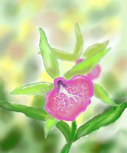
starmarked
(Feb 23, 2004)
Click here. Limelight is the last orchid on this page. Not sure if i made this look any better than the first submission, but i think i am just to the point where i change one think and then change it back to the way it originaly was. and i have not been drawing continously for 6 hours
dixielandcutie (Feb 23, 2004)
oh, im lovin it. cant wait to see it done. so pretty already
Alicia (Feb 23, 2004)
I can imagine being a little tiny ant under the canapy of your beautiful orchid. Thank you for the moment.:)
DeadlyBlondeArcher (edited Feb 26, 2004)
This is so pretty.. I want to be the ladybug. *Gobbles up Alicia* lol
Cordelia_Pink (Jul 13, 2004)
Although Pink is like my least favorite color, this is really pretty. lol Nice leaves too. |
| ||||||||||||||||||||||
|
makai-mccoy
(Feb 26, 2004)
Tails sketch...
lilypad (Feb 26, 2004)
yay 4 tails!
Kloxboy (Feb 26, 2004)
Ask Marcello for more space. I owned the original SEGA, not SEGA Genesis, the very first one back in the 80's, it rocked. Nice Work.
lilypad (Feb 29, 2004)
m' dad's got a genesis...
lilypad (Mar 1, 2004)
u really like the sonic games, dontcha? |

| ||||||||||||||||||||||
|
LightBen
(Feb 21, 2004)
I love the way I colored her hair. :)Otherwise ... There's nothing particular to say : it's just another princess. :)
LightBen (Feb 26, 2004)
Yeah, I know ... :(Let's say that I'm not really good at close-up ... :p I tried to give her a "girly face" ... I hope it's good now. :P
Now I realize that her nose and mouth are not well placed ... Damn ! I'll try to fix that later.
ToraNeko (Feb 26, 2004)
Well, as merely a segestion, maybe you shoul show more hair on the side or longer bangs. Also eyelashes would help, but I kinda like em the way they are n.n But I agree with Marcello, the person looks like eiter a young by, or a tom boy, But aside from that, I like this especialy the hair
HJ (Feb 27, 2004)
She looks very beautiful! I love the colors, & how they blend! But as ToraNeko said, to make her look more girly-ish, perhaps show some longish hair billowing around her face. I think this picture shows alot of motion, the way the bangs are placed and the sea in the back. :D |

| ||||||||||||||||||||||
|
GundamWing
(Feb 25, 2004)
messing around with layers
davincipoppalag (Feb 25, 2004)
I like how you made most of it with blues..
staci (Feb 25, 2004)
me likey. blue is my favorite color and the block shading is nice
Pkingsora (Feb 29, 2004)
my fav char from Vampire Hunter D...hes the best char ever..passionate and yet..misunderstood...this picture give him great justice..great job
Asridaein (Nov 8, 2004)
this is nice, i like how you did the shading. I kinda have a thing for blue guys. rowr. |

| ||||||||||||||||||||||
| |||||||||||||||||||||||
| 2draw.net © 2002-2026 2draw.net team/Cellosoft - copyright details - 5.70sec (sql: 36q/5.64sec) |
PS. Star of David has six points...