| |||||||||||||||||||||||
|
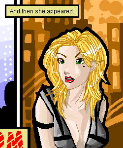
Concept Art
Porcelain
(Nov 25, 2003)
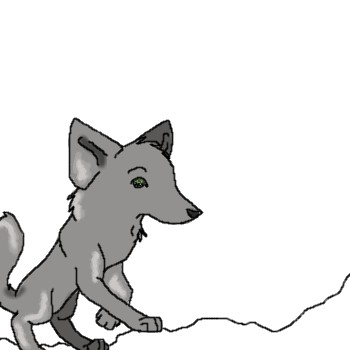
This, my friends, is B.M. (A differently-styled version of a character that is going in my new comic, "Discord"). Her real name is 'Black Mage' -- As in, her first name is "Black". But you know.. Too ghey for my taste. So BM as a nickname suits her fine. :) I'm drawing up her anime version soon, but this is the first of the concept art sketches.
mikhail (Nov 26, 2003)
looks real good, like the background...
IDontLookTooGoodInPink (Nov 26, 2003)
Ahhs hes pretty.. =D
LiLMac05 (Nov 29, 2003)
OMG...that looks like my ex-Girlfriend!?!?!?...dont believe me ill show u a picture...but dang thats GREEEEAAA ::Inhales:: AAAAAAT
tappie_chan (Nov 29, 2003)
the hair is fabulous! |
| ||||||||||||||||||||||
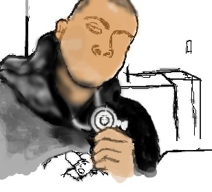
|
LiLMac05
(Nov 29, 2003)
This is a picture of me me me my gangsta self!?!?! hehehe u girlz gonna love itnah im just playin! |
| ||||||||||||||||||||||
|
kaT
(Nov 27, 2003)
A friend and I are having this battle you see, and I'm going to make it into a flash movie when we're done, but I just got a burst of inspiration all of a sudden, and, well, here we are.
RabidMalikFanGirl (Nov 28, 2003)
*is too lazy to look at link* Gunblades??? Pretty :)
mikhail (Nov 29, 2003)
you need to spend more time adjusting the positions of the bodies and the body movements before you get sucked into coloring and details... becouse it really doesnt look like theyre figthing |

| ||||||||||||||||||||||
|
kaT
(Nov 28, 2003)
I saw The Taken today, and it gave me some ideas, and there were some other ideas I wanted to check out, so I came up with this. Any comments (even if they're painfully obvious)?
The_Chosen (Nov 29, 2003)
iT LOOKS LIKE vASH FROM tRIGUN ^^
RabidMalikFanGirl (Nov 29, 2003)
Turn your cap locks off ^^I love the sand!!! It's so smooth and... Sandy.
The_Chosen (Nov 29, 2003)
Oops thnx i didn`t even notice lol |

| ||||||||||||||||||||||
|
Porcelain
(Nov 23, 2003)
Tadaa x2.
elana (Nov 26, 2003)
oh....
ZaKi_nii-san (Nov 28, 2003)
oo, nice pic dude
tappie_chan (Nov 28, 2003)
this is wonderfully graphic. this would be a great t-shirt. do you mind if i make one out of it?
Porcelain (Nov 29, 2003)
No, go right ahead! :) |
| ||||||||||||||||||||||
|
mikhail
(Nov 28, 2003)
... |
| ||||||||||||||||||||||
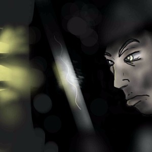
|
Charuba
(Nov 27, 2003)
I hate sending unfinished pictures... I got sick last night and I'm dying for a nap right now. But I promise to finish this when I wake up, if I'm feeling better.
tappie_chan (Nov 27, 2003)
this is very striking. the use of yellow is beautiful.
nyao (Nov 27, 2003)
That's coot! I like her pose and eyes... and the use of yellow is amazing... but maybe too much?
strangeoid (Nov 27, 2003)
Lovely shades of yellow! *stands back in awe* Very lovely, indeed.
The_Chosen (Nov 28, 2003)
this looks great ^^ I lurv the wings ^^ |

| ||||||||||||||||||||||
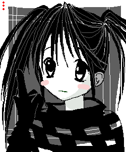
|
Krystiana
(Nov 24, 2003)
Ya.Here we go. Hood didn't work out as well as I planned... oh, well. (Side note: My computer is going very slow... O.o)
Gothic_Otaku (Nov 27, 2003)
You should draw guys more often. You're good at that. |

| ||||||||||||||||||||||
|
coffeejelly
(Sep 26, 2003)
why did i spend so much time on this? ;n;why do i always spot mistakes only after the image is submitted *bang wall*
Sixelab (Sep 27, 2003)
i think its because the hair is less detailed than the rest of the drawing, sort of looks seperate. But wow, what a nice face. She's beautiful, i love it, her eyes are very sweet.
Renmazuo (Sep 29, 2003)
U_U i can't do realism at all.........or semirealism........I realy love her expression!And her lips^W^
nyao (Oct 2, 2003)
prettie... and so real! ^^ me luv the softness of it!
Carlucci (Nov 27, 2003)
Wow. That is really good! i like her eyes and the shading. |

| ||||||||||||||||||||||
|
auroraferret
(Nov 26, 2003)
Im new to this oekaki board,so I feel I'm not to great at this point.Once my tablet arrives,I shall draw more and hopefully,better. |
| ||||||||||||||||||||||
| |||||||||||||||||||||||
| 2draw.net © 2002-2026 2draw.net team/Cellosoft - copyright details - 1.74sec (sql: 33q/1.72sec) |