| |||||||||||||||||||||||
|
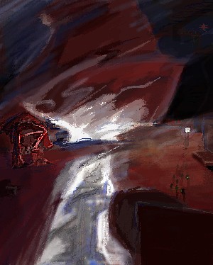
two-na
(Mar 16, 2004)
fsck the machine, fsck the machine and all it's ways |
| ||||||||||||||||||||||
|
brushes4
(Mar 14, 2004)
ah the good ol days....sigh
Northern_shadow (Mar 15, 2004)
w0w, damn nise drawing. the knife is awsome
Knockoff (Mar 15, 2004)
This is awesome, The cut in the paper(?) Is awesome.Excelent job, your best by far.
Kasha (Mar 15, 2004)
wow, I love these pictures within a picture. :)
DeadlyBlondeArcher (Mar 16, 2004)
I just really love this, the idea, the colors, everything. You did a great job on it, and the calligraphy isn't bad either. |

| ||||||||||||||||||||||
|
DMV
(Mar 16, 2004)
I did another one for my daughter.... she is so precious one of these days i will try and draw her
DMV (Mar 16, 2004)
thanks 4 the comments:) the plane I got from using the text button.
davincipoppalag (Mar 16, 2004)
theres clipart under the text button? and I dont remember skulls on carebears.. lol cute.
DeadlyBlondeArcher (Mar 16, 2004)
My son had the carebears! But... they didn't wear Mr. Poison Bibs?
Kasha (Mar 16, 2004)
lol@ plane ohhohoho. I do believe it's Grumpy Bear. I know because it's on my care bear calander. :) |

| ||||||||||||||||||||||
|
thug
(Mar 15, 2004)
based on an album cover
thug (Mar 16, 2004)
he also has sweaty armpits
DeadlyBlondeArcher (Mar 16, 2004)
But, but... we didn't get to have a party!. :(
thug (edited Mar 16, 2004)
go to the bottom of the page here //www.cenedella.com/stone/archives/000302.html for the reference. and thanks DBA for the help!
DeadlyBlondeArcher (Mar 16, 2004)
OMG! I went, still laughing, can't breathe.... to the worst album cover page... your reference.... That is some of the funniest.. Devastatin Dave the Turntable Slave? Thug, where in the world do you come up with these ideas? You are sooo funny!!!! You did a great job of reproducing their geekiness! |

| ||||||||||||||||||||||
|
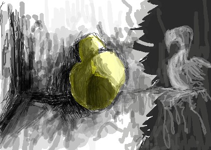
DinoFlorist
(Mar 15, 2004)
I could talk about the symbolism for days, but I won't
davincipoppalag (Mar 15, 2004)
lol Dino dont let Freud get ahold of this one lol
dixielandcutie (Mar 15, 2004)
lol dino. das perdy nifty...please do explain though...now ya got me wonderin
DeadlyBlondeArcher (Mar 16, 2004)
You better do some talkin, boy, because I need to know what this is!!!!? |
| ||||||||||||||||||||||
|
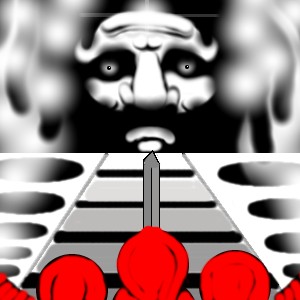
DMV
(Mar 16, 2004)
I think it speaks for itself....
thug (Mar 16, 2004)
I'm an idle worshiper, looks like a 12 cylinder flat engine block. Nice flames and smoke and interesting use of black and white with the only living, or real, beings in color.
davincipoppalag (Mar 16, 2004)
Good call thug! this is the block from a Jaguar XJ12 vandenplas and they are a race of miniature people who worship at the hood ornament! lol great pic dmv!
DMV (Mar 16, 2004)
ya know i wasn't even thinking about an engine block LOL! looks like it's over heated thanks for your comment guys:)
DeadlyBlondeArcher (edited Mar 16, 2004)
yeah, it does look like an engine block! It's got a cracked head though, for sure, with all that heat, and that guy looks like most of the mechanics I know! |
| ||||||||||||||||||||||
|
evil_cloud
(Mar 13, 2004)
Its a drawing to remember the victims of the 03-11-04, I live there in Spain, and what has happened its just a carnage.STOP IT NOW, PLEASE COMMENT FOR SUPPORT.
strangeoid (Mar 13, 2004)
I watched a thing about that on good morning america the other day. It's horrible, what some people do to each other.
evil_cloud (Mar 13, 2004)
yes, but a representant from ALQAEDA has said its the first of a lot of attempts
SaheraNights (Mar 14, 2004)
wow...Here in America, we remeber 9/11/01 ..it was sad when the twin towers fell..though it was years ago..there is still terrorism...I support ya all the way
brushes4 (edited Mar 16, 2004)
i have a friend who trembles every time it storms, she grew up in israel, my bf tells of hiding under the bed while fighter jets roared overhead as a small child in pakistan, a neighbor lost a cousin in oklahoma, a penpal of mine became ill when riacin( i think) was dropped into a crowded subway in tokyo, thanks to god i have had a safe life, always watching these tragedies on the t.v. but it always touches everyone in a way. im sorry. |

| ||||||||||||||||||||||
|
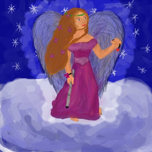
dixielandcutie
(Mar 16, 2004)
your smiles and laughter remain in my heart...miss you
DeadlyBlondeArcher (Mar 16, 2004)
Very, very beautiful, Dixie.
davincipoppalag (Mar 16, 2004)
you drawin self portraits again mizz dixie?? very pretty!
dixielandcutie (Mar 16, 2004)
no siree. but thanks. |
| ||||||||||||||||||||||
|
ToraNeko
(Feb 27, 2004)
.
Childlike_Vampire (Feb 29, 2004)
Fuckin sweet piccy, I like her boobs, and the shading on the pants. Nice texture too. ^__^
PinkuEspeon (Mar 2, 2004)
*is sad* I'm telling you! Even though I use a mouse and all... I'll NEVER, I'll say it again... NEVER, EVER, EVER be as good as you!! XD You're such a great artist!! Wow! I love the results of this!
Noremac (Mar 5, 2004)
ill set her free with my key of eternity making her mine so she can walk the world at my side until the end of time
15grifficorntears (Mar 16, 2004)
cam is being poetic again!!!!!!why does the chain connect to her chest? just want to know. i like it very much. |

| ||||||||||||||||||||||
|
Kazukie
(Oct 9, 2003)
I didn't have a good night.. I don't like the compression. =X
strangeoid (Oct 10, 2003)
Honestly, Hakkai, you thought the exact same thing as me XP
Nanibunny (Oct 10, 2003)
i like the red outline around her ^.^ . . .it gives the picture an eerie feel
supermonkey (Oct 11, 2003)
Woo, the hair is so shiny, and I like the textures in the clothes =D
Methrinn (Mar 16, 2004)
Wow. It's really awesome and completely incredible.... I'm not very good at CG stuff... :( I need a tablet... -_-' Do you guys think they are useful(er)? |

| ||||||||||||||||||||||
| |||||||||||||||||||||||
| 2draw.net © 2002-2026 2draw.net team/Cellosoft - copyright details - 5.64sec (sql: 34q/5.57sec) |
drawn in 47 min