| |||||||||||||||||||||||
|
.
Axil62
(Sep 18, 2005)
.
ambermac (Sep 25, 2005)
damn why didn't i think of this outfit for my wedding. would've saved a bundle. oh, hello from a chic--not nikked though. good luck with your real life world, dan! see you back in a bleep or two.
goldie (Oct 2, 2005)
she looks naughty , i feel like she looks. lol. very good work
marcello (Oct 2, 2005)
she looks quite creepy, to be honest. the face, anyway.
jayceepearl (Oct 8, 2005)
Maybe more along the lines of Mary Magdelene, "The Davinci Code", you know... |

| ||||||||||||||||||||||
|
Axil62
(Sep 21, 2005)
.
brenndurdrykkur (Sep 22, 2005)
well done! i really like the colors in this.. they are very serene
dietsoda (Sep 24, 2005)
holy crap. This picture is soo cool.
Zack (Sep 24, 2005)
I especially like that edge on the right that has bits chipped out of it, by the way.
jayceepearl (Oct 8, 2005)
I want to live there. |

| ||||||||||||||||||||||
|
kristine
(Oct 7, 2005)
Im a drawing machine, maaan. actually this is really ugly i dont know what im going to do with this. =(ewwwwwwwwww
I didnt feel like doing anything else to it, so i just added the blue crap lol
emmamommalag (Oct 8, 2005)
I like the way the blue fades in and out of it.
SneakyWalter (Oct 8, 2005)
This is quite good, you should change the title. |
| ||||||||||||||||||||||
|
Kloxboy
(Jul 12, 2005)
Paris with her hamburger.
ambermac (Oct 8, 2005)
linda trippe of lowensky fame?
DeadlyBlondeArcher (edited Oct 8, 2005)
Multifaceted... not to a fault.... but back to default. This is great.You could maybe use the hamburger... combine "A Night in Paris" with "9 1/2 weeks" the burger, the fridge, Paris, yeah. Could have something there. LMAO
kristine (Oct 8, 2005)
paris hilton looks like a man
IkariIreuL (Oct 8, 2005)
It´s more for that other girl than for paris hilton. ;) |

| ||||||||||||||||||||||
|
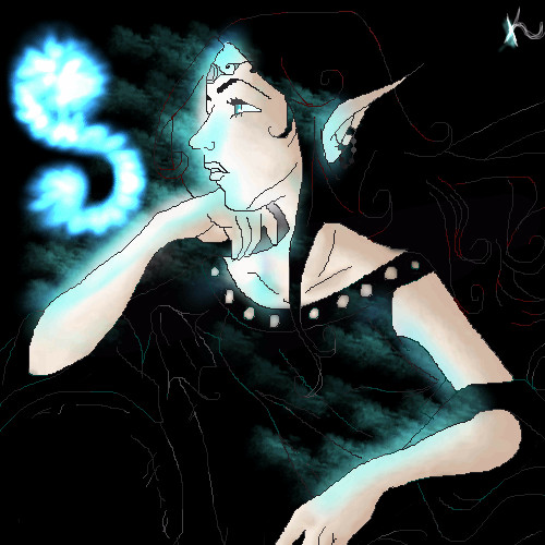
DivineStar
(Sep 12, 2005)
Again, another wet series XD (sounds pervy saying it like that...>___>;;;)Sparda from Devil May Cry, copyright of Capcom.
Etheon (Sep 15, 2005)
It's simply amazing. i watch you on DA, and then i saw this and... things happened. it's amazing how you basically did each hair. i love Devil May Cry :-)
Maiko (Sep 15, 2005)
wow X3 it's so pretty~~so this is where you did this picture! I haven't seen you around lately T_T I miss talking to my neechama~ <3
DivineStar (Sep 30, 2005)
SanzoGirl, you're about to get what you wish for XD LOL! I'll try draw Dante and Vergil later, it seems unfair that the daddy always gets the spotlight >X3 But hey, Dante hogs the game.....uhh...whatever. Thank you, guys and gals! And those from DA....hahaha....thanks a lot for coming here! ^___^ Mai-chan~!!! <3 We collab sometime, ne? Ne? >;3 I'm glad you all like this picture. Quite frankly, this is my most fav pic so far. I wuv Sparda's expression. Angst! Woooo.......*drools*
SanzoGirl (Oct 8, 2005)
Thank you for drawing Dante for me! ^_^ <3 |

| ||||||||||||||||||||||
|
kristine
(Sep 26, 2005)
I had to do this with my mouse...my dang brand new tablet is already actin up... i gotta take it back...so all my drawings for a couple of days will look like pooooooooop. what do you all think? could this possible be advanced quality?.......NAAAAAAAAA! no way.
hideyourface (Sep 27, 2005)
well it depends what you're drawing with a mouse. If it's just lines like in this picture a tablet would probably be better, but with Aubrey's car and a ton of other very detailed pictures, theres not many long precise strokes required. Anyway, this picture is really nice and simple, but I think her head is too far to the right if you think about where her neck would be compared to her shoulder
darkshadow (Sep 27, 2005)
i keep comming back to this i ;ike it a lot and dont know why i mean i can normaly tell you what i like and what i dont amd i dont have eather one for ya good picture
kiketsu (Sep 27, 2005)
OMFG!!!!! YOU DID THAT WITH YOUR MOUSE?!!!? I'M ALMOST AFRAID TO SEE WHAT YOUR DRAWINGS WITH A TABLET LOOKS LIKE! you're so wonderful....
DieChan (Oct 7, 2005)
This is a very unpoop-like drawing. :O~~~You draw so well! >< Marry me? <:D |

| ||||||||||||||||||||||
|
laurael
(Sep 30, 2005)
That's what they're calling it now.
featherstone (Oct 5, 2005)
hey, nice pic! you did a really nice job, laur
darkshadow (Oct 5, 2005)
i wan on i want one good stuff mmmmgreat pic really like the fome
emmamommalag (Oct 5, 2005)
That ice is some of the best I've seen on here. Excellent job, laurael.
HunterKiller_ (Oct 7, 2005)
Mmm... why. must. you. advertise. Coke. Mesa wants. >.< |

| ||||||||||||||||||||||
|
Tezzy
(Oct 5, 2005)
Well Booo i was enjoying drawing this but I saved it and totally ran out of room grrr ohh well.... its pretty unfinished but I sort of like it in a rough and ready kind of way.
darkshadow (Oct 5, 2005)
really liking the old photo look i agree with davin
emmamommalag (Oct 5, 2005)
Nice and spooky.. a good pic for this time of year. :)
Gigandas (Oct 5, 2005)
Ew, pork chops.
HunterKiller_ (Oct 7, 2005)
Lovely gothic picture. |

| ||||||||||||||||||||||
|
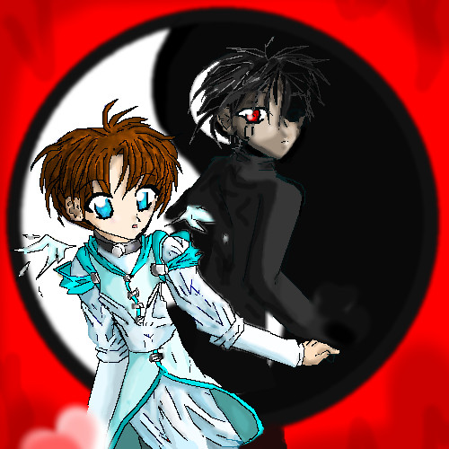
Heiros
(May 13, 2005)
not done
p3ndragon (May 14, 2005)
This is good.. Just a couple comments, if I may. :PUse the Anti-Alias button on Lascaux! It will make your lines look purdy. Or just use the Pen tool in Oekaki Shi-Painter! Also, try blending the hair colors a little bit, like blend the shines in so it doesn't look as awkward. Right. Keep it up, I'm sure you will become amazing very quickly! :P
KH44N (Aug 26, 2005)
HOLY CRAP! This is flippin amazing! The hair and eyes look awesome! Excellent work!
Hirokito (Oct 6, 2005)
Heiros, you psycho... I'm jealous now... that's a very, very good thing... for you...
kristine (Oct 7, 2005)
oh my gosh y ou actually got the female:yin and male: yange right! not many people know that...Yin: Female, submissive Yang: Male, Aggressive |
| ||||||||||||||||||||||
|
~unwritten_law_girl~
(Oct 7, 2005)
this is for my friend on Gaia |

| ||||||||||||||||||||||
| |||||||||||||||||||||||
| 2draw.net © 2002-2026 2draw.net team/Cellosoft - copyright details - 6.71sec (sql: 35q/6.63sec) |