| |||||||||||||||||||||||
|
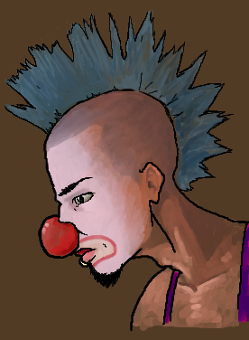
Clown
brainspiller83
(Oct 17, 2005)
For my friend
Deino (Oct 18, 2005)
So far so good! The coloring looks really nice!
Axil62 (Oct 18, 2005)
I like the brown base color. I must remember to try that.
jord (Oct 18, 2005)
I like this alot. To be honest, i feel like the black outline and the colouring don't fit together that well. I do like them both, especially the colouring. Nice work anyway!
woah_pockster (Oct 18, 2005)
sweeeeet xD he looks great xD <333 It looks a tad unfinished but eveything is awesome, none-the-less. and I agree the black outline stands out a bit tooo much BUT THAT'S OKAY. I stilll l love you x3 |
| ||||||||||||||||||||||
|
Estecca
(Oct 18, 2005)
My first time using any computer drawing program other then the simple stuff like Paint BBS or MS Paint. :O I'm pretty horrible so far and layers just boggle the poop outta me, but I want to get better. It's real fun. :) |
| ||||||||||||||||||||||
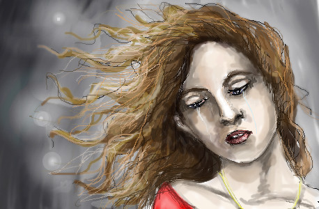
|
thesolarwinds
(Oct 16, 2005)
just how im feeling.... i like this one.. sort of...
Fobix (Oct 16, 2005)
Woah I love this.
hideyourface (edited Oct 16, 2005)
the eyelids stand out a bit to much, and the eyes aren't lined up exactly. Also theres too much shading on the nose. It looks too straight. Alsoo, the neck shouldn't curbe out like that.
thesolarwinds (Oct 16, 2005)
I personaly think she looks like a chipmunk... and thanks.. i'll try to fix those things.
Kokain (Oct 18, 2005)
Just because you're all emo doesn't mean you have to pick at art work.thesolarwinds: this creation is fawking outstanding.. Hoping to see more of your work. |
| ||||||||||||||||||||||
|
anangelmyself24
(Oct 18, 2005)
Umm just felt like doing an oek,akiu haven't drawn in a while so it's not very good but oh well >.<
xiau (Oct 18, 2005)
Oh, I haven't seen you around for a while! Glad to see more of your art!I absolutely LOVE the hair on thise one... Great job!
davincipoppalag (Oct 18, 2005)
I think this is among the better drawn of such pictures we see here. It has nice lines and good shading and coloring.
DarkCloak (Oct 18, 2005)
She's got lovely pair of eyes. ;)You should see about adding a background, it would make the pic even better than it already is! :)
hideyourface (Oct 18, 2005)
why are her boobs so huge. |

| ||||||||||||||||||||||
|
~unwritten_law_girl~
(Oct 9, 2005)
not even close to done, il finish it more tomarrow
Ferret_Boy (edited Oct 11, 2005)
avatar is correct, it is a graphical personification of a computer or a computer process, intended to make the computing or network environment a more friendly place. See? Im smart!
alia93 (Oct 11, 2005)
I like this so far it looks cutei changed my character XD she looks like this now
hideyourface (Oct 18, 2005)
I think the arm is long and the head is a little big. Proportions are hard.. |

| ||||||||||||||||||||||
|
mcop-girl-anime
(Oct 17, 2005)
dell is one off my charaters hope you like him ^.^
Fobix (Oct 18, 2005)
necks a we bit long |
| ||||||||||||||||||||||
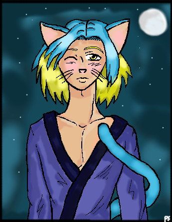
|
DieChan
(Oct 18, 2005)
Yay for the genderless faerie spirit. :D"Look Billy! A time consuming piece of artwork that still looks like crap!" "You're right, Bob! Let's point and laugh!"
darkshadow (Oct 18, 2005)
hahahahah no really ... hahahha i like this one i cant get past the hair and eyes good pic
Maiko (Oct 18, 2005)
Issopretty D: <3 <3 <3it's not crap >_<
Fobix (Oct 18, 2005)
Maiko's right this is no were near crap this PWNS! ^^ |

| ||||||||||||||||||||||
|
Borg453
(Mar 20, 2002)
Ok, so the figure is a bit odd.. but the water colour function is pretty cool, so I toyed with that for a while.
marcello (edited Mar 20, 2002)
ninja :)
Judson (edited Mar 22, 2002)
water color ?? havent found it yet?
Zack (edited Apr 9, 2002)
look, it's Edge, the ninja surgeon from Final Fantasy II/IV
darkshadow (Oct 18, 2005)
....owe |

| ||||||||||||||||||||||
|
thug
(Oct 17, 2005)
a nice Chianti with out the Fava Beans
kristine (Oct 17, 2005)
you are absolutely right darkshadow =)
davincipoppalag (Oct 17, 2005)
Wheee.. vindication hehehe
Deino (Oct 18, 2005)
Scary... D:I love that movie x)
darkshadow (edited Oct 18, 2005)
my sister loves the first 2 and hates reddragon and she is a scaredy cat who wont watch them by herself so i get to see them all the time and i like all 3 so if any one wants to get me a christmas present hehe lol still great pic its all about the eyes |

| ||||||||||||||||||||||
|
nekodesu
(Oct 17, 2005)
Woot...no ref XD and I somehow managed to make him seem a bit masculine. And horrah for my lazy ass sketchy shading. Felt like doodling but I have tons of hw left.....hw should burn in hell.
Zack (Oct 17, 2005)
That finger is tiny. The crosshatching doesn't really work for me at the moment either. Pretty nice otherwise. I like the inky feel of the darker parts of the drawing.
hideyourface (edited Oct 18, 2005)
tiny finger, straight/small nose, and small mouth. I like the eye though.edit: this actually looks somewhat like jade puget.
darkshadow (Oct 18, 2005)
ya it is small but cool pic i though it hsd more of a char cole look |

| ||||||||||||||||||||||
| |||||||||||||||||||||||
| 2draw.net © 2002-2026 2draw.net team/Cellosoft - copyright details - 1.31sec (sql: 35q/1.28sec) |