| |||||||||||||||||||||||
|
Childlike_Vampire
(Dec 2, 2005)
My co-worker at the liquor store. |

| ||||||||||||||||||||||
|
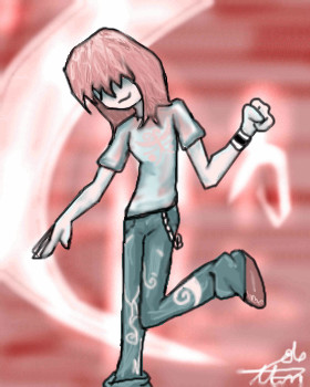
Chaotic
(Feb 18, 2006)
Well, I was listening to one of my favorite jams by Hellogoodbye...I don't think many people have heard of them, but they rock and the song below inspired this picture. The wilted flowers that I gave Were not as nice as your bouqet All the lyrics that I wrote Not as smart as the words you spoke The starlight above my hometown Aint as bright as the star ive found Every drawing that I drew Was never ever as cute as you Serious as a heart attack I'm looking in my almanac Ive gotta find out all the things And find out where she got her wings Shimmy shimmy quarter turn I feel like I will never learn How can I check lost and found When I'm too busy getting down Gotta get it back to A back up plan to find you Start acceleration Take it back to square one I swear that I'm not kidding We're just trying to fit in With all the other answers Questions never confirmed States that keep us far apart Track the beating of my heart Mark the places in my book With photographs we never took I swear that I'm not kidding The night time is so pretty With all the stars above your eyes I'm sneaking out and making ties States that keep us far apart Track the beating with a chart Mark the rythms that I shook Everytime I caught you look "Shimmy Shimmy Quarter Turn"----> Hellogoodbye
SYTHE (Feb 18, 2006)
"Shimmy Shimmy Quarter Turn", that makes me happy. Cute picture!
darkwings45 (Feb 18, 2006)
i like it alot :D |
| ||||||||||||||||||||||
|
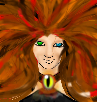
PsycArtist
(Feb 18, 2006)
Hi I'm new...(obviously) XD A random picture to get used to oekaki-ing again. ^^ Most of the time was spent on deciding how to do her hair. >>;
Sweetcell (Feb 18, 2006)
It's lovely, I was going to ask if this is Jean Grey, but I see the title now, she does remind me of her though. Though a general newbie myself (been here since the end of last year) may I say welcome, and hope to see more of you. |
| ||||||||||||||||||||||
|
Punky
(Feb 9, 2006)
I don't really like this, I just wanted it the hell out of my studio.Experimenting with colors and stuff, and I wanted to draw a gas mask. :P edit: If it's not worthy of intermediate, feel free to move it down to beginner.
Pakasutemanshikuka (Feb 18, 2006)
The colors look so good together! I absolutely love all the colors, and the coloring does not suck >:O~Awesome work, again!
sal (Feb 18, 2006)
really like this pic as well.. :x
woah_pockster (Feb 18, 2006)
you;re beautiful punky :D your hands are very skilled and your creative mind is developing wonderfully :Dyou're awesome :D <333333
HunterKiller_ (Feb 18, 2006)
Great style. Gas masks are too cool for school. |

| ||||||||||||||||||||||
|
Kira
(Feb 5, 2006)
LOL
marcello (Feb 7, 2006)
daddy long legs!
Kira (Feb 7, 2006)
Thats it... I'm deleting this. You all can go to hell e.e
thesolarwinds (Feb 14, 2006)
duh.... it was looking good, why delete. just practice is all. I like this. especialy the bed.dont overwork it, and just try another. legs are hard to make look good.. so.. c'mon!? *cookies*
Kira (Feb 18, 2006)
Thank you... I'm sorry.. I just felt like I was being attacked because of how I do things.. Nothing I do is good enough. I only made this because a friend requested it. Not so I can be hassled about imperfections and little things other's don't like about it. |
This is hidden because it is rated Extreme. Edit your privacy settings to make it visible.
| ||||||||||||||||||||||
|
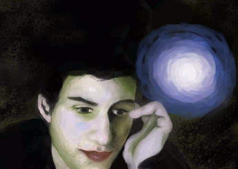
phantasmagoria
(Feb 10, 2006)
*
Punky (Feb 18, 2006)
Why doesn't this have more comments? I love the lighting and the skin tones, awesome work. His face looks great. <3
davincipoppalag (Feb 18, 2006)
I like this one too. He looks like that actor that played a chess master..I can't remember his name...
woah_pockster (Feb 18, 2006)
:0 I'm loving this coloringthe lips could use a bit more dark shades but meh, I'm just being picky :D this is great :D keep it up! <3 |
| ||||||||||||||||||||||
|
patienceisoverrated
(Feb 17, 2006)
Boogie boogie boogie... More fun with lineart. Hands= cheap cop out
Rosemary (Feb 18, 2006)
lovely :)
JoeNobody (Feb 18, 2006)
this is very pleasing to look at, the full figure and a wonderful choice of colors. She reminds me a bit of J-Lo.
Zack (Feb 18, 2006)
This is a cool picture. I like the style it's done in. Even though I usually don't like some of the colors in there, you made them work really well. The way the sash thing with the hearts on it almost matches her skintone really threw me off at first though, and had me wondering if I was looking at a bare-bellied dancing pregnant woman. Just a small change of shade or color for that should fix it.
patienceisoverrated (Feb 18, 2006)
the bare-bellied dancing pregnant woman bit made me laugh... it's like those chicks in the yogurt commercial. I hadn't noticed that. Thanks. |

| ||||||||||||||||||||||
|
jimno1001
(Feb 17, 2006)
Fell asleep DVD authoring and drawing this pic.
staci (Feb 17, 2006)
how. cool.
davincipoppalag (Feb 17, 2006)
This is really well done. I like the little tendrils of vegetation coming down the shaft.
HunterKiller_ (Feb 17, 2006)
Great concept.
Zack (Feb 18, 2006)
I really like this kind of work. |

| ||||||||||||||||||||||
|
suzie
(Feb 17, 2006)
Working from a ref, have been asked to draw her :D its my pleasure too.
Punky (Feb 18, 2006)
Nice work, I love the lighting and the hair. Lovely drawing.
Lycan (Feb 18, 2006)
Really, really good drawing!
flowerandsunshine (Feb 18, 2006)
Thanks for drawing my little Emily girl. It's great and I think its the best one you have done on here. Thanks again!!!!!!
ZeBadger (Feb 18, 2006)
Fantastic picture. I loved watching it being drawn. |

| ||||||||||||||||||||||
|
Protocom-iko
(Feb 17, 2006)
I was in the mood to draw one of the greatest anime artists on 2draw
Maiko (Feb 17, 2006)
XD;; I'm not the greatest.but thank you :3 it's quite nice so far~
SanzoGirl (Feb 18, 2006)
Haha, yes you are Mai.YOU CAN'T HIDE THE FACT THAT YOU'RE GREAT! D: Great job so far. ^_^
Protocom-iko (Feb 18, 2006)
thanks^_^almost done.
|

| ||||||||||||||||||||||
| |||||||||||||||||||||||
| 2draw.net © 2002-2026 2draw.net team/Cellosoft - copyright details - 2.70sec (sql: 34q/2.68sec) |
"who shit in your cornflakes?"
I'm not sure if you noticed, but 75% of the comments on this site are absolutely meaningless crap
Would you rather I said "OMFG, LOL, THIS IS TEH BESTEST, ROFL, KAWII, =P @_@ \m/, ,\m/"
and ditto to what kenn said.