| |||||||||||||||||||||||
|
PolythenePam
(Jul 5, 2007)
something to counteract the pain and the bordom and the urge to cough my lungs out and onto the opposite wall. |

| ||||||||||||||||||||||
|
nekodesu
(May 23, 2007)
alright....I messed up on the proportions. Especially the size of the lips. @_@I randomly found a picture of this person and I have no idea who he is. ref **edit** His name is Wori Wori (????) from Necro Circus.
davincipoppalag (May 23, 2007)
THat's a girly-lookin' dude...but ya drew him wsll neko!
DoOp (May 24, 2007)
hawt :o I unno who he is but he's hot :)
nekodesu (May 24, 2007)
Haha, yes it's a dude...what can I say, I like pretty things. :PThanks for the comments!
Sixelab (Aug 1, 2007)
this is looking cool, i really love the bold colours. some facial proportion tricks that apply to almost every human being: - the edges of a person's lips almost always extend to the middle of the eye - the space between two eyes should be about the length of one of the eyes - the outside edges of the nostril align with the inside tips of the eye |

| ||||||||||||||||||||||
|
Kloxboy
(Jul 31, 2007)
junkie superstar
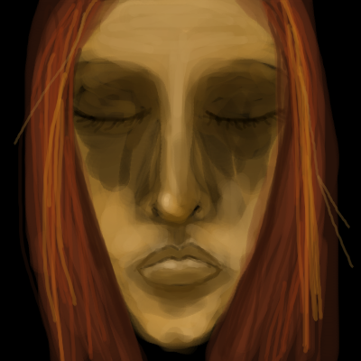
Wraith (Jul 31, 2007)
Wow what a trip. The Icon for this drawing looks really really detailed. Can't stare at this for too long because it's giving me sick feelings. Great drawing otherwise.
patienceisoverrated (Jul 31, 2007)
I like this lots, feels mellow and fuzzy-headed, looks goopy like an oil painting.
davincipoppalag (Jul 31, 2007)
The price of fame, sometimes. Excellent hopless expression
lori (Aug 1, 2007)
love these colors together <3 great pic |

| ||||||||||||||||||||||
|
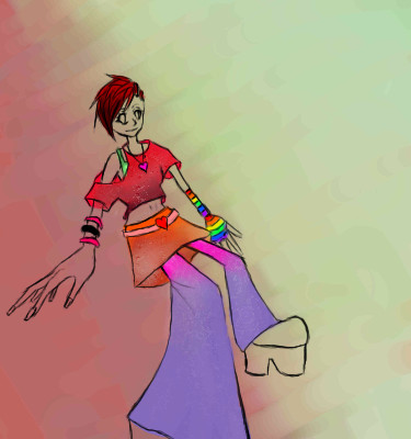
2 comments
– latest 2:
davincipoppalag (Jul 31, 2007)
Hiya Neko!
dridridreamz (Jul 31, 2007)
the perspective is hott. not to mention the outfit! cute =] |
| ||||||||||||||||||||||
|
lori
(Jul 30, 2007)
maybe I'll add more
lori (Jul 30, 2007)
nah was just doodling, been good thanks
Sweetcell (Jul 30, 2007)
So glad to hear it. Hate when my friends get sick, I worry. :)
lori (Jul 30, 2007)
thanks :) I hope you're well too.
Sweetcell (Jul 31, 2007)
Got myself an ear infection and can't see the doctor till Thursday. Add the overwhelming heat and humidity....I'm looking forward to winter. X} |
| ||||||||||||||||||||||
|
pug106
(Jan 10, 2005)
Need to take a break now, will finish later.
Anna (Jan 10, 2005)
woohoo! You're doing great! I love looking to see what you've drawn next. This one is excellent! :-D
spiritdweller (Jan 10, 2005)
nice pug... nice work
Shawna (Jan 11, 2005)
plop - plop, fizz - fizz, oh what a relief it is!!
Wraith (Jul 31, 2007)
Drooling. :O.... |
| ||||||||||||||||||||||
|
pug106
(Jan 12, 2005)
nearly done
Nyuusen (Jan 14, 2005)
It looks like a photographed postcard. ^_^
crazybrat (Jan 15, 2005)
Awsome job it looks like you bought a post card and just took a picture of it.
bakuraiscool (Jan 15, 2005)
This is wonderful. I love your art, pug106.
Wraith (Jul 31, 2007)
I can stare at this all day. Amazing. |

| ||||||||||||||||||||||
|
pug106
(Jan 25, 2005)
Got more stuff to do x
ak.to.v.his.di (Jan 26, 2005)
this is awsome....! you did a great job on this....love how the ghost appears, kinda like in a scary movie or those tales you hear about people seeing ghosts....
laurael (Feb 2, 2005)
Love the way that sky turned out and the creepy feel of this....nice!
sincity (Feb 2, 2005)
What laureal said. :}>
Wraith (Jul 31, 2007)
Wow.. Eerie indeed. Either I have Slight Schizo or Ghosts ARE REAL! I have experienced a Female ghost in an apartment complex once. The ghost was coming towards me from my closet. All I saw was a dark mist like orb. The screeming was high pitched, my whole body was trembling. I was so scared I was hiding under the covers like a little kid. Then, just like that, the ghost was gone, and I was no longer scared. As if nothing happened. During the next few months, I still felt the presence of it in the living room whenever I dozed off on the couch. It did not want me in the living room. Then, a couple of months before I moved out, my apartment complex caught fire on the third floor. They say it was a faulty heater. Could this all be my imagination?Great picture pug! |

| ||||||||||||||||||||||
|
pug106
(Jan 5, 2005)
Never tried to draw fish before, so finding it quite difficult! lol
cyclops (edited Jan 13, 2005)
awesome job on this...never drew fish before....yeah sure lol...>O)...great vibrant colors in this.:-)
davincipoppalag (Jan 13, 2005)
Great job on this. It turned out really well.
Wraith (Jul 31, 2007)
Wow this is great! These are the glowing fish I was talking about Davinci. :D Nice background. It's as if I am watching them swim in a cool looking fish tank. |

| ||||||||||||||||||||||
|
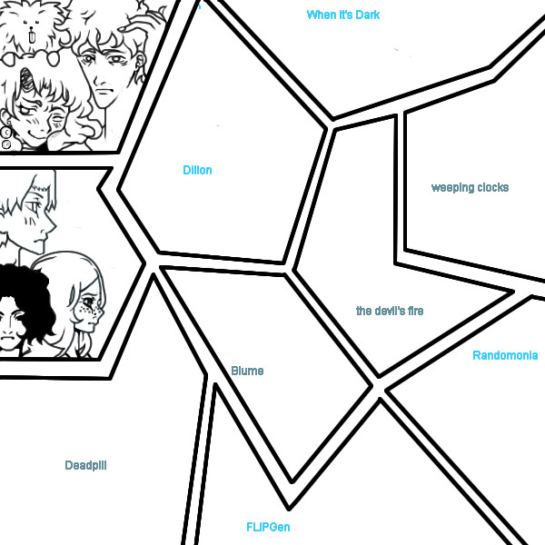
Hokori
(Jul 30, 2007)
Sorry guys. I didn't even put any of the people in their slots. :'(This is a big ol' picture of a few of my comics/stories. It has slots for each story, ya' see? But my father's kicking me off, and I can't work on it right now. I'll probably have to request more than 5 versions. @_@ |
| ||||||||||||||||||||||
| |||||||||||||||||||||||
| 2draw.net © 2002-2026 2draw.net team/Cellosoft - copyright details - 3.87sec (sql: 31q/3.78sec) |
Does the Skittlegoose lay multicolored Skittle eggs? (what would that taste like)
You have the look of colored pencils in this one Giselle, I've been wanting to try that myself. Is pweddy.