|
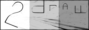
This is a design for a logo my aunt asked me for her company/job/Ireallydon'tknow. But hopefuly it will be rejected and I can use it as an ID for Deviant Art xD xD
Anyway, my aunt told me that the theme was evolution, I tried diferent designs: birds, humans, lizards... birds/humans/lizards. But, at the end I followed an old idea I had when I was little: Ammonites (and their modern descendants, the nautilius) represent for me the pass of time. Their spiral and gorgeous designs not only show age, but functionality, a design that had to envolve to reach that state. No, it's not perfect (nothing is perfect) but at least it has worked for the last 260 millions years! xD So, Nautilius = symbol of evolution. And by the way, they are extremely beautiful.
I'm sorry if what I wrote is nonsense, I'm still not confident when writing in english.
|
You need to be logged in to post a comment. If you don't have an account, sign up now! | |


drawn in 1 hour 8 min
drawn in 15 min
Again, Metal gear solid song x) Oh, I love the Bondish sound of "Snake Eater".
1.618 indeed: el numero Aureo, the golden ratio, the figonacci sequence! x) Well pointed Solve!
Thanks for the comments :)
drawn in 7 min
drawn in 8 min
drawn in 2 min
drawn in 54 sec
Thanks Dave and Opium! x)
drawn in 22 min