boardsintermediateBlue Heron <Unfinished>
watch animation - 100% - zoom in - zoom out
drawn in 7 hours 57 min with Oekaki Shi-Painter
Artist
alwaysLearning
Apprentice
alwaysLearning (Mar 10, 2004)
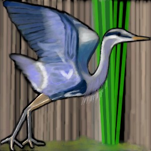
This is a blue heron, painted based on the one in this photo, which I found on the web. I started out working without an immediate visual reference, but the bird I created looked nothing like a Blue Heron, so I started over, working from the photo.

For that matter, any useful comments and suggestions will be gratefully appreciated -- not that I would say no to compliments, either... *grin*

Edit: I specifically chose the reference photo that I did, because I liked the soft, painted look of the heron in the photo itself. So, this piece will still have a soft look, just a more detailed soft look, when finished. Any suggestions on technique to achieve that look would be very welcome. :)
alwaysLearning (Mar 10, 2004)
drawn in 3 hours 27 min
I know it's imperfect, but I hope to get it looking better, with a bit more time and work, preferably when I'm more awake. *LOL*
davincipoppalag (Mar 10, 2004)
I like it so far.. but I like sharper pictures (which I am sure this will become as you work on it) I love herons and egrets...we see the snowy egrets and blue herons here all the time in the great meadows salt marsh out by our airport (connecticut)
alwaysLearning (Mar 10, 2004)
On the one hand, it will become somewhat sharper, and definitely more detailed as I revise it; now that I'm awake and can see straight, I'm sure I want to keep working on that. On the other hand, though, I specifically chose the reference photo that I did, because I liked the soft, painted look of the heron in the photo itself. So, this piece will still have a soft look, just a more detailed soft look, when finished. (I should add that to the description -- thanks for giving me the idea! *smile*)

Do you mind if I ask if you viewed the reference? I'd love to know, because it might give you a better idea what my goal is, on this piece, and thus let me know whether it's the style of the image, or my rendition of it (or both, for that matter), that is coming across as less sharp than you prefer.

I ask in particular because I've seen a number of your images, and they have a very crisp clean look to them -- but it, in turn, is a little *too* sharp, for my personal tastes, and it makes me wonder how much of this is me missing my target and how much is just a difference in personal style. *smile*

I don't want to offend, and I *do* like your work; in fact, considering that I've got a lousy memory for names, and I remembered yours and correlated it with your work, that's high praise indeed! It's just that though I can still tell that they're very nicely done works, they're not the type of thing I'd pick out for myself, if I were buying art, and therefore not the style I'm aiming for here. I hope I'm being clear here...

In any case, thank you VERY much for the comment, it gives me a better idea how this is looking to someone else (whose eyes are probably working MUCH better than mine were, by the time I stopped last night... *LOL*).

Speaking of which, I've found that after a while of working on a piece, sometimes, my eyes get too used to looking at the picture, and I stop picking up on the details as well. Does this ever happen to the rest of you folks?

Any suggestions on technique to achieve that look would be very welcome, too. :)
alwaysLearning (Mar 10, 2004)
drawn in 4 hours 30 min
Not done yet, but I think I've made progress. I'm still having trouble getting the wing feathers to look right, it's driving me batty... but the rest of it is definitely looking better. I'm expecting one more session, or so, ought to wrap this piece up. :) Before then, though, I may try a practise session doing nothing but wing feathers - so if anyone has any suggestions on how to get them to look like the reference photo, PLEASE let me know! *hopeful smile*
davincipoppalag (Mar 10, 2004)
I just looked at the ref pic... there is motion in that photo...top of the head..and the top half of the wings are blurred from the beginning of the take off by the heron...the rest is pretty sharp.....I rather like that you arent trying to reproduce the photo but have stylized it...so..why try to make feathers ...stylize them too! I tend to overwork my junk and I dont get alot of time to draw..but..i lean to marine art and landscapes..(because I have NO ability to draw animals or people..) you might try to condense your comments some..they are very long usually ...
DeadlyBlondeArcher (Mar 10, 2004)
This is very pretty... it already is taking on a soft, but detailed look, which is what I like. I looked at your reference photo and so far you are getting there. You can have alot of fun playing with the light that is happening there - you should take advantage of that. I don't know if this applet has an airbrush (I use lascaux only) but if it does, it works nicely for things you want to have a *soft* look to, and then for the details you can come back with a regular brush or antialias brush and add them. It looks like you are using a light opacity, which is good for soft. Keep layering light opacities and then add your detail and I think you'll get what you want. (btw - you have a nice grin! lol)
alwaysLearning (edited Mar 10, 2004)
Believe it or not, this *is* me trying to condense my comments. *sigh* On the other hand, there's only so much I can compress into so few words, and I don't see much point in asking for comments without giving information on what I'm looking for. I also try to give people a chance to know who they're talking to, when I join a new site.

I *am* going for something stylized, not photo-exact, so I'm not trying for exact feathers -- but at the same time I am also trying for something that's got the look and feel of that photo, since that's what made me choose it. So, the question stands, if anyone has any suggestions as to how to get that look and feel a bit more closely on the wings. Regardless, I still appreciate the comment, feedback, and suggestion.

Edit: Thanks for the suggestion, DBA! I'm still getting used to the options on the different applets, and there are some things I seem to be able to get Shi-Painter to do that I can't seem to manage on Lascaux, yet -- but there *is* an airbrush option, I'll have to give it a try, next painting session. *smile* Thanks again!
Ari (Apr 8, 2004)
Groovy heron! ^_^ I like how you drew the outline, it makes it look like an inked watercolour ^_^ *applauds*
Urei-sama (Aug 10, 2004)
oh wow, this looks lovely! gives me a calm vibe *baskes in the calm vibe* ahhhh
post comment
You need to be logged in to post a comment. If you don't have an account, sign up now!