| |||||||||||||||||||||||
| Public Boards/Beginner | |||||||||||||||||||||||
|
P-Chan
(Dec 27, 2003)
This is my first time, I draw with a mouse. |

| ||||||||||||||||||||||
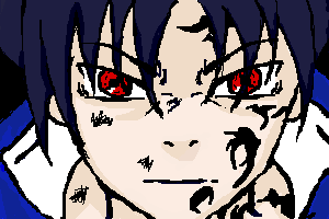
|
MalfoyBabe
(Dec 27, 2003)
Decided I wanted to try drawing Sasuke for the first time ever on the computer instead of paper. I love how it's coming along ::huggles Sasuke:: I'll finish it ASAP.
tappie_chan (Dec 27, 2003)
this looks really nice so far. it reminds me of a scene from ruroni kenshin or something. is this your own character, or is he from an anime? this style is tight, and the composition is cool. *sigh* i like this a lot! ^__^
mazi (Dec 27, 2003)
personally not fond of the uber low contrast but thats just me. other than the varied width of some of the lines, this is pretty good.Uchiha Sasuke from Naruto=Done ^_^ Very happy with the way it came out.
|
| ||||||||||||||||||||||
| Public Boards/Intermediate | |||||||||||||||||||||||
|
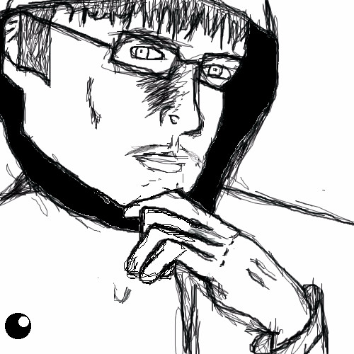
JesusFreak89
(Dec 27, 2003)
Yeah I'm pretty new to the whole "realism" thing...
mazi (Dec 27, 2003)
the hands looking really unnatural. look at your hand, and look at the size of your fingers (both width and length) in comparision to your hand.. and dont forget we have more than one finger joint and when your hands relaxed theyre all slightly bent. and wrists like to bend sometimes too.as well if one side of his head is further away, dont you think the lens of his glasses that are further away would be a bit smaller looking? Just so you don't get freaked out, that doesn't really look like me...It kinda makes me look older anyway...Any comments on how I can fix it up please tell me..
Knockoff (Dec 28, 2003)
Yes his fingers are a little too boig, but I dont think there that bad.Every thing else looks good cept I think hew has to big of a jaw bone, but mabby thats just me. Nice job so far.
NETO (Jan 4, 2004)
OMG you are commander Ikari from evangelion! |
| ||||||||||||||||||||||
| Specialty Boards/Collaborations | |||||||||||||||||||||||
|
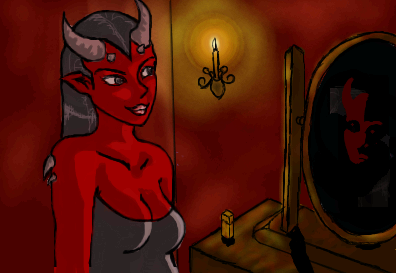
Hm not what I started out with but that's what it is now. O.O
6 comments
– latest 4:>> Yay finito. Looks damn spiffy with that last edit. Although compression truly isn't our friend...
Tylop2 (Dec 29, 2003)
Awesome! I really love the lighting around the candle, and her hair. You two are my heros!
Fin_beast (Dec 31, 2003)
w00t!*Falls down onto knees* I don't belive it! *Puddle starts forming on the floor due to waters breaking* =D
tappie_chan (Dec 31, 2003)
this has a very pretty atmosphere to it. |
| ||||||||||||||||||||||
| Public Boards/Beginner | |||||||||||||||||||||||
|
Inu-chan
(Dec 27, 2003)
In the dead of nigh exists a creature shrouded in mystery and cloaked by darkness...it has no fear. It knows no pain.
RabidMalikFanGirl (Dec 27, 2003)
I love Umbreon, but Espeons so much better! Espeon=z00tI like the colors ^^ Do a few odd shadows for the big blank bg...
Gandalf (edited Dec 27, 2003)
I like this atmosphere enigmatical
tappie_chan (Dec 27, 2003)
i love the neon-ness of this. some BG would be nice though (the composition demands it).Does it look better now?
|

| ||||||||||||||||||||||
|
Childlike_Vampire
(Dec 26, 2003)
Well...I know there are a million eye pics hanging around...but I figured since my first drawing on here was an eye, my first drawing with a tablet should be an eye as well. I think I've improved a bit since then. Eyes are also my number one doodle on the sides of paper so I thought I'd do something fairly simple for my first real go at the wonderous world of tablet drawing. lol. C&C appreciated. </too long comment>
mazi (Dec 27, 2003)
not a fan of the eye pics but this is really nice. love the dark sketchy kinda look over the shading. looks almost like a kids story from the matrix. which i think is awesome animation. =D
Gandalf (Dec 27, 2003)
Beginner Stuff?I don`t think it be
tappie_chan (Dec 27, 2003)
i love the smooth beautifulness of the coloring and the way it contrasts with the sketchyness <spelling?> of the lineart. i love the skin color and the little details (like the pink and grey in the eye). this is nice.
Fin_beast (Jan 10, 2004)
This eye is pretty cool! I like the tones around the eye. The tones differ quite alot. not to sure about the iris. |

| ||||||||||||||||||||||
| Main Forums/Drawing Discussion | |||||||||||||||||||||||
 |
JesusFreak89 (Dec 26, 2003)
It doesn't seem to let me work on my unfinished drawings for some reason, has anybody else had this problem?
10 comments
|
||||||||||||||||||||||
| Public Boards/Advanced | |||||||||||||||||||||||
|
mikhail
(Dec 23, 2003)
well im done with it but i need to have 2 hours total so i can submit it on this board, so ill try to sharpen it up later...
xvolcomx (Jan 10, 2004)
Awesome pic.....the glow of the light source is really cool. And those trees...amazingly thin lines. Awesome.
honeywhiska (Jan 11, 2004)
how did you do this??? it looks so realistic, like a photo!!
EverDream (Jan 16, 2004)
I like this...I like this alot...perhaps it's because it looks just like a watercolor painting? *shrugs* This still is beautiful work though. Great job!
DeadlyBlondeArcher (Jan 27, 2004)
This is absolutely spectacular. Such a great job in drawing focus to the little birds in the nest. |

| ||||||||||||||||||||||
| Public Boards/Intermediate | |||||||||||||||||||||||
|
10 comments
– latest 4:
The_Chosen (Dec 23, 2003)
o.O *blinks* o.O ......
mazi (Dec 23, 2003)
=D well i guess im done zappo. do whatever you want with the text. or i'll color it if you wanna chop out the white parts. and if its the way you want it, then set it to finished...p.s. i suck at ideas. and your madcool at lineart. and i rather enjoy mooching off your ideas p.p.s. i dont do the bearing children thing. wanna bear mine? =D we'll find a way.
Turtlebuster (Dec 23, 2003)
with cloning on the horizon, zappo and mazi should have no problem raising a disoriented, confused little child. good work
Zappo (Dec 24, 2003)
gah! TB is on! *Gives a Curtsy* |

| ||||||||||||||||||||||
| Public Boards/Beginner | |||||||||||||||||||||||
|
ky
(Dec 23, 2003)
Okay, I spent 20 minutes on it.Are you going to tell me it sucks because of the lack of time, or lack of skill? Because if it's lack of skill, then it's just rude and insulting. Should that not be a rule of common courtesy, if not 2Draw? Marcello, you don't need to say anything. I'm asking the members, really.
ky (edited Dec 23, 2003)
I'll squish your head.Thanks for your two cents. They mean a lot and are truthful. Marcello is mean. ;__; Marcello. Of course, good man. But I'm demonstrating. It sort of needs to be... what say you... shit? Yes.
mikhail (edited Dec 23, 2003)
these people who suck and submit lil drawings with friggin kirby or sum other afterschool cartoon on em or something shouldnt even submit their drawings in the first place, what do they expect people to say "0h s0 c00t!! ^_^~!!! i wuv kurb3y s00 mooch!!" thats non productive, its NOT art and its irritating to see... i think 80% of the drawings in the begineers board are complete CRAP! and they DO suck and frankly i dont give a fuck if its becouse of lack of skill or lack of time... (auh cry me a river)
Nyuusen (Dec 24, 2003)
Meep, I think it's great, especially the whole 'burning blood' concept.
Wolfheart (Dec 24, 2003)
I think everything is art, mikhail. The company that made your computer, they made art, just its art with a different function. mikegreen (i think thats his name) on deviantart said "art is what you make of it." Some art, well, to me, isnt that great to look at. to others it may be, but to me i like to see (some)skill. |

| ||||||||||||||||||||||
| |||||||||||||||||||||||
| 2draw.net © 2002-2026 2draw.net team/Cellosoft - copyright details - 1.89sec (sql: 44q/0.70sec) |
drawn in 29 min
drawn in 1 min