| |||||||||||||||||||||||
| Public Boards/Beginner | |||||||||||||||||||||||
|
taori
(Oct 22, 2003)
I finished something! Yay! C&C always a good thing... |
| ||||||||||||||||||||||
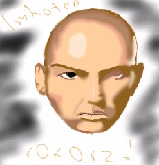
|
taori
(Oct 14, 2003)
brief realism. arnold vosloo, the cover of "the mummy returns." you know what though? the second after i hit "upload," that little black line popped up on his nose, and there's not a damn thing i can do about it. that pisses me off. |
| ||||||||||||||||||||||
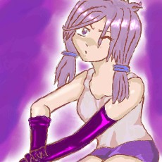
|
taori
(Oct 13, 2003)
13+ for...the skimpy bathing suit. still working on anatomy (and failing noticably), only this time i had fun with it and drew a bizarre, unsuccessful superhero. yessss. c&c always appreciated.
ShadowKitten (Oct 13, 2003)
I think its pretty good, Very nice shading. The head should be further back tho, and if she's in a bathing suit she should not be wearing a cloak.
taori (Oct 14, 2003)
Why not? I always wear cloaks when I go swimming. Don't you?
ShadowKitten (Oct 14, 2003)
I think that it would have looked better without the cloak.
ryanator (Oct 15, 2003)
really...no boobies? |

| ||||||||||||||||||||||
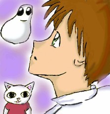
|
taori
(Oct 12, 2003)
first that dude was getting shot...then on a whim i put in a little nekojiru cat and it no longer made sense...so i added squishface...and realized that the dude looked kind of like shinji so i gave him brown hair. |
| ||||||||||||||||||||||
| Public Boards/Intermediate | |||||||||||||||||||||||
|
taori
(Oct 10, 2003)
alright, it's done, and i hate how it came out...is that called compression, that crappiness it gets after sending? cuz it looks terrible. can some dear, sweet mod move this to beginner, please? tried a different way of doing the hair, to see if it looked better. and i tried different coloring on the skirt. i don't think the shirt looks too bad...c&c always appreciated.
Porcelain (Oct 10, 2003)
The one thing I think you seriously need to work on is your coloring. AKA, blending them together. Other than that, this looks fine! You might want to read up on body poses as well (You know, for inspiration). I usually do that if I think my pictures are going stupid. =P Great picture (I love the focused/lost sort of look in her eyes. Like she's confused, but at the same time, really concentrating on something).
Fin_beast (edited Oct 10, 2003)
Yea..Miki...You get those colours blending nicely and your stuff would be RAWShe [color:purple]looks[/color] like she's peaking.... whew, almost lost it. done
digigoddess85 (edited Oct 24, 2003)
really nice, in a similiar situation |
| ||||||||||||||||||||||
|
taori
(Oct 4, 2003)
finished Try for the second time, I'm such a nerd, and was like, YES, FANART. Ameraq, you're right...I should do Xellos some time...muahahaha...sore wa himitsu desu, you know it...guide pic http://www.angelfire.com/realm/phoenixfire/images/slayers/lina1.jpg and I think that's all. Okay. Comment now, or die. }:^D>
Wolfheart (Oct 5, 2003)
Wow, this is very good, like the lighting
dothacker (Oct 5, 2003)
GREAT JOB. I could never do better. ^_^ shading and tone is really nice! ^_^ keep it up!!!
the_commenter (Oct 6, 2003)
good job, with the shading and the overall pose... (i like the eyes, :D)
Sixelab (Oct 6, 2003)
thats my moms name >.>and amazing! very anime, you're improving so much its scary! Sixela |

| ||||||||||||||||||||||
| Public Boards/Beginner | |||||||||||||||||||||||
|
taori
(Sep 30, 2003)
A doodle, playing with styles...I feel kind of cheap considering this only took 18 minutes...I might delete this from the sheer guilt.
yuhkaz (Sep 30, 2003)
I think it looks pretty good except that the chin is defined a lil too much.
Gothic_Otaku (Sep 30, 2003)
I on't ee anything wrong with the chin except those bulging black lines around it.
yuhkaz (Sep 30, 2003)
Yeah thats basically what I meant... besides the chins lines (or well I called it defining because it stands out) I think it's a good picture :-) Good work, keep it up. |

| ||||||||||||||||||||||
| Public Boards/Intermediate | |||||||||||||||||||||||
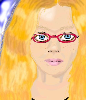
|
taori
(Sep 29, 2003)
Maw very first semi-acceptable realism...I think it came out alright. It's a self-portrait, copied off of my school picture. Keep the following in mind, please: Although that looks a bit like me, I am much, much better looking than that...my crappy drawing skills made me look kinda funny...heh..IT IS FINISHED! WAAAHAHAHA oh yeah and it's me, by the way
Knockoff (Sep 30, 2003)
YaY! Very nice, I still love thew hair. Teh lip are neat, And the eyes are really swanky, Great job taori.
the_commenter (edited Sep 30, 2003)
hmm... i dont think it looks like you... something about the face makes it look a lot different than you... i thinks its just someything about the eyes. but dont get me wrong, this is a REALLY good oekaki pic... (especially the hair, you did a really good job on the hair) ^__^
Sixelab (Sep 30, 2003)
*fears the great toari* |
| ||||||||||||||||||||||
| Public Boards/Beginner | |||||||||||||||||||||||
|
taori
(Sep 28, 2003)
This is a mreep. Would anybody like to adopt one?
SuzieSuze (Sep 28, 2003)
ohh I want one! hehe its so cute
Gothic_Otaku (Sep 28, 2003)
I'd worship it and raise it as if it were my own. =)
ShadowKitten (Sep 29, 2003)
Me wants one, *jumps up and down*
Sixelab (Sep 30, 2003)
flipping adorable |

| ||||||||||||||||||||||
|
taori
(Sep 27, 2003)
Poor thing. All she ever wanted was to be an Iron Chef...but she really just can't cook. (Someone should tell her that there has to be something in the pot before anything can boil.) Cynicisms, comments, compliments, constructive criticism...? (By the way, I normally don't sink to putting fuzzy animal ears on my characters...but once in a while we all have to do that....so...)
Marienkind (Sep 27, 2003)
fuzzy ears doesn't mean to sink low.your drawings are getting sexier. one nagging question though... who is that on the lavender box? |

| ||||||||||||||||||||||
| |||||||||||||||||||||||
| 2draw.net © 2002-2026 2draw.net team/Cellosoft - copyright details - 1.46sec (sql: 31q/0.83sec) |
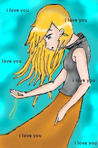
Damn Taori, this one is awesome. nice shading!