| |||||||||||||||||||||||
| Public Boards/Intermediate | |||||||||||||||||||||||
|
Kasha
(May 10, 2004)
k |

| ||||||||||||||||||||||
|
jeremy_jones
(Mar 19, 2004)
comin along pretty well so far, but im not sure wot 2 do next. any suggestions?
davincipoppalag (Mar 24, 2004)
Yes Lori! thats exactly what it made me think of...its lovely..wonderful expression in the eyes
RavioloiTheDancingClown (Mar 24, 2004)
great job. i love these.....
Knockoff (Mar 26, 2004)
Woow, This is really nice. It looks like he's looking at me *shudders*Excelnt work though.!
jeremy_jones (May 11, 2004)
Yes. I am of Afgan origin. In my bone. |

| ||||||||||||||||||||||
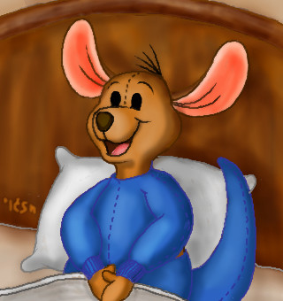
|
Ixbalam
(May 9, 2004)
Roo in his jammies. He looks too static to me. Roo is a very energetic character. I'll probably try drawing him again.
davincipoppalag (May 9, 2004)
Great character... good shading job in this..
tivatdoar (May 10, 2004)
H A P P Y
staci (May 10, 2004)
try..him and tigger bouncing on their tails holding their feets..oh piglet i loves piglet draw piglets >.<
Ixbalam (May 10, 2004)
Icats: I like that idea. I'll see what I can do with it. I love the way Tigger and Roo are together and want to do something really nice with them. I'm not a big fan of Piglet though. Maaaaybe I'll do a picture of Piglet. |
| ||||||||||||||||||||||
|
Kasha
(May 5, 2004)
lica hi mica hiney HO!
Pandora (May 6, 2004)
I really like the black birds in the back it's giving it a dark feeling. Your work in your gallery is wonderful.Nice sketchy feeling.
Kasha (May 6, 2004)
ahh thanks. I didn't know what exactly I was trying to convey...darkness? maybe. :)
tivatdoar (May 10, 2004)
awesome birds. the falling bird is awesome.nice job on the face. really emphasize the dark side.
Kasha (May 10, 2004)
thank you. :) this is my soon to be fairytale illustration style. :D |

| ||||||||||||||||||||||
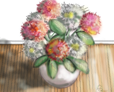
|
longway
(May 7, 2004)
fwowers.....lol
lp_phaery (May 7, 2004)
so pretty this is this is is is*
davincipoppalag (May 7, 2004)
Very nice longway. Good job on the shadows on the left.
emmamommalag (May 7, 2004)
Very pretty. Feels like a sunny spring morning.
staci (May 8, 2004)
i like the colors and contrasts...i dunno if you are using blur alot..when i first started i would blur then add line and blur and add lines and it never came out right..not that there is anything wrong with that style..but if you are going for more realistic, what helps is to play with the opacity and flow tools...they are the sliding bars under your brush selector menu..then you can create less harsh lines without bluring : ) |
| ||||||||||||||||||||||
|
safescene
(Mar 5, 2004)
woo, this one was fun :)
davincipoppalag (May 5, 2004)
Beautiful! It does kinda look like a stairway (well a handicap ramp) to Heaven! Great colors and perspective
LovelyLori (May 5, 2004)
how very pertiful.... love it... good job!
Knockoff (May 6, 2004)
Oaah! Awesome, you have some of the best lineart skillz. Plus this is lovely, and the snow brings you to how cold it is.I love the color too. Blue........ Anyways, great job safescene
emmamommalag (May 7, 2004)
It feels like we're very high up.. makes me dizzy. Great picture. |

| ||||||||||||||||||||||
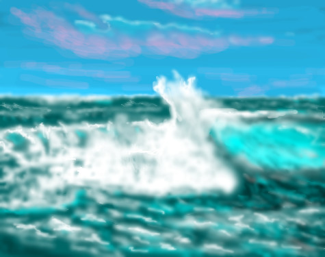
|
xwindflyer
(May 1, 2004)
I just had to revisit the sea, and let it all go! lol
xwindflyer (May 2, 2004)
lol, It does seem a little out of focus to me now too. I don't remember that it was that way when I posted it. (maybe I was just tired, and my eyes were out of focus, and it looked good to me then.) :o)
davincipoppalag (May 3, 2004)
If you're on aol xwind.. they have that preset compression thing for graphics which makes things go blurry in the interest of speed in loading. You can disable it. There is a posting here somewhere on how, I forget where.I did it..but I decided I would rather see a bit blurry than have another birthday waiting for sharp loads. I am on dialup so its already slow as molasses .
DeadlyBlondeArcher (May 6, 2004)
Maybe that's why everything needs to be sharper, Davin? lol....
emmamommalag (May 6, 2004)
Do you mean from the artist's or the viewer's standpoint? It seems to me that if it had something to do with your computer or connection, ALL the pics would look blurry. |
| ||||||||||||||||||||||
|
LovelyLori
(May 6, 2004)
uh oh... gotta blow the size up again... another disappearing pic.. why does it do that Marcello?more practice of faces..
emmamommalag (May 6, 2004)
I like this, Lori. Wonder what's causing him to have to think so hard.
LovelyLori (May 6, 2004)
he's deciding on the right healthcare option for his heart problems... lol.....
davincipoppalag (May 6, 2004)
Ohhh.. I assumed he was choosing between the chocolate glazed and the Boston Creme pie donut at Dunkin Donuts!
Aubrey (May 6, 2004)
Both very tough questions to hafta ponder.. nice picture Lori :-D |

| ||||||||||||||||||||||
|
staci
(May 3, 2004)
you cant make me
laurael (May 4, 2004)
I like this just the way it is...not overly done...beautiful work icats...another gifted arteest. You can do anything...a n y t h i n g...
emmamommalag (May 4, 2004)
Awww what an adorable little girl. You did a perfect job on this, Icats.
staci (May 4, 2004)
thanks..this is based on my wittlest sister >.< shes cute as hell but dont let that fool you! : P
pulkidamnesiac (May 5, 2004)
*runs in, and slaps teethy pink bear over this* yehahahah. Anyways stop stealing the kids icecream cone. |

| ||||||||||||||||||||||
|
evil_cloud
(Apr 25, 2004)
My name is John CrichtonAn astronaut Three years ago I got shot through a wormhole I'm in a distant part of the Universe Aboard this living ship of escaped prisoners My friends I've made enemies Powerful, dangerous Now all I want is to find a way home To warn Earth Look upward and share the wonders I've seen
strangeoid (Apr 29, 2004)
Great job! *applauds* The words are, like, perfect... did you do those freehand? Lovely partial face. The incompleteness definitely adds to the mystery of it all.
marcello (Apr 29, 2004)
My only suggestion would be to add a lot more contrast to the face. It is completely overshadowed by the text logo, and loses most of its importance that way. I think if you took some of the brightness of v10 and added it to what you have now (and I'm not saying to make the whole thing bright, just towards the center, probably), I think you may surprise yourself. Then again, you may not.
evil_cloud (Apr 29, 2004)
Well i took a decision ... THIS WONT FINISH LIKE THIS... er.... i need space
tappie_chan (May 5, 2004)
i like this. it looks like it could be the shows logo. i love the text! how did you do it?? very nice buddy! keep it up! ^____^ |

| ||||||||||||||||||||||
| |||||||||||||||||||||||
| 2draw.net © 2002-2026 2draw.net team/Cellosoft - copyright details - 3.14sec (sql: 33q/2.21sec) |
your last one was awesome as well..loved the use of dodge, totally reinterpreted the piece