| |||||||||||||||||||||||
| Public Boards/Intermediate | |||||||||||||||||||||||
|
xiau
(Sep 2, 2005)
Testing out a new style for once. I actually like it, but I have to say, Oekaki's not too good for this style of cell-shading... Oh, well. You can expect to see more of this kind of drawing from me.I drew Pandappi! Awww! Um, Chibippi was gonna be in there, he just, dissapeared o_o;; May his adorableness haunt you. |

| ||||||||||||||||||||||
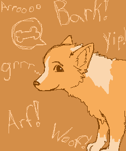
|
Boichi
(Sep 3, 2005)
This is a drawing of my dad's and step-mom's Corgi. He's the coolest dog on earth!
renire (Sep 3, 2005)
Thats adorable, and a great drawing too! I just think the background is way too simple...
SanzoGirl (edited Sep 3, 2005)
Awww, so cute!It looks kinda like a Welsh Corgi. Edit:Oh, I just realized that you said it is a Corgi. ^_^;
Caddris (Sep 9, 2005)
HeeHee! Cute! He reminds me of Ein. |
| ||||||||||||||||||||||
| Public Boards/Beginner | |||||||||||||||||||||||
|
Regina
(Sep 3, 2005)
Like? :D
renire (edited Sep 3, 2005)
Yeah..... I think its actually pretty cool... :D But maybe there should be a background? And some shading?.....This is very good for a first drawing! ^_^
Pakasutemanshikuka (Sep 3, 2005)
very good for a first drawing as renire said ;> and i agree that there should be a background. but this is very good soo.XD |

| ||||||||||||||||||||||
|
renire
(Sep 3, 2005)
Help please! :l
voodoobunny (Sep 3, 2005)
Ooh....Those spikes are cool. but I'm still waiting for the yaoi action :P
renire (edited Sep 3, 2005)
Lol, thanks. I'll search up Yaoi on google, then i'll find a good picture annd draw it. O.K?
voodoobunny (Sep 5, 2005)
Better if you don't search the word: yaoi on google.
renire (Sep 7, 2005)
Lol ^_^ |

| ||||||||||||||||||||||
| Public Boards/Intermediate | |||||||||||||||||||||||
|
Zer0
(Sep 3, 2005)
Started with nothing in mind. Layered bunk appeared. Followed by many rectangles.
p3ndragon (Sep 3, 2005)
I really like this.Looks amazing.
sincity (Sep 3, 2005)
this came out really nice. good jobbers. :}
HunterKiller_ (Sep 4, 2005)
I really love the white outline around the red. ^.^
Nightmare (Sep 4, 2005)
Came out looking really nice. I bet if you took your time and used the grey foreground buildings you could've made a interesting city scene. |

| ||||||||||||||||||||||
| Public Boards/Beginner | |||||||||||||||||||||||
|
Drummer6
(Aug 31, 2005)
It didn't take that long, I was just messing around.Finished. It's a blurry star. :P
renire (edited Aug 31, 2005)
It looks as though it's exploded out of nowhere.
KH44N (Aug 31, 2005)
I love the background so far. Very creative! Keep up the good work! ^__^
Drummer6 (Sep 2, 2005)
I just realized this said unfinished, but it was actually finished. sorry about that. |

| ||||||||||||||||||||||
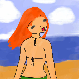
|
tapchel
(Sep 2, 2005)
It took me a bit to figure out, how to get the background done...but I figured it out, as you can see!
Sai_Wo (Sep 2, 2005)
It's nice, but heads turn that much, it looks like someone snapped her neck or something. I like her hair though.
Ty854 (Sep 2, 2005)
It's the girl from the excorcist on vacation?
Drummer6 (Sep 2, 2005)
I like her hair, is she part owl?
renire (Sep 3, 2005)
Lol! Thats what I thought Drummer6!!!! Nice drawing... <:D |
| ||||||||||||||||||||||
|
Broken_Chaos
(Sep 1, 2005)
I needed something to do. ...Top eye looks horrid. guess i need a ref or something next time.
Phil (Sep 1, 2005)
i like the bottom one :) I love to draw eyes too intresting backround nicely faded.
nekodesu (Sep 1, 2005)
I actually like the top one. :)
Broken_Chaos (Sep 1, 2005)
Thanks you two ^^
renire (Sep 3, 2005)
I think the middle one looks best. But all of them are great! Cool drawing. ^_^ |

| ||||||||||||||||||||||
|
loveydoveykissywissyprincess
(Sep 1, 2005)
i'v had people say i was and i'm not ok |

| ||||||||||||||||||||||
| Specialty Boards/Collaborations | |||||||||||||||||||||||
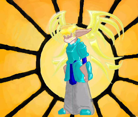
|
Bitching Background hunter
13 comments
– latest 4:
kitty25 (Nov 24, 2005)
very nice colors! and cool wings things !
Zeal (Feb 17, 2006)
Hmm I see a flaw*gasps* The leg is vanishing~ <_<
Noremac (Feb 17, 2006)
woah... i never saw that...
Zack (Feb 18, 2006)
The background itself is cool, and so is the character, but the two styles clash a bit. Cameron's work always has very low levels of contrast, so that high level of contrast in the background is a bit confusing. It makes the background design pop out more while the character's low contrast makes it recede into the background. If you squint, the wing designs and hair almost disappear, as well. If you did a layer above the background and below the character of solid dark red and set it to maybe 50% transparency, that might help fix some of the contrast issues. |
| ||||||||||||||||||||||
| |||||||||||||||||||||||
| 2draw.net © 2002-2024 2draw.net team/Cellosoft - copyright details - 0.39sec (sql: 38q/0.24sec) |
- Rina-chan
EDIT:chibippi ... lol .. mispelled itz!