| ||||||||||||||||||||
| Public Boards/Beginner | ||||||||||||||||||||
|
Stunned
Cordelia_Pink
(Dec 5, 2004)
I just love anime. That's all I can say.
bumpinthenight (Dec 7, 2004)
:((((( noo! v3 was waaay better! ohwell... really freaking neat stuff! :D XD woot...
pulmonq2 (Dec 8, 2004)
After a bit of thought (and flipping back and forth) I'm going to have to agree that version 3 was better than this gray stuff all over everything. I know what u were going for, but it just looks a bit washed out this way.
Cordelia_Pink (Dec 9, 2004)
I didn't want to put so much emphasis on the face so I put air brush on the side to make it look a bit smokey-ish. Sometimes I get tired of brightness in colors so make it looked washed or blurred.
pulmonq2 (Dec 16, 2004)
Yes I see that. I like the current one too. It's neat. |

| |||||||||||||||||||
| Public Boards/Intermediate | ||||||||||||||||||||
|
DeadlyBlondeArcher
(Dec 9, 2004)
Some beach, somewhere
ak.to.v.his.di (Dec 13, 2004)
this is amasing! i love it! the coloration, detail, etc etc.... this is so cool, i love how u have the rays of sun comming from the sky.... this is awesome! excellent work!
xwindflyer (Dec 14, 2004)
This is absolutley gorgeous! What a great scene! Just wonderfull. And I think the forground is supposed to be in dark shadow silhouette.
HunterKiller_ (Dec 14, 2004)
*falls off the chair and dies*
Aubrey (Dec 14, 2004)
That's great, funny song as well. The picture's really purdiful. |

| |||||||||||||||||||
| Public Boards/Beginner | ||||||||||||||||||||
|
Cordelia_Pink
(Dec 7, 2004)
Another Sailormoon pic... I miss Sailormoon. =) This is her with wings... sorta.
sincity (Dec 7, 2004)
Sheesh, how good did this come out. I know some people have read that I am a little sick of seeing animae work, but I still have to give shouts out to good work. Great jobbers.:}
Asridaein (Dec 8, 2004)
This is wonderful. Now I am jealous of you. Gosh darn, I guess I'll have to get to practicing more on the boards so I can get better at different techniques.
pulmonq2 (Dec 8, 2004)
looks ok. not bad.
Solvera (Dec 10, 2004)
lol looks ok? not bad? what are you talking about this is freakin awesome. great job! |

| |||||||||||||||||||
| Misc. Boards/Sprites | ||||||||||||||||||||
|
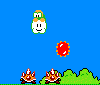
RokGolam
(Dec 6, 2004)
those things get annoying after a while
pulmonq2 (Dec 6, 2004)
lol I hates those things too. This brings back fond old memories.. ^^
Kenshin (Dec 6, 2004)
omk.. I hate those things! o_o You are so good at these.. this looks like a screen cap from the game, only no Mario.. maybe he died :D
StrawberryYamichan (Dec 8, 2004)
i love this so much |
| |||||||||||||||||||
| Public Boards/Intermediate | ||||||||||||||||||||
|
Cordelia_Pink
(Sep 24, 2004)
A place that only exists in my mind... and a world that's far away...
davincipoppalag (Sep 25, 2004)
Ya did it again CP..Nice. That sunflower face looks almost as if it could be a being in the next dimension looking into this one from a hole in the fabric..very cool!
Cordelia_Pink (Sep 25, 2004)
thanks. lol hey you know what, that sunflower face looks almost like my face though. lmao just kidding. it's a lonely sunflower actually. why? because it's different from all other sunflowers. it's tired of being considered the 'happy' flower (since it's so yellow and bright), that's why it's frowning. hehe
pulmonq2 (Nov 24, 2004)
To me, Deadly, the focal point is more the eye/boat than the sunflower, or even the tree really, being the dominant form. Christy, this is probably about my favorite that you've done. The colors, I guess. The way you mix them is unique and yes, as Iwonder said, vibrant. The strongest parts are obviously the tree trunk, and the grass and rocks around it. Rich tones and I like the way you texturize by using thin brushes and going over the same area in different colors (lights and darks). Good details there in the grass and tree trunk. The sun's face looks like the sun stones I've seen on certain structures. Good work.
Knockoff (Nov 24, 2004)
Ohh. Thats very cool. I love the tree, and all the detail. Awesome! |

| |||||||||||||||||||
| Public Boards/Beginner | ||||||||||||||||||||
|
nozomii
(Nov 19, 2004)
My heart beats for you, and the stars shining make me feel closer. Cause we under the same sky.I know it's not really good, but i did it with all my love. To you. Love you alot, Paul.
spiritdweller (Nov 21, 2004)
that's very sweet.... I think love sucks.
pulmonq2 (Nov 21, 2004)
lol spirit. It is a little rough sweetie, but it's not bad for a beginner. My favorite part is the big star on the right. It really shines. Like I say, Vera, I think you have a pretty good grasp of color, if you could just get bold and not worry so much about the outcome, I think you could make some nice colorist works. Try being more impressionistic if you want: worry less about exact and perfect forms and just make gestures with color. Also, try working less with the pattern tools.
Cordelia_Pink (Nov 22, 2004)
Oh I think it looks fine. Although maybe you should add a bit of shine on the heart but other than that it looks pretty good. And I'm not saying that to be polite or anything but it does look illustrative. lol The stars are really nice, they're shining, (especially the one on the right) and you did really make some nice light and dark areas. I like the texture too. But keep up the good work. Just put more emphasis on the heart since that's what's more focussed. |

| |||||||||||||||||||
| ||||||||||||||||||||
| 2draw.net © 2002-2025 2draw.net team/Cellosoft - copyright details - 0.74sec (sql: 23q/0.24sec) |