| ||||||||||
| Public Boards/Beginner | ||||||||||
|
Jtablet works!
pix
(Feb 8, 2004)
wow, this Jtablet plugin gives tablet user pressure sensitivity, it works
marcello (Feb 8, 2004)
Of course it works, why wouldn't it?
pix (Feb 8, 2004)
I didn't know there even was a plugin. I am sure others don't as well.
staci (Feb 8, 2004)
wow what a discovery. : S
dixielandcutie (Feb 8, 2004)
cool beans! i didnt know that... |
| |||||||||
|
HJ
(Feb 7, 2004)
Since its my birthday today, I drew a slightly-birthday-themed picture. :)
ky (Feb 7, 2004)
Well, happy birthday. Not as though I've anything much to give you.
HJ (Feb 7, 2004)
Thanks, I didn't expect anything, though. :D
DeadlyBlondeArcher (Feb 7, 2004)
Happy Birthday. :)
pix (Feb 8, 2004)
Happy Birthday HJ! |

| |||||||||
|
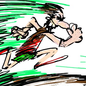
dixielandcutie
(Jan 23, 2004)
break time. line art done. almost done coloring. shading needed.oops, had forgotten to shade the shorts...hehe
pix (Jan 23, 2004)
I like that style you used in the her pink blouse Dix, you could try a whole drawing with that... I mean, use disrupted and trembled lines of the outlining ... they make your drawing more mature... but technique aside... wow... what theme...bg changes
DeadlyBlondeArcher (edited Jan 24, 2004)
Oh Boy! You're turning into a great student!! :) I see you muted the colors in the sky and blurred it a bit for perspective, very good! We are getting somewhere! I like this one! |

| |||||||||
|
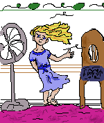
dixielandcutie
(Jan 20, 2004)
not done yet. need a break.
staci (Jan 21, 2004)
ok i have a suggestion. you spent 33 minutes on this..now..you could take maybe another 33 minutes and add some shading and depth by looking at real subject..studying folds in fabric..see how light reflects color and makes shadows and highlights. play with the tools..as you have seen almost anything is possible to reproduce with these applets. i personally think you could do better if you took a bit more time.
dixielandcutie (Jan 21, 2004)
hey icats. thanks for the suggestion. i agree, it could be a lot better. my main problem is i dont know how...time isnt an issue, ill work on it as long as i need to. i will take your advice tho...thanks. (and i keep getting comments about shading...*clueless*...what is that?)um, ok...i tried to do what you said, but i dont think im doing it right. no it just looks like theres stain everywhere....*help?*
DeadlyBlondeArcher (Jan 21, 2004)
Bless your heart, Dixie! :) Wish you lived next door to me and we'd get a paint brush and get messy lol. Okay, first of all, the image you drew is adorable, and the idea very creative. As for shading, there will be more than one color in a shadow of something (such as the folds of the fabric) would go from dark blue in the deepest fold, graduating blue tones upward until the lightest blue is on the outermost part of the fabric. Do that and blend. Work on thinking about which direction your light source is coming from, and keep it consistent in your pic. Everything casts a shadow somewhere if there is light. That'll give you a couple of things to think about. Hope it helps. Dont give up!!! |
| |||||||||
|
dixielandcutie
(Jan 21, 2004)
doncha miss those days? hehe. okay...go ahead...tear it apart...id love any suggestions
ambiguous.alkadette.amnesiac. (Jan 21, 2004)
shading!
dixielandcutie (Jan 21, 2004)
haha. scarey? oh my. any suggestions on how to shade? i dont really know how...HAHA. okay, if she wasnt scary before...she is now. i tried some shading, and now she just looks bruised, lol. umm...guess its >>back to the drawing board<< *hehe* im gonna practice some light/dark stuff *sigh*
DeadlyBlondeArcher (Jan 21, 2004)
Okay, Dix, it's not _that_ scary. :) lol. It's really great for a beginning. With every piece you do, you'll learn and evolve. On this one, I think your choice of colors is really good, even in the skin tones. For the shading on a face, try to remember to highlight the plains and darken the receding places for shadows. Blend it with the rest of the face. And for shading in your backgrounds and with objects, to get perspective remember that colors are less vibrant the farther away they are, and things are less defined in general. Now practice some more! And if u have a tablet, USE IT! You've got talent! Love ya Dixie. :) |

| |||||||||
|
dixielandcutie
(Jan 19, 2004)
new to drawing...on computer and general. just trying to get the hang of this this. any suggestions welcome! thanks.
RabidMalikFanGirl (Jan 19, 2004)
Welcome to 2draw :) As for suggestions, the highlights on the hair are nice but shading the pic in general would be a good idea. The wings should be a bit more defined, and it could use a background possibly ^^ (Okay, I suck at bgs, I know ;.;) is that better? not really sure how to do the shading...
DeadlyBlondeArcher (Jan 19, 2004)
Dixie this is adorable! Love her facial expression and the way it looks like she's sitting in the clouds. Isn't this site FUN!!!? Glad you came... draw some more now!
pix (Jan 20, 2004)
lovely drawing Dix, too bad it is soooo small... but it rocks |

| |||||||||
| Public Boards/Intermediate | ||||||||||
|
DeadlyBlondeArcher
(Jan 15, 2004)
Another Man Down......
marcello (Jan 16, 2004)
nice picture but that face really creeps me out. it looks too old for the body, and it's not clear if it's a male or female. not that that couldn't be intentional.
DeadlyBlondeArcher (edited Jan 16, 2004)
yes, Marcello, the asexual appearance is quite intentional, as is the question of age, as Cupid is usually portrayed that way. Although to "creep you out" was not my intention.
strangeoid (Jan 16, 2004)
It does look like a painting... absolutely marvelous representation of Cupid. I really love the glittering arrow.
laurael (Jan 16, 2004)
wow...love the way it 'does' look painted...just incredible. |

| |||||||||
| ||||||||||
| 2draw.net © 2002-2026 2draw.net team/Cellosoft - copyright details - 2.57sec (sql: 28q/1.08sec) |