 |
| |||||||||
| Specialty Boards/Contest! | |||||||||
| 9 comments – latest 4: | |||||||||
| Specialty Boards/2draw Ink | |||||||||
|
still needs a lot of work... going to try for a lot of special effects.
30 comments
– latest 4:lol it is the teenage mutant ninja spark plug -- Mwaha! I'll be working some ideas on this now... ph34r. ~method3 -- gunmetar!!! feel free to continue messing around, hopefully I didn't do anything that would bother you. love the radiating lines addition. -z
dorothyblueeyes (Sep 2, 2012)
i like it, altho my tastes run to the black/white simpler "2 and robot".i guess simplicity appeals to me, but this is excellent.(i don't know how people do these,either.heh.)
Cookie2 (Jun 22, 2021)
wow. just wow.
davincipoppalag (Jun 22, 2021)
zack designs computer games now.. he's quite good
Cookie2 (Jun 22, 2021)
:0 |
|||||||||
|
15 comments
– latest 4:
Punky (Nov 12, 2005)
This makes me so happy. :)I love Zoraw. This would be a pretty cool shirt, I mean, I'd buy it (if I had money).
narutofan (Nov 24, 2005)
cool i like it
Kanuto (Nov 10, 2006)
that composition looks nice, tho I still cant find the "d"..
dorothyblueeyes (edited Sep 2, 2012)
so good. it really does say"2draw". this is a shirt?hey, here's my money!we need a 2draw t-shirt. get some large sizes, eh? (I've done lithography, i loved it. black litho crayon on stone; ecstacy.)(i know where you can get cheaper blank t-shirts,the more the cheaper;"Dharma Trading.com",but they don't do the printing.but lotsa kinds, sizes,maybe black.)cheap for just one, also(this is not an ad) yeah, do it. |
|||||||||
| Public Boards/Intermediate | |||||||||
|
7 comments
– latest 4:
Ty854 (Sep 22, 2005)
That's either a giant cookie, or a really small maiko. :)
p3ndragon (Sep 22, 2005)
Oh dear lord. ^_^;;
Zack (Sep 24, 2005)
Wow, this turned out great! I like the illustrative-ish style of it.
method3 (Sep 26, 2005)
Don't you all imagine Mai as a small chibi fury thingy? Well, I do, that's why I drew a normal sized cookie like that... mwah. |
|||||||||
| Specialty Boards/Elite Bastards | |||||||||
|
What did grammar evar do to you? The case of one nub that didn't know any better...
14 comments
– latest 4:
Zack (Sep 25, 2005)
I'm sure Method and Marcello are devastated.Oh yes indeed... is this ever gonna get finished?
SneakyWalter (Sep 26, 2005)
I liked version 4. I people who type like that.Cat ears And spikes on the back? Funny. Do Marcello and Method3 even Care?
dorothyblueeyes (edited Feb 6, 2012)
what the funk? "yoga nazi "? my dad, one time, I called a nazi, but he did ' sing*, dEutche land obeR alles" to make fun of me studying Hebrew. shit. (we are part Jewish); great picture, that is the real nazi, you got him, great pic!:)yes, finish this epic! |
|||||||||
| Specialty Boards/Collaborations | |||||||||
| 7 comments – latest 4: | |||||||||
| Misc. Boards/Sprites | |||||||||
|
Inspiration. Hey, someone had to do it. If you got any qualms about how it turned out TRIP I'll add you so you can mess with it if you want (since it's not my character, or characters for that matter). Oh yeah, all mouse work.
4 comments
– latest 4:>:P |
|||||||||
| Public Boards/Intermediate | |||||||||
|
the start of another Ed-kun e__e after my first one would not submit..
12 comments
– latest 4:c & c very much appreciated, will finish when i have time >< -- I am declaring this as done finally... hehe. Actually I just can't stand working on it anymore and the background was giving me such a headache. Maybe it's not, but that's up to Wasil to decide now! ~method3
Xodiak (Apr 10, 2005)
Wow... fantastic drawing! It is impressive that you waited almost a year to finish. I have many unfinished drawing waiting for long time, Xod is ashamed...Very great quality miss Maiko and mister Vincent. >:) |XOD|
nekodesu (Apr 10, 2005)
Wow! Awesome collab you two! The sketch is great, the coloring is great, and the BG looks so cool ^^
marcello (Apr 10, 2005)
gotta be one of the longest collabs in existence. good stuff.
Animegirl250 (Apr 11, 2005)
oOoOoOo my Edward!!!! Me thinx hes seeexy! ^^ |
|||||||||
| Specialty Boards/2draw Ink | |||||||||
|
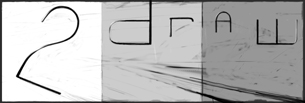
A 2draw logo designed for the back of a tshirt. Originally pretty faithful to the original sketch on paper with a few changes to make it more readable and hopefully less complicated. Now this monstrosity is pretty much a brainstorm of ideas. It will probably not be reproducible on a tshirt except by photographical reproductive process (not like a silkscreen).
6 comments
– latest 4:This thing is just a monster to work on. Messing with some other colors I think will help so... that's next. Also all the old layers are there in case you want to mess with them so don't worry.
Fin_beast (edited Apr 8, 2005)
Looks much better with that black surrounding. Should be insane when it's finished.Just added stuff behind (under?) the letters. What else does it need...
Some fixes to what I didn't like. But whether it's done or not... I think it still probably could use some work. Suggestions definetly welcome at this point.
|
|||||||||
|
This is so much better than everything I sketched out before.
31 comments
– latest 4:I cleaned up some of the line art but I might wana clean it up some more. Any idea's on colour schemes? I thought maybe really reflective metal... Or maybe just Gradients of colours? Whad'ya think? ----------------------- Finished version for now until someone on Ink goes at it again. ~method3
davincipoppalag (Apr 7, 2004)
a portrait of Marcello? lol
rainstar (Apr 21, 2004)
love this one! it's so cool! again, if it were a shirt, i would wear it!
staci (Apr 27, 2006)
i still like this one.
sparklycupcake (Jul 2, 2007)
i like this 1 |
|||||||||
| |||||||||
| 2draw.net © 2002-2026 2draw.net team/Cellosoft - copyright details - 1.02sec (sql: 49q/0.36sec) |
haha....i love it!
drawn in 1 min