| ||||||||||||
| Public Boards/Advanced | ||||||||||||
|
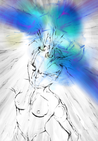
method3
(Mar 20, 2004)
A skull. And some arrows. Read the title f00. |

| |||||||||||
| Specialty Boards/Elite Bastards | ||||||||||||
|
method3
(Sep 27, 2003)
Tripping the light fantastic...-------------------------------- The first edit went over the 800kb limit on the advanced board, so it is therefore ending up on the elite bastard board because I really don't have a choice. At least it seems submittable, although notably still abstract and un-interesting for the most part.
dixielandcutie (Mar 10, 2004)
lol, davinci. i do like what you're doin with it! keeeep it up!
ProjectZeppher (Mar 11, 2004)
this sucks...
Maiko (Mar 13, 2004)
teh head's a bit big O_O;; an' her body is kinda scary ^^;;but i like the lineart, very smooth
bumpinthenight (May 25, 2004)
Woah.... Good anatomy.... Interesting headpiece you got there, too! (or is it a headpiece... :P) |
| |||||||||||
| Public Boards/Intermediate | ||||||||||||
|
method3
(Feb 14, 2004)
2d design assignment, contrast of opposites or something...I think it's pretty much done. The rocky stuff on the right doesn't quite fit in with the whole piece, but I'm planning on making some textured paper so that it'll kinda contrast everything else at the same time. Anyhow, I can't do much more since I really have to get started on this project now, no more time can be wasted on the study.
DeadlyBlondeArcher (Feb 16, 2004)
I like this, it's interesting. Induces a sort of *let's search for something else in there* feeling. Pretty cool.
davincipoppalag (Feb 18, 2004)
...dont let Sigmund Freud get ahold of this... all those phallic symbols lol my goodness.. lol I like this great interplay of shapes and colors..
method3 (Mar 13, 2004)
I guess the thing actually turned out alot like this amazingly enough. Might scan it some time if I feel like it. |

| |||||||||||
|
method3
(Jan 30, 2004)
Just a sig for a board...Just a little something going off a really tiny 5sec doodle I did...
Okay, yeah, now that my eyes are bleeding I think I can safely take a break. Please let me know what you think of the detail, I want to add some evil color to finish this thing up.
safescene (Jan 30, 2004)
the detail's wonderful, which is probably something you didn't need to hear :P still, this sig. is very, very cool...and for some reason, I really like the way the letters flow with the swirls - nice job
Urei-sama (Jun 28, 2004)
i completley dig. this looks awsome |
| |||||||||||
|
method3
(Jan 23, 2004)
I wanted to do something in the same style as gusiLuNg... so here it is. Somehow he gets these great details and depth with just some vague ghostly shapes. A tribute I guess you could say.
Darknightstar (Jan 28, 2004)
Very kewl....it looks good.... The eyes give it a lost look to it, like it is a view of a lost soul. *looks back at it..pauses*..It is very kewl. Keep up the amazing work.
Look (Jan 28, 2004)
That's really cool. How do you do all the dots? It looks just great
method3 (Feb 24, 2004)
Just saw the comment about the dots, very simple actually. If you turn down the diffuse on the brush in Lascaux (it's a bar on the bottom right) you can get a pretty good random dot thing going.
Gigandas (Feb 24, 2004)
Reminds me of Jenova in a weird sorta way.Looks like it could be some alien scan or something.Nice... |

| |||||||||||
| Specialty Boards/Elite Bastards | ||||||||||||
|
method3
(Oct 10, 2003)
this was supposed to be some kind of metal stamp kinda thing, but that looked pretty crappy.plus since i ran out of space on the other boards on the first submission it yet again ends up on the only board i have been posting to, that is the only reason it's here.
method3 (Jan 22, 2004)
Just posting to let people know that I guess I'm still going to work on this piece as new ideas come to me. The thing that's missing from this is just overall lack of depth i guess.
marcello (Jan 22, 2004)
you need more contrast in the main outlines, I think... btw, are you boycotting aim/icq now?
method3 (Jan 22, 2004)
Nope, I just never bother to start trillian anymore, I don't think that's the same as boycotting it.
mukumuku (Dec 23, 2004)
this looks just like a real paining! i think it looks great |

| |||||||||||
| Specialty Boards/Contest! | ||||||||||||
|
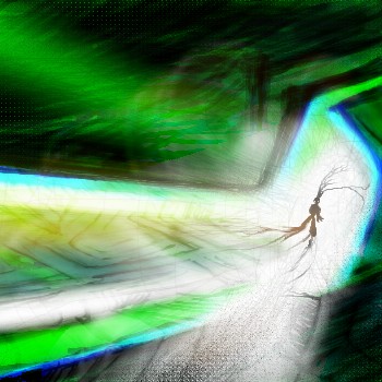
method3
(Oct 1, 2003)
Have you ever drawn something for several hours, and STILL had no idea what it was? I just had a moment!Just pretend that this is whatever you think that it is. With green stuff. And a guy with wires or something coming from him, with one hand. WTF?!?!?!
Exactly my words here.
Zinc (edited Oct 1, 2003)
There were times when I thought I was extremely weird, but now I can just look at this and think again.Nifty effects. Edit: I am a retard and cannot speak English.
pulmonq2 (Dec 29, 2004)
lol. The obscurity is what makes it interesting, to me. And the vivid coloring.
davincipoppalag (Dec 29, 2004)
I wish method had time to draw more. I always liked his pics. |
| |||||||||||
| Public Boards/Intermediate | ||||||||||||
|
method3
(Sep 19, 2003)
You know this is l33t.
Zinc (Sep 19, 2003)
a) That's a penguin.. just a weird one.b) Not really chirp.. more like raaah! c) I just realized there wasn't any shading. d) "weerd diggity"
concannon (Sep 19, 2003)
Deh beak is screwy. But I dig the feet. They resemble leaves.The light glinting off it's eyes is grey? Interesting. |

| |||||||||||
| Specialty Boards/Elite Bastards | ||||||||||||
|
method3
(Sep 4, 2003)
I wanted to do another picture with flames and horns and stuff, and this time the sketch came out as a could-be she-devil. So that's what it is.------- This was on the intermediate board... then i ran out of space. This was on the advanced board... then i ran out of space. Now I've run out of space on the l33t b4st4rd board, so now it's finished...
laurael (May 22, 2004)
Yeah, you're in a class all yer own...interesting pic though...
IkariIreuL (edited Nov 15, 2004)
The wings reminds me of some insect wings
Xodiak (Nov 15, 2004)
She is a very sexy female demon. I want to kiss her although she has no mouth. She cannot steal my soul, because I do not have one. >:)Her wings look a little like fly or moth wings. They are awesome! >:D |XOD|
darkshadow (Oct 18, 2005)
WOW nice like the shading and you still have tons of space work on it and use it up |

| |||||||||||
|
method3
(Aug 27, 2003)
evil guy with flames and such. the burning, the burning!fire added to add a bit more flare.
just put some finishing touches to the eyes (reflecting some fire). decided that this is probably all i want to add to it, didn't want to mess with the colors again except a little around the eyes.
laurael (May 22, 2004)
Yeah, the eyes are cool looking...
mukumuku (Dec 23, 2004)
i like how you colored this, very cool |

| |||||||||||
| ||||||||||||
| 2draw.net © 2002-2026 2draw.net team/Cellosoft - copyright details - 1.29sec (sql: 35q/0.53sec) |
He must be one of those flaming skulls the Cacodemons cast from their mouths at you. >:D
|XOD|