| |||||||||||||||||||||||
| Public Boards/Beginner | |||||||||||||||||||||||
|
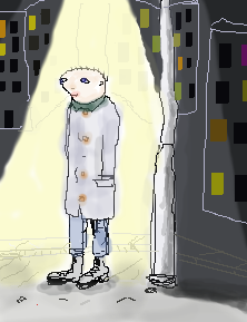
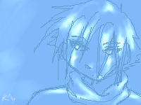
myyr
(Nov 26, 2003)
can't escape the city-mood... |
| ||||||||||||||||||||||
|
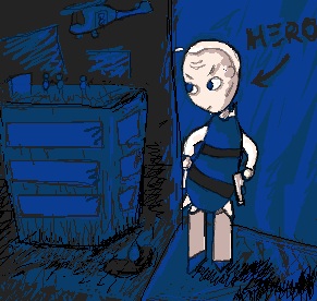
matt
(Nov 23, 2003)
Come on, baby: he can't help his effeminate means. It's just his nature.
jord (Nov 24, 2003)
nice style! great space suggestion
Arisuki_Artemis (Nov 27, 2003)
This is so cool, I really love the scribbly-ness of the background...fits in perfectly! |
| ||||||||||||||||||||||
|
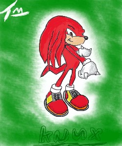
Tylop2
(Nov 25, 2003)
Hope everyone likes this more then my previous crap, May..may add a background in the future. Comments appreciatedSorry about the lack of effort in the background, other then that IM happy with the end result. Commenta as always appreciated.
haruko_ryuu (Nov 25, 2003)
i think it looks pretty good. the line art is a little off, but otherwise, nice job!
jord (Nov 26, 2003)
precious crap...sounds like some radiohead song
raenboe (Nov 26, 2003)
Hmm...pretty accurate. The only thing I see wrong is that he doesn't have his little upside-down-sideways moon symbol on his chest. |
| ||||||||||||||||||||||
|
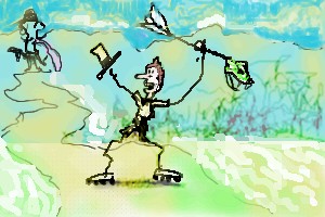
lumpypixels
(Nov 25, 2003)
FRIEND OF THE HEADLUMP PLAYIN WITH 2DRAW FOR THE FIRST TIME
jord (Nov 26, 2003)
hee, nice, very suggestive, and expressivei like the background, only he road seems a bit wrong |
| ||||||||||||||||||||||
| Public Boards/Advanced | |||||||||||||||||||||||
|
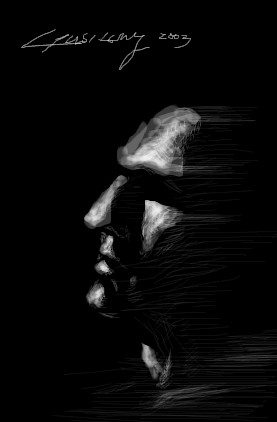
gusiLuNg
(Nov 17, 2003)
Just Fun... for Killing time.
jord (Nov 18, 2003)
hm, this is good...plz kill time again... your previous work is quite amazing toohehe...now that i keep looking at it...he has alot of nose! (but those people exist)
evil_cloud (Nov 18, 2003)
wow amazing!! I like very much that realist drawingIt is only a comment: He seems like Liam Neeson (schlinder list, starwars episode 1 Qui-Gon)
marcello (Nov 18, 2003)
welcome back! looks pretty cool
strangeoid (Nov 22, 2003)
Very cool. He looks like he's made of stone. *sigh* sometimes I wish I was. |
| ||||||||||||||||||||||
| Public Boards/Beginner | |||||||||||||||||||||||
|
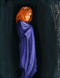
jord
(Nov 16, 2003)
just trying to make foldings hmm...it turned out a bit strange
jord (edited Jan 3, 2004)
- i went looking at aunvi's board and idd sometimes the light looks a bit familiar...(not that obvious i think)- wha, boromir, i see it too now, but it's not intentional...i feared he looked like jesus
Charuba (Nov 16, 2003)
It looks as if the man in the dark is hiding something, or it's as if he was hiding himself, cloaking himself in the darkness as well as the 'folding practice'. Maybe a sheet? Nevertheless, the background and what is of the person's pose blend well together.
Krystiana (Nov 16, 2003)
Very dark. Very impressive. ^_^hm, I'll try to not touch it anymore
|
| ||||||||||||||||||||||
|
Knockoff
(Nov 13, 2003)
I Felt sick this morning so Im not at school right now, *snif**cough* Done now,.
Knockoff (Nov 13, 2003)
This is just a realism practice for the "Face". =/
marcello (Nov 13, 2003)
so you spent half an hour on the face, and 40 minutes on the hair. practice for realism. did you use a reference? I highly recommend looking at some real eyes and noses. (mouth seems alright although a little rough on the outline)But also for hair. Despite popular belief, hair does not grow like a rose-branch. mazi posted a nice tutorial on hair, and it doesn't hurt to look at it. you gotta get away from the notion of anime when one tries realism. traditionally you'd learn realism first, then move onto stylized forms such as anime/manga...
jord (Nov 13, 2003)
its not that bad...i like it when you do other stuff than your usual...but idd the nose needs some workabout the tutorial...hm, where is it? i've been waiting for tutorials quite a while now (okey, i should just search some on google) but i always get: The specified article cannot be found
RIKG (Nov 16, 2003)
Pretty hair! Very nice over all,. The background is a nice touch. |
| ||||||||||||||||||||||
|
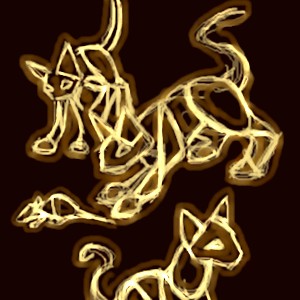
4 comments
– latest 4:
elenawing (Nov 11, 2003)
aww so cute! i love the illusion of them glowing ^_^ *really likes cats*
jord (Nov 11, 2003)
cool!! reminds a bit of the new rhcp-videogood effect
concannon (Nov 11, 2003)
Cookies to jord. Yep, that was the influence.
HJ (Nov 13, 2003)
To me it looks like rings of fire or a hot piece of metal shaped into a cat.. Really awesome! |
| ||||||||||||||||||||||
|
ky
(Nov 12, 2003)
Let me ask the veterans. Does anyone remember ChinkyFlip?
jord (Nov 12, 2003)
hm, yeah....i thank she changed her name into porcelain.... (am i right?)hehe, whaa, am i a veteran already
Knockoff (Nov 12, 2003)
Yes Its the lovely porcelain that was then known as "Chinkyflip" =Danyways not bad.
mazi (Nov 12, 2003)
yep i remember her. though im not sure about the name change, its quite possible.
furyofroy (Nov 12, 2003)
Of course I remember her. She is the only person who did fan art of my characters. ^___^ And now that you mention it, it's possible that she changed her name. It would make sense. *nods* |
| ||||||||||||||||||||||
| Public Boards/Intermediate | |||||||||||||||||||||||
|
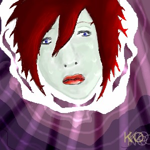
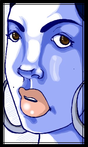
tappie_chan
(Nov 8, 2003)
a highly stylized version of moi. "mistakes" are intentional.
liggy21491 (Nov 9, 2003)
hey i am the dude who was on my mates account and said that graveyard guy was wikd. U are so good! i love the eyes and lips
safescene (Nov 9, 2003)
she (you?) is gorgeous. wonderful job as always :)you like wearing hoops, huh? ;P
JesusFreak89 (Nov 9, 2003)
Cool tappie_chan...
Childlike_Vampire (Nov 10, 2003)
Very spiffy! I love the lips, but I hope your skin isn't really that blue! lol. I like the harsh lines for the shading, and the nose is done great. Nice!! |
| ||||||||||||||||||||||
| |||||||||||||||||||||||
| 2draw.net © 2002-2024 2draw.net team/Cellosoft - copyright details - 0.33sec (sql: 38q/0.15sec) |
but i like this...it has a real atmosphere, and some melancholy