| ||||||||||||||||||||||
| Public Boards/Intermediate | ||||||||||||||||||||||
|
Kasha
(Mar 17, 2004)
People start to smoke just to look cool. Just give up, you'll never look this cool (gay) smoking. |

| |||||||||||||||||||||
| Specialty Boards/Contest! | ||||||||||||||||||||||
|
marcello
(Mar 7, 2004)
oops, I accidentally spilled some red paint on my drawing.
two-na (edited Mar 27, 2004)
quite blah, nice usage of blah
Lalaland (Mar 17, 2004)
they`re so cute >_< i like the bunny guy on the leftnice colors! ^_^
laurael (edited Apr 4, 2004)
I like the 'mouse' creature...can just see it scurrying about(like a roach)...creepy.
joe_shmo (May 24, 2004)
i see a mistake! there is no link on the thing that says Marcello, good job though |

| |||||||||||||||||||||
| Public Boards/Beginner | ||||||||||||||||||||||
|
nehpets
(Feb 24, 2004)
one of my most favorite styles...
jord (Feb 24, 2004)
nice idd, but a bit too much blurr, that takes away alot (like the sharpness of the thorns)
davincipoppalag (Feb 24, 2004)
yes...this needs more sharpness..but I like the lines and the shapes...
lilypad (Feb 25, 2004)
i agree..needs sharpness, but is a pic thus far... |

| |||||||||||||||||||||
| Specialty Boards/Contest! | ||||||||||||||||||||||
|
Zappo
(Feb 23, 2004)
shit...now i have to do one : (
DeadlyBlondeArcher (Feb 24, 2004)
Well, it is close. It does look like a Zappo, neway. Self-portraits are so hard to do.
EverDream (Feb 24, 2004)
Hee...this is a really good try here Zappo. From your picture though you look cuter in real life. But this is good too, sometimes a break from the usual realism stuff is refreshing and cool to look at. good work. ;)
strangeoid (Feb 24, 2004)
*giggles* You are quite a cutie IRL. This is a good picture, but I don't think you did yourself justice.
morbidboblover (Feb 29, 2004)
Wow thats good! I likie! |

| |||||||||||||||||||||
| Public Boards/Beginner | ||||||||||||||||||||||
|
sal
(Feb 23, 2004)
...
Deformed (Feb 23, 2004)
Why are you obsessed with blood all of the sudden? I'm not complaining because I love gore but I was just curious.
davincipoppalag (Feb 23, 2004)
That's not blood..its V8 juice.. he's just a sloppy drinker...
dixielandcutie (Feb 23, 2004)
lol. awesome wallpaper ;p
Deformed (Feb 23, 2004)
Have any of you guys ever tried V8 juice?? Is it good?? |

| |||||||||||||||||||||
| Public Boards/Intermediate | ||||||||||||||||||||||
|
Zappo
(Feb 21, 2004)
C&C
jord (Feb 21, 2004)
wha, you drew a female! (yay for neckidness without too much erotism...) i'm not a fan of that eye either, though it's very expressive, it adds to the sadness...the white thing and the hand immediately reminded me of the creation of adam in the sixtene chapel (by michelangelo), you know, those almost-touching fingers (is that intended or am i seeing ghosts again?)anyway, nice work (damn, now i see the under-left part...i don't know, but for me that curses, with the rest) and still, i like it
Zappo (Feb 22, 2004)
lol thanks for the c&C, i ment for the eye to be simple i didnt want it to be the focal point if i gave it lots of detail, plus if i tried to do that ide probably fuck up anyway :)
dixielandcutie (Feb 22, 2004)
i love the sharp/soft contrast. awesome work
timE (Feb 23, 2004)
nice. one of the more original pieces i've seen. it could use some work though, more development that's all. is it finished? |

| |||||||||||||||||||||
|
mazi
(Feb 16, 2004)
bleh. inspired from a scene in some movie my brothers watching..hope thats light enough for people with crappy monitors
Zinc (Feb 16, 2004)
"hope thats light enough for people with crappy monitors" Sure isn't.From what I think I can see, the eye looks too big and too far up. Nice job on the hair though. ;x
Zinc (Feb 16, 2004)
Wow.. My monitor sucks..
jord (Feb 19, 2004)
hmm, my crappy monitor tells me the eye is too much to the side of the head...why is everybody so bity at comments lately? but if you didn't draw an eye, than thats just a dark hole? then what's the little white dot?...blarh i like it anyway (realy) |
| |||||||||||||||||||||
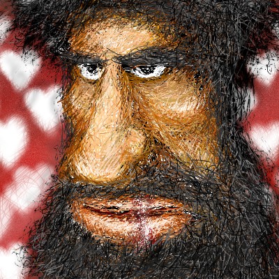
| Specialty Boards/Collaborations | ||||||||||||||||||||||
|
14 comments
– latest 4:
staci (Feb 9, 2004)
noice! the bg is poifect.
jord (Feb 10, 2004)
wha... this is great method 3...wicked (i take back my previous comment)...
davincipoppalag (Feb 15, 2004)
lol..Rasputin meets Castro.. what a great face. you people amaze me
genuinedesigned (Apr 29, 2004)
I think this is perfect the way it is... dont let any one change it.....very different |
| |||||||||||||||||||||
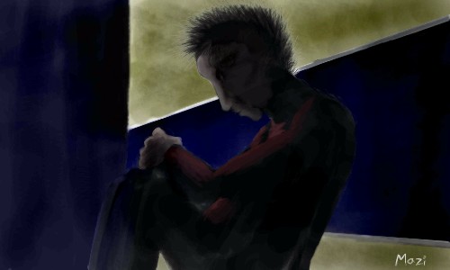
| Public Boards/Intermediate | ||||||||||||||||||||||
|
thug
(Jan 26, 2004)
You rang
jord (edited Jan 27, 2004)
uw...i don't think i would ring a second time... even if wasn't eaten by that time ... i like this...maybe a bit simple, but i don't mind... cool 'paleness'
Tamuriil (Jan 27, 2004)
XD Whee!I love Lurch! *snoogles him* The Adams family rawks. :o
Look (Jan 28, 2004)
He resembles that Luther from Superman. :) Very nice expression! |

| |||||||||||||||||||||
|
sooj
(Jan 25, 2004)
its messy thats cuz i finished it in a rush, going to go see lotr again. ill do a better one later, cheers!
Look (Jan 28, 2004)
Awesome job!!! I like her expression.
Sixelab (Jan 29, 2004)
that is one sexy expression.
KiwiKitsune (May 3, 2004)
Yes. It is a little, teensy bit messy... buuut... eh. I think it's pretty good! Rikku's facial expression is the coolest part! ^_^ I love your art!||:~*KiwiKitsune*~:||
laurael (Jun 7, 2004)
But it looks awesome this messiness! Get back on 2draw more and draw, draw, draw...you do great faces! |

| |||||||||||||||||||||
| ||||||||||||||||||||||
| 2draw.net © 2002-2026 2draw.net team/Cellosoft - copyright details - 1.16sec (sql: 38q/0.34sec) |
Also, please don't use 'gay' as a derogatory term. Because I sincerely doubt that you mean that he looks either happy or has homosexual tendencies.