| |||||||||||||||
| Public Boards/Intermediate | |||||||||||||||
|
where wolf?
17 comments
– latest 4:
Alex-Cooper (Oct 15, 2008)
Nice rat-wolf. Excellent lighting.
Kloxboy (Oct 15, 2008)
Dan: That shirt was -made- for people like you. ;)
Axil62 (edited Oct 15, 2008)
Clox my friend. Let me just say this. While we disagree politically, I was pleasantly surprised that you would go to the trouble to do such a thing. It says volumes about your character, the kind of person you are. Despite our differences, I would hang out with you, laugh, joke and enjoy. I like you Clox, you're good guy. Thanks.
Kloxboy (Oct 15, 2008)
Dan: No problem broski and thanks, I appreciate it. I've always admired and respected the fact that you're true yourself, whether people like it or not. |

| ||||||||||||||
|
horsefeather
(Oct 13, 2008)
vaguely based on a photo of mine
PS (Oct 13, 2008)
Nice colors.
Aakyra (Oct 14, 2008)
Very, very beautiful!
bette_davis_eyes (Oct 15, 2008)
this is so beautiful!
lori (Oct 15, 2008)
you're good horsefeather :) |

| ||||||||||||||
|
PS
(Oct 12, 2008)
This roof could never hope to save me, and my family from certain death.and my fear just fuels the hate machine.
davincipoppalag (Oct 13, 2008)
This is an interesting concept. The sky is falling? A meteorite is coming?
PS (Oct 13, 2008)
Those lyrics do come from a song called "The sky is falling".
horsefeather (Oct 14, 2008)
I really like this, its like the sky split open and light is leaking through.
bette_davis_eyes (Oct 15, 2008)
I love the colors in this! very beautiful |

| ||||||||||||||
|
luxfox
(Oct 13, 2008)
davincipoppalag (Oct 13, 2008)
Beautiful colors.
luxfox (Oct 13, 2008)
Thank you!!! Since this is my first attempt, I was afraid I'd lose what I'd started if I didn't submit it, so it's unfinished (for now). I love the default colors in Lascaux; I was able to use them as my 'jumping off point' for every stroke! I love this website!
PS (Oct 13, 2008)
I like this alot.
horsefeather (Oct 14, 2008)
Very pretty, I feel like I'm there. |

| ||||||||||||||
| Specialty Boards/Contest! | |||||||||||||||
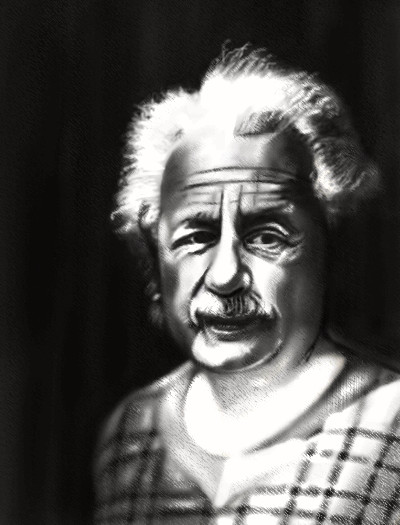
|
Flubbles
(Oct 13, 2008)
cyclops (edited Oct 13, 2008)
since this already is on the contest board, just add some herbs and cook it , its kinda zombish already
Caddris (Oct 14, 2008)
XD I just saw your comment in version 4. I thought you were going to paint Mr. Einstein and then zombify him. Either way, this is looking good.
horsefeather (Oct 14, 2008)
You make black and white look so effortless flubbles, that's not to say your colour draws are any less. ;)Ive lost the reference for this and cant find it anywear, so im setting it to finished until i can revise it again because i need some room.Sheeeeet! i forgot to untick the box to stop it jumping to the front, can it be moved please.
|
| ||||||||||||||
| 11 comments – latest 4: |

| ||||||||||||||
| Public Boards/Intermediate | |||||||||||||||
|
horsefeather
(Sep 17, 2008)
horsefeather (Oct 4, 2008)
thank you, i may try to redo this again in shi-painter, lascaux doesnt work as well for me and it seems that the quality got lost in the compression because it looks a lot different now than it did in the applet... ah well, c'est la vie.
Suntan (edited Oct 4, 2008)
Yes, i like the way you've worked the mountains, too. Come back to it and work some more , unless you really want to start over. This applet is a challenge for me, too. >< :)
horsefeather (Oct 5, 2008)
hehe thanks =)
bette_davis_eyes (Oct 6, 2008)
very nicely done! |

| ||||||||||||||
| Specialty Boards/Contest! | |||||||||||||||
|
25 comments
– latest 4:
QTgillie (Sep 14, 2008)
Thanks Fuzzy, Xina, Miss DJ...very appreciated.
HiroDaZero (Sep 14, 2008)
i like tuhtles
bette_davis_eyes (Sep 15, 2008)
one of best turtle drawings I've seen!
QTgillie (Sep 16, 2008)
thank you so much bette and hiro |

| ||||||||||||||
| Public Boards/Intermediate | |||||||||||||||
|
QTgillie
(Apr 6, 2008)
Photo
Kloxboy (Apr 14, 2008)
QT: I agree, this is not an advanced oekaki applet painting. I also agree you've posted a lot of work on the Advanced Board that doesn't belong there. However, I don't blame you for thinking your artwork belongs on the Advanced Board, there are a few pieces by other artists on the Advanced Board that don't belong there either, yet no one is pointing it out. Had you listened to Sweetcell a while back, none of this would have happened. Maybe if she was a little more polite, you would have listened. That's all behind us now. The current situation is, the Advanced Board's rules need to be better defined and the moderators need to be more pro-active about keeping Intermediate (or lower) level submissions where they belong. As I've said before, if the boards aren't going to be regulated properly, the boards should be divided by "canvas size", not artistic ability.I have one thing to ask you, QT, please learn to use the niftyToo system. When you post large links in the description section of your submissions, it expands the whole site to the right, which is not good. Thanks.
MARLONSEPPALA (Jun 3, 2008)
I just think this bird is or looks like a faithful Led Zeppelin Fan
QTgillie (Sep 14, 2008)
LOL Marlonseppala and Clover pocky |

| ||||||||||||||
|
Lucy90
(Aug 7, 2008)
Roytje (Aug 7, 2008)
Wonderful atmosphere. I like the brushstrokes, especially for the water above :)
Miss_DJ (Aug 7, 2008)
SWEEET!!
horsefeather (Aug 9, 2008)
Simply awesome!
bette_davis_eyes (Aug 9, 2008)
this is just sooo fantastic lucy! |

| ||||||||||||||
| |||||||||||||||
| 2draw.net © 2002-2024 2draw.net team/Cellosoft - copyright details - 0.18sec (sql: 38q/0.08sec) |