| |||||||||||||||||||||||
| Public Boards/Intermediate | |||||||||||||||||||||||
| 5 comments – latest 4: |
| ||||||||||||||||||||||
|
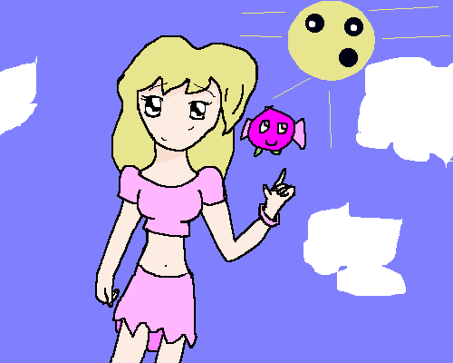
nekodesu
(Oct 17, 2005)
Woot...no ref XD and I somehow managed to make him seem a bit masculine. And horrah for my lazy ass sketchy shading. Felt like doodling but I have tons of hw left.....hw should burn in hell.
Zack (Oct 17, 2005)
That finger is tiny. The crosshatching doesn't really work for me at the moment either. Pretty nice otherwise. I like the inky feel of the darker parts of the drawing.
hideyourface (edited Oct 18, 2005)
tiny finger, straight/small nose, and small mouth. I like the eye though.edit: this actually looks somewhat like jade puget.
darkshadow (Oct 18, 2005)
ya it is small but cool pic i though it hsd more of a char cole look |

| ||||||||||||||||||||||
| Public Boards/Beginner | |||||||||||||||||||||||
|
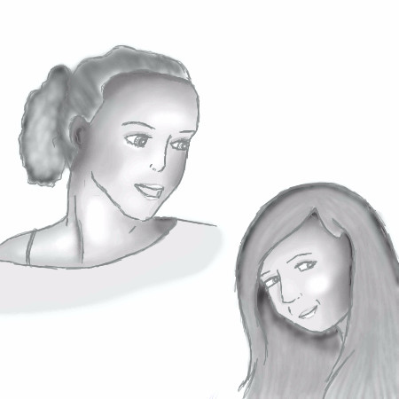
GreenEye
(Oct 17, 2005)
My friend and I, used a photo for reference. It's not great, I'll admit. I looks really wierd tho.. (I'm the one with long hair). Something doesn't look right... hm...
Sammi122 (Oct 17, 2005)
i think it looks very good!i think the part that looks funn might be because your hairline is so far back... and theres a few too many lines over by the nose but the other person looks soooo good! and so do you! you just need to alter it a little dont takle this comment the wrong way
hideyourface (Oct 17, 2005)
you also shouldn't outline everything on the face. Like the lips, the top lip should be shaded darker while the bottom a but lighter with shine on it, then shaded underneath it . Just look at a picture of a face and try to figure out the shape of it, and where the light from one direction hits, and doesn't hit.um... more colours, tried fixing the hairline...
|
| ||||||||||||||||||||||
| Public Boards/Advanced | |||||||||||||||||||||||
|
JK-Arts
(Oct 17, 2005)
.
davincipoppalag (Nov 2, 2005)
DMV!!! Damn!...
JK-Arts (Nov 3, 2005)
Thanks to be compaired to Clox is very good he owns.its not the first time either...
meobi (Nov 16, 2005)
Hey i like it.. really cool looks like a design for a cd cover
terracotta (Dec 28, 2005)
There's something more than vaguely obscene about that nose...very cool graphic and the background werks perfeck with it. Now get that guy away from me. Brrrrrrrr. |

| ||||||||||||||||||||||
|
Axil62
(Oct 16, 2005)
Fin
Noremac (Oct 16, 2005)
HARPIES!
hideyourface (Oct 17, 2005)
I dont like the shading on the person in the back much, but I really like the guy up front. You use good colours for skin an are great with anatomy. |

| ||||||||||||||||||||||
| Public Boards/Beginner | |||||||||||||||||||||||
|
TaCO
(Oct 12, 2005)
Trying new things.
TaCO (Oct 16, 2005)
No no those are birds.
JK-Arts (Oct 16, 2005)
This is a little bit fuzzy and hard to see but it looks to me its gonna be a very long night for the boy that that thing is sleeping on.
hideyourface (Oct 17, 2005)
haha, I like the colours and sense of space.
TaCO (Oct 17, 2005)
Hide you hit the nail on the head. |

| ||||||||||||||||||||||
| Public Boards/Intermediate | |||||||||||||||||||||||
|
TaCO
(Oct 16, 2005)
This was good practice, but I'm still having trouble with a few areas.I been using a mouse for a year but I still draw much much better with Traditional media. Mouse art is hard:(
Gigge (Oct 18, 2005)
I think it's starting to look cool already.
woah_pockster (Oct 18, 2005)
woo I love the shading and I'm glad it's done! you did a great job with the shading <3
TaCO (Oct 20, 2005)
But It's not done.
fleeting_memory (Oct 21, 2005)
something about this picture reminds me of dinoflorist-hmmmmm |

| ||||||||||||||||||||||
|
Axil62
(Oct 16, 2005)
Horny biker sluts assortment
DireOnion (Oct 17, 2005)
Round brushes are very computer-y and don't always suit your style. Have you tried using shi-painter? Its textured brushes are gimmicky but the "water 2" tool might look better than lascaux's "blend" option. who knows!
hideyourface (Oct 17, 2005)
yeah, sometimes the really round look of the brushes stick out too much in your pictures, but when it blends in nicely like on the nose, it looks a whole lot better. I like the quick sketchy style, but not too sketchy.
DarkCloak (Oct 17, 2005)
This must be one of the guys who tried out for the "Surgeon General's Warning" picture auditions. The ones where they show images of nasty teeth on the back of cigarette cases.
koo (Oct 18, 2005)
I have added two comments and both have been removed, not going to bother a third time.I like it though, menacing grin. |

| ||||||||||||||||||||||
|
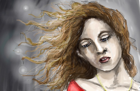
thesolarwinds
(Oct 16, 2005)
just how im feeling.... i like this one.. sort of...
Fobix (Oct 16, 2005)
Woah I love this.
hideyourface (edited Oct 16, 2005)
the eyelids stand out a bit to much, and the eyes aren't lined up exactly. Also theres too much shading on the nose. It looks too straight. Alsoo, the neck shouldn't curbe out like that.
thesolarwinds (Oct 16, 2005)
I personaly think she looks like a chipmunk... and thanks.. i'll try to fix those things.
Kokain (Oct 18, 2005)
Just because you're all emo doesn't mean you have to pick at art work.thesolarwinds: this creation is fawking outstanding.. Hoping to see more of your work. |
| ||||||||||||||||||||||
|
Cianteed
(Oct 15, 2005)
Ville Valo
DieChan (Oct 15, 2005)
Hm... just use the excuse that he's a contortionist. :D Great work, wish I could do something like that.
kristine (Oct 15, 2005)
UMM.. THIS ROCKS...BECUASE HIM IS MY FAAAAVORITE BAND. you are my idol ._.
~unwritten_law_girl~ (Oct 15, 2005)
I LOVE HIM!!I was just listening to their new cd
Pakasutemanshikuka (Nov 26, 2005)
cool! nice to hear people like finnish music 8-------DD i love the colours! |

| ||||||||||||||||||||||
| |||||||||||||||||||||||
| 2draw.net © 2002-2025 2draw.net team/Cellosoft - copyright details - 1.53sec (sql: 40q/0.96sec) |
drawn in 32 min
drawn in 6 min
drawn in 1 min