| |||||||||||||||||||||||
| Public Boards/Intermediate | |||||||||||||||||||||||
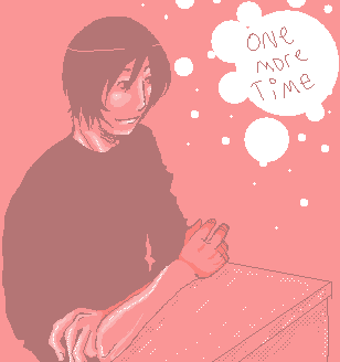
|
Boots_And_Braces
(Jun 23, 2005)
Not nearly done. |
| ||||||||||||||||||||||
|
ironoxide_red
(Jun 23, 2005)
Really useful when you're out in the desert and you don't have water... ok, that was a stupid joke.
Excel_Ichigo (edited Jun 24, 2005)
xD This is very funny.Now this is what happens when you attempt perspective drawing without planning - you end up spending way too much time on a silly cartoon. Let's call this finished, ok?
-> darkshadow: I live in Sweden so I've unfortunately never seen that show (I've seen SNL, though). I guess "the thought of water" would be the next logical step but I'm not sure you could make it profitable... or draw-able!
kawaii_otaku323 (Jul 2, 2005)
witty ^_~ but...i wish there was ramen in it... ^^ mmmm...i'm hungry i guess, lmao, great pic. ^_-
nekodesu (Jul 2, 2005)
Water creates water...genius XD I like the picture of the water pouring into the cup. And the lettering is awesome! |

| ||||||||||||||||||||||
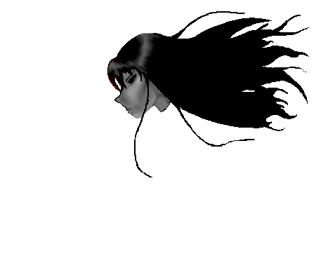
|
torahke
(Jun 23, 2005)
Needs a background and color upgrade. Yaaa........... shading is horrible too.Heylo! -noob alert- Meh name is Kacie, do I need to head over to the begginers, or am I good to go here? Guess what.... time lies.... by so freakishly much....
hideyourface (Jun 23, 2005)
just shade and make sure that highlight on the eye is white. You draw nice smooth lines and actually colour in the lines, so you're fine in intermediate I think.
sarna (Jun 24, 2005)
I agree with hideyourface. I think that your art is just fine on the intermediate board. |
| ||||||||||||||||||||||
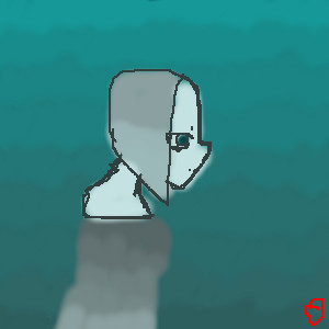
|
Gabriel-Aria
(Jun 23, 2005)
Inspired by Keane - Snowed Under.
hideyourface (Jun 23, 2005)
neat idea and colours. but the proportion is a bit too off, and his face looks flat.
Gabriel-Aria (Jun 23, 2005)
Yeah--I know. I should fix that sometime soon. Alright--nose fixed.
hideyourface (Jun 23, 2005)
you might want to make the nose even bigger. from that view it would be. and also it would cover part of the eye. |
| ||||||||||||||||||||||
| Public Boards/Beginner | |||||||||||||||||||||||
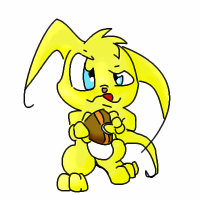
|
Thirteen_Black_Roses
(Jun 23, 2005)
The retired squirrelman of the Apocalypse, to complete the set.
hideyourface (Jun 23, 2005)
try adding some more detail and shading. |
| ||||||||||||||||||||||
| Public Boards/Intermediate | |||||||||||||||||||||||
|
7 comments
– latest 4:
bumpinthenight (Jun 23, 2005)
Thanks, dudes XD Heh... Well, I have a real live glowing elephant! Not just a neon head on my wall... He's sitting on my head right now :D 10000 lbs of migrane goodness...Lmfao...
Xodiak (Jun 23, 2005)
Nice elephant... It looks like a spirit, but the tusks are real. Awesome picture. <:)|XOD|
hideyourface (Jun 23, 2005)
really cool, and really smooth lines. I likeee it.
darkshadow (Jun 24, 2005)
looks great like the colors and the lines |

| ||||||||||||||||||||||
|
MALAONE
(Jun 23, 2005)
this is one of my original characters from my story Twisted Heartache. this is Angelique. not done yet.
Menyway (edited Jun 24, 2005)
I REALLY love that dragon on her back!!! Her right hand is a bit weird but all in all good drawing!!! It make me want to go to the beach!!!!! ^_^Oh and Welcome to 2draw!!! Glad ta have you here!!!!!
squee (Jun 24, 2005)
I can see her butt. lol. Nice tattoo.
darkshadow (Jun 24, 2005)
i like big butts and i can not lie all you other brothers can't ........... fun pic
cold_graffiti (Jul 8, 2005)
i love the brazillian booteh! |

| ||||||||||||||||||||||
| Public Boards/Beginner | |||||||||||||||||||||||
|
Chezas_Place
(Jun 23, 2005)
this is dead soul..her name is aryla...and she is a lost soul in a complete darkness made by a heartbreak..that lil red thingeh is a heart.GOSH im just bad at heart..shit..,my character is super pale
bumpinthenight (Jun 23, 2005)
Hnn... I think that if you had put a tad bit more time and effort into this piece, you would have achieved a better result... For example, the coloring of the figure really needs work... you didnt even color within the lines, and there is no shading to speak of (the random dark grey stuff on the head doesnt count...)Also, the lineart itself is messy and ill executed... the shapes are there, but the lines need to be refined.... lastly, the background, although kind of cool, could have been a tad bit more complex... Oh well... Try harder next time, please :|
hideyourface (edited Jun 23, 2005)
the only thing I'd change about this, is too get the colours in the lines ( but leave the lines the way they are) and to make the water blend nicer. It looks like she's in a hot spring so mist would be neat too. I wish I could edit it ;o |
| ||||||||||||||||||||||
|
geekyshoes
(Jun 23, 2005)
:)decide to go a bit cartoony suposedly self portrait (i don't think so). no i definiteewly do not look like avril
renire (Jun 23, 2005)
reminds me of avril lavigne...dunno why. cool pic! ^_^
hideyourface (Jun 23, 2005)
do you intentionally draw with that really messed up style? It looks cool.
sephiroth54321 (Jun 24, 2005)
man I hate red |

| ||||||||||||||||||||||
| Public Boards/Intermediate | |||||||||||||||||||||||
|
GundamWing
(Jun 23, 2005)
Mugen
hideyourface (Jun 23, 2005)
yeah, I think the mouth is not like his, and the eyes might not be big enough or something. Still cool though. great colouring.
GundamWing (Jun 23, 2005)
maybe it will look like him when i finish it
FLYING_SQUIRREL (Jun 23, 2005)
I dont think his hair is the right color. :-P
woah_pockster (Oct 20, 2005)
I'm loving the shadingg and I love most all yer art xD <3 |

| ||||||||||||||||||||||
| |||||||||||||||||||||||
| 2draw.net © 2002-2025 2draw.net team/Cellosoft - copyright details - 0.71sec (sql: 39q/0.51sec) |
drawn in 25 min