| |||||||||||||||||
| Public Boards/Advanced | |||||||||||||||||
|
frootcake
(Jul 16, 2006)
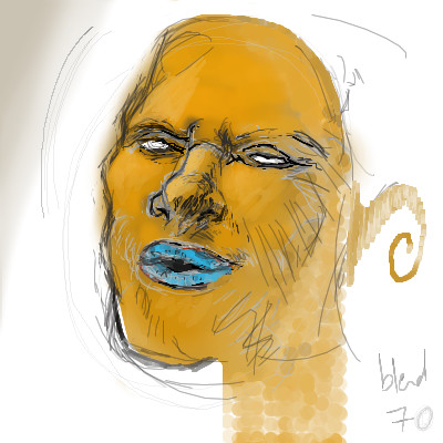
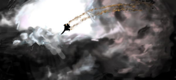
i went advanced for canvas size, i won't get this to advanced standard, i do kinda like it ilke this :) i could play all day |

| ||||||||||||||||
| Public Boards/Beginner | |||||||||||||||||
|
frootcake
(Jul 20, 2006)
joe makes it look easy, i might do a mini project of all the faces he has drawn in the process of his finished pics ;)note, it may be oekaki or his tablet, but his lines are waay smoother than mine, i think its the lack of pen tool. |
| ||||||||||||||||
|
frootcake
(Jul 13, 2006)
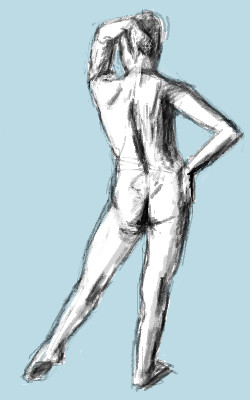
1. As you begin to draw, concentrate on the simple lines that suggest gesture - the angle of the shoulders, the thrust of the hip, the curve of the spine, the position of the legs supporting the weight - and indicate these quickly, and decisively (about 12mins should do if you're a n00b like meh)2 Develop the solid form of the figure and indicate the shadow side with tone (15minutes) 3 Finally, strenghen the total drawing to emphasize the gesture as well as the form. you can do it toooo :)
Violette (Jul 13, 2006)
Lovely.
HunterKiller_ (Jul 13, 2006)
Nice stuff.
Sweetcell (Jul 14, 2006)
Good tute. |
| ||||||||||||||||
| Public Boards/Intermediate | |||||||||||||||||
|
frootcake
(Jul 13, 2006)
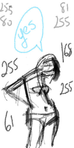
aw i was gonna post beginner, i'm startin again |
| ||||||||||||||||
| Specialty Boards/Contest! | |||||||||||||||||
|
frootcake
(Jul 5, 2006)
i didn't like my other pic, and anyway, this is more me, this is what i do
Sweetcell (Jul 5, 2006)
I love in the thumbnail it has a realistic look to it and when you click on the picture it's more impressionist.3 of you, can one handle three frootcakes? X)
Orkdoop (Jul 6, 2006)
I agree this is original! The thumbnail looks better tho...looks more like the thumb i hope
DoOp (Jul 8, 2006)
fuzzy :O shave man, shave~!!! show that sexy face >:O |
| ||||||||||||||||
|
frootcake
(May 24, 2006)
this is for the contest, i wanted to do a beach scene, a place where friends come together to play, read books, and lay about. i felt inspiration from Monet and am pretty happy since this mostly from my head :)
DeadlyBlondeArcher (edited May 24, 2006)
I love Monet, I did a study of the evening haystack this week and then deleted it. I had to laugh at myself because I was furious that I couldn't make mine look exactly like his. I like the variation of colors you used on the figure. (There's too much to do at the beach to lay around and read books!)
davincipoppalag (May 24, 2006)
Beautiful style and color..you really pulled it off
Miss_DJ (Jun 4, 2006)
very nice!! |

| ||||||||||||||||
| Public Boards/Advanced | |||||||||||||||||
|
frootcake
(May 2, 2006)
this is from a series of amazing celebrity portraits by an unknown photographer, i've wanted to attempt this picture for ages but only now do i feel inspired to do it in this style.....referencepic im willing to work on this some more, c&c welcome.
HunterKiller_ (May 10, 2006)
Ah i recoginized this instantly. Excellent piece. The lighting is so dynamic.
alichanotaku (May 23, 2006)
whoa. -bows- O_O
BlitzCloud (May 23, 2006)
ill take v.1 thanks! :PReally, the likeness to the actor is outstanding, and the color you used for the eyes fits perfectly
fleeting_memory (May 29, 2006)
this really is quite good if not a little creepy :) |

| ||||||||||||||||
| Public Boards/Intermediate | |||||||||||||||||
|
frootcake
(Dec 17, 2005)
just practicing :)
fantomas (Dec 18, 2005)
oooo...great & bold colors
davincipoppalag (Dec 18, 2005)
Nice shading . The one on the right looks like a little duck.
Zack (May 29, 2006)
Saw this as your icon and had to find it in your gallery. Cool stuff.
Sweetcell (May 29, 2006)
One of the first things an artist learns how to render to understand dimension shadows and highlights. Spot on frootcake.Wouldn't the disks edge have a slight hint of hightlight (reflective light?) Sorry quibbling. Ignore the silly lady. |

| ||||||||||||||||
|
frootcake
(May 25, 2006)
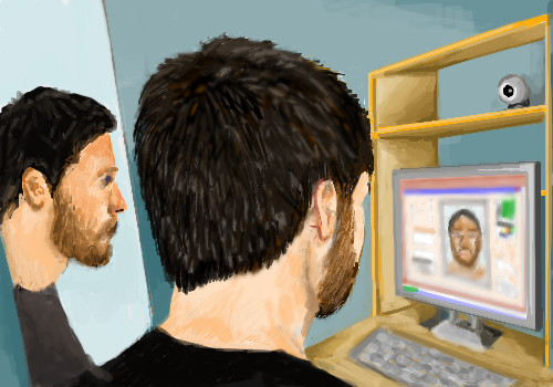
hey this is an interpretation of a friends photograph. take like an infinite #hrs off, i went to the shop during timer.pretty happy with this one :)
davincipoppalag (May 25, 2006)
You should be! I love this..
Roytje (edited May 25, 2006)
Nice perspective and it is well drawn, too. |
| ||||||||||||||||
|
frootcake
(Apr 16, 2006)
i saw, stole and drew this beer mat :) i'll finish it soon, i just fancied a warm up on the program, not used the new lascaux.
Sweetcell (Apr 17, 2006)
Came out great froot. The writing on the mug makes the glass look thick with the placement of the shadows, and it looks so frothy and good. Yumm yumm. What would finish this is a small trickle of beer down the side.
gerbear (Apr 19, 2006)
excellent draw.
Mali (Apr 19, 2006)
That's so very cool =D even though i dont like beer XD!
chan2005 (Apr 28, 2006)
wick beer texture! |

| ||||||||||||||||
| |||||||||||||||||
| 2draw.net © 2002-2026 2draw.net team/Cellosoft - copyright details - 0.85sec (sql: 32q/0.43sec) |
drawn in 25 min