| |||||||||||||||||||||
| Public Boards/Beginner | |||||||||||||||||||||
|
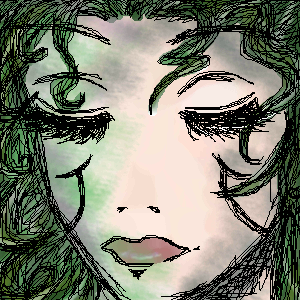
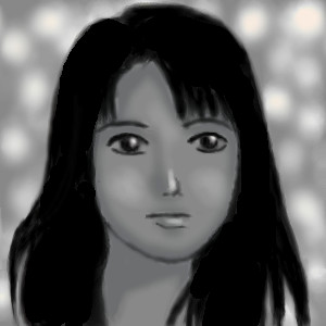
Farore~
LadyLoire
(Dec 15, 2003)
This is my take on a "human" form of Farore from The Legend of Zelda. ^___^ That explaines the green-ness. I kinda messed up on the eyes though. *sigh*
forgotten-memory (Dec 15, 2003)
The hair and eyelashes are pretty. There's only one thing that kinda bugs me... the style of the lips don't really fit with the style of the rest of the picture. for a while, I thought the lips were actually an open mouth, and that triangle of black denoted where the lips were. I was like "now those are some thin lips--oh wait! her mouth is closed!" but you've shaded the lips nicely..it just doesn't seem to fit with the rest of the lovely drawing.
marcello (Dec 15, 2003)
Looks nice, I think the lips are fine. The real problem is the fact that you used the epen tool, really ruins it.
Zinc (Dec 15, 2003)
And I just thought you completely missed the forehead.
LadyLoire (Dec 15, 2003)
Ah. I see. Thank you. ^__^ |
| ||||||||||||||||||||
| Public Boards/Intermediate | |||||||||||||||||||||
|
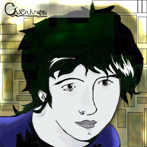
Zappo
(Oct 4, 2003)
This stated as Death From Sandman, but got messed up, and went throught several sex changes......So I just NAmed her Guenivere. C&C greatly appreceated!ok.... NOW its done.... Im starting to nuderstand shi painter
Sixelab (Oct 5, 2003)
i love love love love love love *love* sandman! Death and Del are my favourites ^^ Great drawing, you forgot the most important part! Her spiral!! (and she's not wearing her ankh! but it might look like just a cheesy gold chain if you cant see the ankh part so nevermind ^^)
Zappo (Oct 5, 2003)
Actually I had the Spiral in V2 but it didnt look like death, so I changed it to guenivere.
IDontLookTooGoodInPink (Nov 26, 2003)
ooo neat are we talking about the same sandman book by Alisa Kwitney? |
| ||||||||||||||||||||
| Public Boards/Beginner | |||||||||||||||||||||
|
graywolf
(Sep 14, 2003)
unfinished
forgotten-memory (Sep 15, 2003)
blur = badbut if it were sharpened up it would be very very beautiful. I look forward to the finished result...
Zinc (Sep 15, 2003)
Besides the major bluring here, the pupils are very big.. Might want to work on those while this is unfinished. ;PP.S. ;x
Ari (Nov 25, 2003)
SW33TN3SS!!! Safi-chan, you are getting sooo good!!!! *thinks* Hmmm... Maybe I can get you to do the eyes on my portrait of Gackt... You take bribes, right? *holds up Pocky* |
| ||||||||||||||||||||
|
Childlike_Vampire
(Nov 11, 2003)
Just for fun.
HJ (Nov 11, 2003)
eek! mah eyes! how can a skinny thing like that ..... ?
furyofroy (edited Nov 11, 2003)
More titties! *squeals* I love eet!
lumpypixels (Nov 11, 2003)
Wowzers!
forgotten-memory (Nov 13, 2003)
implants....o.O |
This is hidden because it is rated 18+. Edit your privacy settings to make it visible.
| ||||||||||||||||||||
|
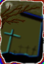
kohrak
(Oct 29, 2003)
what else could i paint here to add a mistery feeling to it?
joe_shmo (Oct 30, 2003)
more clouds
forgotten-memory (Oct 30, 2003)
to be honest, I'd get rid of the green and blue on the corners, and I'd put at least *one* cross in focus. And, yeah. more clouds, more grey, less ugly yellow. But I still think its a nifty fifty picture.
Lark (Oct 30, 2003)
clouds yes, and fog. but big difference....
ladylime (Oct 30, 2003)
nod nod looks better with the tree but you still need clouds hehe |
| ||||||||||||||||||||
| Public Boards/Intermediate | |||||||||||||||||||||
|
coffeejelly
(Feb 24, 2003)
X'Dher hair looks dull... it's all my fault X'D chinese girls look better with black hair, haha :D
Samwise (edited Feb 26, 2003)
That looks really neat. Sort of depressing if you look at it at one perspective but also really mysterious when you consider the way her lips are shaped.
Ari (edited Feb 28, 2003)
It looks real!!! It looks like a photo I saw once. I LOVE IT!!! :)
mauvemalady (edited Mar 5, 2003)
Love the expression. Lost in a world and not sure it's worth waking from.
misho1337 (Oct 27, 2003)
wow, this is great... her expression is very life-like! |
| ||||||||||||||||||||
|
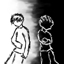
Hakkai
(Oct 21, 2003)
Not done. I have to color it in... >_<; I CHEATED! Shame shame shame. Stupid vertical and horizontal flipping button. It was so tempting!x_X;
furyofroy (Oct 21, 2003)
Oohh, Such a lurvly picture! Your lineart is god.
mazi (Oct 22, 2003)
sex as per usual hakkai. though left boy is cuter, the other ones like.. "*hip thrust* im so badass.."kick
x-syndrome (Oct 22, 2003)
wow! this is so cute! i really love the colouring!
nyao (Oct 23, 2003)
^^ Me like the upside down and normal person. (but smoking is bad for you, tho I do like the smoke) and I luv how you draw the hair, it's cool! ^^ |

| ||||||||||||||||||||
|
concannon
(Oct 21, 2003)
For a completely original and never-before-used title....never ask me.Woohoo. Done. Love the sky; used supermonkey's 'Wings in the Clouds' piece for a reference. Also...for those of you that know me, you know I go insane with markings. So...one neck band turned into multiple neck bands. But I found a reason, this time! This species of dragon have band markings that correspond to strength. The darker, and the more of them there are, the more powerful the dragon. At some point, I'll draw one that's almost completely covered in 'em. Hurrah. *slinks away*
supermonkey (Oct 21, 2003)
Nice. The only thing kinda buggin me is the far shoulder blade... shouldn't it be a little farther foreward? =D Still looks great though.Since it seems that you aren't working on the gryphon, mind if I work on it?
concannon (Oct 22, 2003)
Supermonkey: .....oh. Eh hehehe. ~__~ Yeah. Go ahead. Many apologies.And you're right about the shoulder blade. I was kinda dazed while I was drawing...will fix soon. Uh...yeah. Off to take a nap. Again. ~__~
quintessence (Oct 23, 2003)
Guuuh. Looks great. I like the two background dragons especially, and the sky. (Of course). The little bit of the front-most dragon's tail that's showing is nifty, too. *presses nose to screen* |

| ||||||||||||||||||||
| Public Boards/Beginner | |||||||||||||||||||||
|
Minitsaru
(Oct 21, 2003)
some see black, some see white, why cant we all just be happy with grey
bluesky (Oct 21, 2003)
yes i do like the contrast
Aunvi (edited Oct 21, 2003)
If you do the afterimage trick the blacks on the left and the whites on the right.
forgotten-memory (Oct 21, 2003)
I like dead people.they're quiet and unobtrusive. provided they don't stink yet... I particularly like the way you did the kid with a white outline's hair.
Espada (Oct 22, 2003)
Hell YA!!! Get it across the world, I hate racist basspoops, and good pic |
| ||||||||||||||||||||
| Public Boards/Intermediate | |||||||||||||||||||||
|
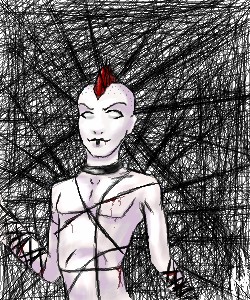
mazi
(Jun 24, 2003)
eerm not sure.. it just happened.. the bg was fun times.. O_o
OneWingedMoo9se (edited Jun 24, 2003)
WHOA! This is extremely good. Androgynous/Goth/S&M Type stuff always good. ^_^
forgotten-memory (edited Jun 24, 2003)
heh...niftage.....love teh background, but the dude things arm seems a bit off...maybe its the perspective or maybe im just loony...probably the latter. lovely job.
Mad_Hatter (edited Jun 26, 2003)
[COLOR=gray]I had a mohawk once. o_o I see what forgotten-memory is talking about. His right arm gets kind of big. His left arm is fine.[/COLOR]
Sixelab (edited Oct 20, 2003)
mmmmm sexy androgynous girl.........whose actually a guy.......but is going to be a girl in my head........reminds me of Desire of Sandman ^^ |
| ||||||||||||||||||||
| |||||||||||||||||||||
| 2draw.net © 2002-2025 2draw.net team/Cellosoft - copyright details - 0.70sec (sql: 37q/0.18sec) |