| |||||
| Public Boards/Intermediate | |||||
|
fleeting_memory
(Jul 13, 2005)
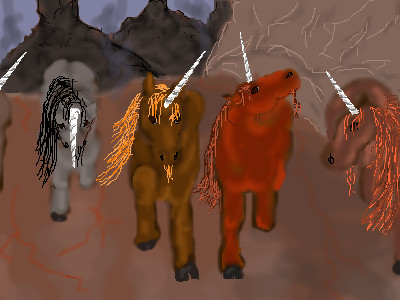
Alright I am afraid to add anymore to it. All I really wanted to fix way the skin to tail transition. Thank you to Maiko for the space! YAY you are awesome. If you guys feel that this should be moved then I can't stop youl, but I am proud of it. |

| ||||
|
fleeting_memory
(Mar 30, 2004)
"Red Halla's royal scouts roved forthExplored the Pain's edge east and north, Sought scarlet dragons' Smoking Hills Beyond bare Saltlands' bitter rills. Four scouts fared forth, fast shoulder-friends, Climed clouded cliffs where world ends, And, ragged ranks reduced to three, Were wared of wyvern trechery By Melintelinas, lite queen Of dragons languid, long, and lean. One scout sped south, strove to return, Lest Halla, herd, and homeland burn. His fellows fallen, stranded here, Have heard no word four hundred year. Their daughters' sons bide, yearning yet For news of Halla's offspring's get That wryms lie vanquished, Hallows freed By valiant victors' distant deed. Come outlander with tidings and His name shall be the Firebrand. More swart than midnight swept of stars, The moon athwart his brow bescars. One heel whicked white by wyvern stings, His flame the final firefall brings. We dragons' denmates must remain Till Firebrand fetch us home again..." A line of unicorns appeared around the bend... -from The Son of Summer Stars (Firebringer Trilogy)
Gigandas (Jun 24, 2004)
I think the problem with the grey one is that the horn is pointed too far down and that the angle it should be at is kinda pointing right at us, the viewers.The other horns seem to look just fine to me.I think my favorite would be the brown one in the middle cause he looks like he's about to take someone out and you did a nice job capturing that XDD.Nice work :).
laurael (Jun 24, 2004)
Pretty good, so far FM...but also on the grey one, maybe not have the top of the horn so high up? I like the red one the best...it's got attitude. :)
davincipoppalag (Jun 24, 2004)
Nice colors, and a good idea. I agree with Laurael about where the grey one's horn originates, I think if you shorten it, the angle you made will look right. I would like to see some shadows on the road to connect then to it, ( I know, I know you're not done..) I like this.
Bumble_Beez (Jul 22, 2004)
I love that Trilogy! ^_^ It was kind of sad though, at some parts.. well, actually it wasn't all that sad compared to some other books I've read... x_x Never mind.Well, anyway, this picture is really good! ^_^ |
| ||||
|
fleeting_memory
(Feb 25, 2004)
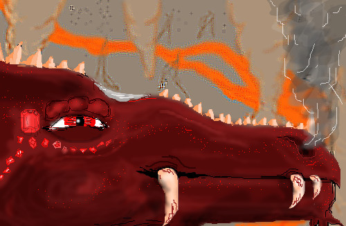
I actually have two versions of this-one like this and one where the dragon is orange-next save I'll post the other one-as for now this is far from done-please tell me what you guys think
Thear (Mar 17, 2004)
Yeei! a dragon! :) i love dragons! so your ff9 fan too? =)
fleeting_memory (Mar 17, 2004)
haha of course-but I'm not to good at drawing the characters that's why I applaud your attempts-best game ever-best game
Thear (Mar 17, 2004)
hehee :) u shoud draw more dragons i think....
15grifficorntears (edited May 9, 2004)
oooooo! i see a dragon! very good though you might want to add more feeling. |

| ||||
|
fleeting_memory
(Apr 8, 2004)
this is not turning out how I had hoped
Baka-Usagi (Apr 8, 2004)
OOW! KEWL!!!!!!*drools*Ur a great artist!!!XD ARG! I am so mad with this picture-Gig I wanted to move the mouth but I'm retarted and I can't cause it looks worse everytime I do-BAH! Now I'm outa space and so I'm just gunna stop-I know it looks 2D I know the ridges on her eyes are deformed but yeah at least she looks better than she used to
laurael (Apr 24, 2004)
I LOVE the way this looks...awesome teeth! Liking the way you put jewels on it too...great idea...!
Gigandas (Apr 24, 2004)
Hey, the teeth seemed to fix it anyways XD.And it definitely looks better^^.Nice additions made and awesome finish >v<! |
| ||||
|
fleeting_memory
(Mar 29, 2004)
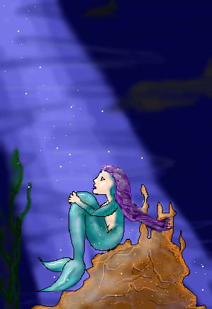
She's thinking-of what I dunno you'll have to ask her-I just liked the feel of this
DeadlyBlondeArcher (Mar 30, 2004)
She's thinking of sailors, of course!
davincipoppalag (Mar 30, 2004)
The colors are very nice.. I think something to give the suggestion that is water would help.. at first I thought it was sky ..and what Gigandas said about some unlit sparkly specks in the dark area would be good.. nice picturethere-more dimension to it ^^
Gigandas (Mar 31, 2004)
XD.Yay, you added some more stuff^^.Now it doesn't have such a lonely feel to it >v<.Very well done^^. |
| ||||
| 2draw.net © 2002-2025 2draw.net team/Cellosoft - copyright details - 1.79sec (sql: 19q/1.03sec) |
I like the rain, but now the tail seems to blend into the background a bit. You could try lightening up one or the other to separate the two. I might also add some glow around the lightning too. I like seeing how hard you're trying here for sure :). Keep on going.