| |||||||||||||||||||||||
| Public Boards/Beginner | |||||||||||||||||||||||
|
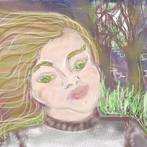
Hey its arnold!!!
Minitsaru
(Feb 22, 2004)
title has nothing to do with the drawing....
PinkuEspeon (Feb 22, 2004)
OOOHH!! This is pretty! That's the way I was like this morning! ^_^;; I like this! I like this a lot!
dixielandcutie (Feb 22, 2004)
lol. cool background. maybe spend a little more time tho? nice work |

| ||||||||||||||||||||||
|
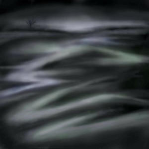
Alicia
(Feb 22, 2004)
The moon's dim light shines through the limbs on the trees. The fresh breeze ,calls me away from the city.
dixielandcutie (Feb 22, 2004)
huh, not really sure. but nice work. great detail, and cool idea. |
| ||||||||||||||||||||||
|
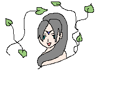
icers
(Feb 22, 2004)
i llove elfs
dixielandcutie (Feb 22, 2004)
cool, nice work. some suggestions tho...maybe a bigger canvas would make it easier, and some more general shading. keep it up! |

| ||||||||||||||||||||||
|
Harmanye
(Feb 21, 2004)
Well, as they say, the title say it all. No clue waht I was doing, just having fun. Well I think it looks alright, anyway ^^;
HJ (Feb 21, 2004)
(Psst, its way back in the top left hand corner) Maybe its a pillow and the fluffy thing in the back is one of the feathers poking out. Hehe
davincipoppalag (Feb 22, 2004)
oh.... I didnt see it with the bus parked there...
dixielandcutie (Feb 22, 2004)
LOL. yall are hilarious. cool piece. i like the tree too ;p
foxman8245 (Feb 23, 2004)
looks like it spells SEX. "S" at the bottom, lower case "e" in the middle and a wide lookin "X" at the top. Oh yeah.... I do like the blending and the tree IS really cool. |
| ||||||||||||||||||||||
|
foxman8245
(Feb 22, 2004)
Those who are wondering "WTF" - a letter B?? Well, I'm killing 2 birds with one stone. Teaching my 5 year old the alphabet while getting her interested in computer graphics. She says this is ALOT more fun than flashcards!!
foxman8245 (Feb 23, 2004)
thx Lily.... no killing of the birds....yet.Very clever comment Icats, I wish I had the ability to muster up such a glorious apparel of words to form an outstanding display of literature! :)
Deformed (Feb 23, 2004)
You got somthin' against kids Ishats??? Huh? HUH?!? (I spelled Icats wrong on purpose) I'm a kid!!!
Wez (Apr 13, 2004)
-B-eutiful
joox (Nov 25, 2007)
it looks ilike an ear lobe. |

| ||||||||||||||||||||||
|
icers
(Feb 22, 2004)
i thought i'd draw something, but how u get drawings u did in realz on here?
dixielandcutie (Feb 22, 2004)
i dont know that you can... |
| ||||||||||||||||||||||
| Public Boards/Intermediate | |||||||||||||||||||||||
|
DinoFlorist
(Feb 20, 2004)
I decided color was too hard again.
The_Chosen (Feb 21, 2004)
wowwwww! i like kina creapy tho ^^
Harmanye (Feb 21, 2004)
Verra nice, a little hard to make out the outlines and shapes, but otherwise really good.-_- In other news; How dare you draw so well?
dixielandcutie (Feb 22, 2004)
wow dino. awesome detail...i love your style. you rock.
-simulacra- (Feb 22, 2004)
Fair play, you sketch like a bitch... |

| ||||||||||||||||||||||
|
Zappo
(Feb 21, 2004)
C&C
jord (Feb 21, 2004)
wha, you drew a female! (yay for neckidness without too much erotism...) i'm not a fan of that eye either, though it's very expressive, it adds to the sadness...the white thing and the hand immediately reminded me of the creation of adam in the sixtene chapel (by michelangelo), you know, those almost-touching fingers (is that intended or am i seeing ghosts again?)anyway, nice work (damn, now i see the under-left part...i don't know, but for me that curses, with the rest) and still, i like it
Zappo (Feb 22, 2004)
lol thanks for the c&C, i ment for the eye to be simple i didnt want it to be the focal point if i gave it lots of detail, plus if i tried to do that ide probably fuck up anyway :)
dixielandcutie (Feb 22, 2004)
i love the sharp/soft contrast. awesome work
timE (Feb 23, 2004)
nice. one of the more original pieces i've seen. it could use some work though, more development that's all. is it finished? |

| ||||||||||||||||||||||
|
6 comments
– latest 4:
davincipoppalag (Feb 22, 2004)
Lol you should sell this as a wallpaper pattern
DeadlyBlondeArcher (Feb 22, 2004)
A Mr. Potato Head board game! This is interesting. I like it.
lilypad (Feb 23, 2004)
that's DEFFINITLY modern. or maybe Picasso reborn. or a new art style. or an old lost one. or i don't know one. or one i've seen but don't remember. but it's modern. ^^me likey this
method3 (Feb 23, 2004)
Ok, I think I'm going to be the first one to say this, here goes. Firstly the colors suck. I mean, I get how they are matched together and all, but you look at it overall and it's like someone puked up bubble gum and spaghetti all over a green and blue floor or something.Secondly I hate most modern art. |

| ||||||||||||||||||||||
| Public Boards/Beginner | |||||||||||||||||||||||
|
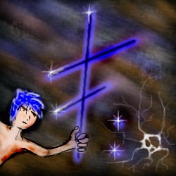
foxman8245
(Feb 21, 2004)
Letter "F" from the extreme alphabet... will eventually do all letters. 5 year old daughter picking colors, also helps her to learn the alphabet. Fun way for her to learn ;)Have to finish this later.... 2 yr old just woke up ...
15grifficorntears (Feb 22, 2004)
wow. shiny. me like big shiny stick. me want big shiny stick. give to me.
dixielandcutie (Feb 22, 2004)
cool sparkles and background...maybe more detail on the guy? |
| ||||||||||||||||||||||
| |||||||||||||||||||||||
| 2draw.net © 2002-2026 2draw.net team/Cellosoft - copyright details - 3.35sec (sql: 36q/2.27sec) |