| |||||||||||||||||||||||
| Public Boards/Beginner | |||||||||||||||||||||||
|
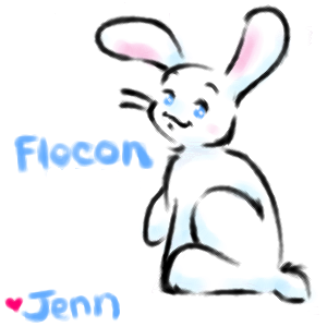
Flocon for Charlottee
MooKittee
(Feb 25, 2004)
Just a little doodle for my penpal Charlotte in France. It's her bunn "Flocon!"
ToraNeko (Feb 25, 2004)
AWW Kawaii no da!! I love how you have the fadeing of the lines happening, and the very light touch of color, Its so cute I wanna eat it! Like a peep!
strangeoid (Feb 25, 2004)
Adorable! I love the soft shading and its precious lack of detail. ^_____^ I want to just squeeze it!
dixielandcutie (Feb 25, 2004)
oh thats just too cute, awesome coloring
bunnyfoofoo (Feb 26, 2004)
it's verry prety and cute keep it up i'm not a really good drawer but i'm verry good at painting |
| ||||||||||||||||||||||
|
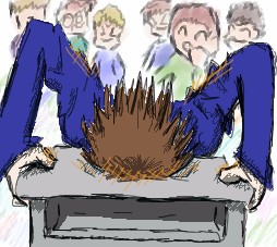
Minitsaru
(Feb 25, 2004)
inspired by a pinky finger...
Minitsaru (Feb 28, 2004)
lol, the pinky is cool! its just the fact that it inspired me thats weird O.o..... the blood was sposed to be sprayed? well i wouldent say sprayed but whetever it was its cool =) ok, i guess "i dunno" is ok =) ..... well, i cant do not sketchyness so we're even!... wtf.... bg... fadeing away.... at torso.... effect? erm.... yea, thats what it is... i ment to do that.... yea.... *confused smile?*
ToraNeko (Feb 29, 2004)
lol, fine, we'll just say I made up the torso part so you can go on with your happy little life n.n
Minitsaru (Feb 29, 2004)
=) *goes on living happy little life, totally forgetting the torse incident* (which would have for some reason spoiled everything?? almost sounds magical! *sparkle sparkle....?*)
morbidboblover (Feb 29, 2004)
Owww....that must hurt :) |
| ||||||||||||||||||||||
|
HJ
(Feb 25, 2004)
The timer is waay off. I left it on unsent for a few hours. Its a picture of a girl. How very creative of me. :l
ToraNeko (Feb 25, 2004)
What scares me about this is the nose. It looks like it should be a side view... O.o.. But Other then that, I like this! A round face like that is cute, but thoughtful at the same time, like Chihiro from Spirited Away (Japanese with subtitles is better) Same iead applies for the eyes, I like the icey shading of them, and the cute little dashes at the sides n.n
dixielandcutie (Feb 25, 2004)
thats cute. i like her hair : )
HJ (Feb 27, 2004)
Its always the noses! X| More often than not, they turn out big. Perhaps its because mine is big.. *feels nose* Spirited Away is great! Though I haven't watched it with the subtitles. Grr, the hair gave me much trouble! If you watch the animation a bit, I kept changing the hair style around. But now I'm satisfied with the piece, and am very happy it received comments! :D |

| ||||||||||||||||||||||
|
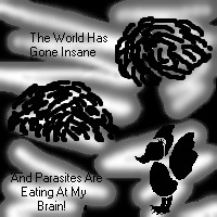
BlackLaertes
(Feb 22, 2004)
There we were, just above the battle,There was trust in our eyes, As the blood stained the skies, Let the world hear our cries� (chorus) Ghost dancers, take me where white men don't tread, Ghost dancers, take me now, for I am dead, Ghost dancers, take me to immortal realms, Ghost dancers, take me�away� Ghosts of our ancestors, please, are you there? We call for you! Dance for you! Wait for you� Wind blows the bitter scent of grief through the air, We live for you, die for you, wait for you� We wait for you, all alone� We are calling you, as our blood turns to bone. Now that I think of it, we did not have a chance, We fell for what purpose, and is there a choice? And we waited there, and we started to dance� As the battle broke out, we rejoiced� (chorus) There I was, just above the battle� I can see every body below� Here I am, the very last one standing� The last one, Ghost dancing� Ghost dancers�take me�away�
Gigandas (Feb 22, 2004)
Have no idea why....but reminds me of the "One-Winged Angel" song.....Sephiroth XD.
dixielandcutie (Feb 22, 2004)
very nice so far...bg is different...but i think i like it! Buahaha! The Duck and the Parasites have nothing to do with the title or the poem!!!
dixielandcutie (Feb 25, 2004)
haha, wow...ok : ) nice |
| ||||||||||||||||||||||
|
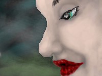
strangeoid
(Feb 25, 2004)
A pretti face. Not original, but I felt compelled to draw something.I <3 Water colours
dixielandcutie (Feb 25, 2004)
very pretty colors, and awesome shading |
| ||||||||||||||||||||||
| Public Boards/Intermediate | |||||||||||||||||||||||
|
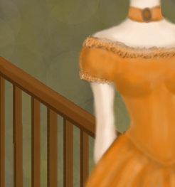
FlyingTangerine
(Feb 25, 2004)
Not finished-but I'm much too tired to work on it tonight. Just wanted to get the idea on paper (so to speak). ^__^ I'll probably change the position (and size) of the vanity...It doesn't quite look right...o_O
davincipoppalag (Feb 26, 2004)
This is coming along nicely..need more in the background... you can memo one of the moderators to see if they will give you more space, there are instructions on the main page how to do thisFinally done. :) The vanity became a staircase when I realized that although I cannot draw a vanity, I can draw one mean staircase. ^_^
davincipoppalag (Feb 26, 2004)
I think the staircase was a good decision.. I like what you've done.. but if you have any space left to do it.. you might put a little something on the wall back there ? or not.. I think i would find it more visually pleasing if the outline of the woman was a tad sharper too because, as you have it here..the staircase in the background..is sharper than the main figure in the foreground.. which is kind of reverse reality... just a suggestion and the others may not agree
FlyingTangerine (Feb 27, 2004)
I would have to agree that she needs to be a bit sharper. Just looks a bit funky. Of course, whether or not I'll get around to it... |
| ||||||||||||||||||||||
| Public Boards/Beginner | |||||||||||||||||||||||
|
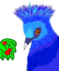
breac
(Feb 25, 2004)
a tribute to my 3rd fav. pigeon, The Victoria crowned.
dixielandcutie (Feb 25, 2004)
thats awesome. maybe a little bit sharper all round and a bg would make it amazing
davincipoppalag (Feb 25, 2004)
yes..more sharpness and a bg..this will be great. the eye is good and the colors are great..
Urei-sama (Sep 12, 2004)
oo i like this! birdies are always good in my opinion. it does seem alittle blurred but thats fine. the eye is pretty |
| ||||||||||||||||||||||
| Public Boards/Intermediate | |||||||||||||||||||||||
|
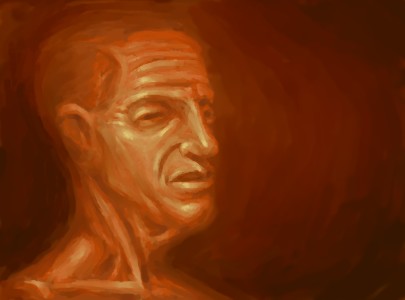
Kloxboy
(Feb 25, 2004)
time to be a man
dixielandcutie (Feb 25, 2004)
clox, i love it. ill hafta be watchin this board with all these wonderful unfiinished works comin downorange puke face
DeadlyBlondeArcher (Feb 25, 2004)
oooh, this reminds me of one of the oolld artists, umm, can't think of his name, dangggit..he did those ghoulish, dripping, nightmarey, vision in the night faces all melting together, and demon-looking creatures. I have a book of his work somewhere, *runs to go find it* (I like it, I like it.)
davincipoppalag (Feb 25, 2004)
looks a little like james caan.....great pic terrific highlighting |
| ||||||||||||||||||||||
|
Fin_beast
(Feb 25, 2004)
Well.. I quite like this.I think I'll be using Lascaux more for stuff with no line art.
dixielandcutie (Feb 25, 2004)
wow...im baffled, its very sharp and clear in a blurry way...cool, howd you do that? haha, anyway, likin the color scheme. nice work!
Fin_beast (Feb 25, 2004)
I think i'm going to try having a dark feel to all my drawings for a period of time.I really like Gigers work and if i can do some good work like that it will help loads in some of my art projects.
DeadlyBlondeArcher (Feb 25, 2004)
This looks like the entrails of something that needed to see a gastrointerologist, but strangely... I like it. It's kind of hypnotizing.
davincipoppalag (Feb 26, 2004)
very imaginative.. this kind of picture is interesting because everyone sees something different in it.. |

| ||||||||||||||||||||||
|
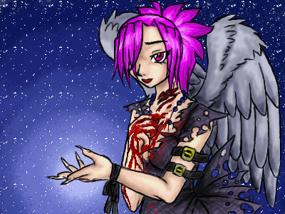
ToraNeko
(Feb 23, 2004)
I need Help with the BG
dixielandcutie (Feb 25, 2004)
thats gorgeous, i love what you did with it : )
Noremac (Feb 25, 2004)
blood. tis a sign of human life
oversoul_trump (Feb 28, 2004)
Very nice detail on the clothing, the only thing I would say to improve on is the wings, they look a bit off :P but that might just be me
fleeting_memory (Feb 29, 2004)
I love your drawings but they all make me so sad-I really hope that you are not as sad as you're drawings ^^;;; |
| ||||||||||||||||||||||
| |||||||||||||||||||||||
| 2draw.net © 2002-2026 2draw.net team/Cellosoft - copyright details - 1.09sec (sql: 40q/0.54sec) |